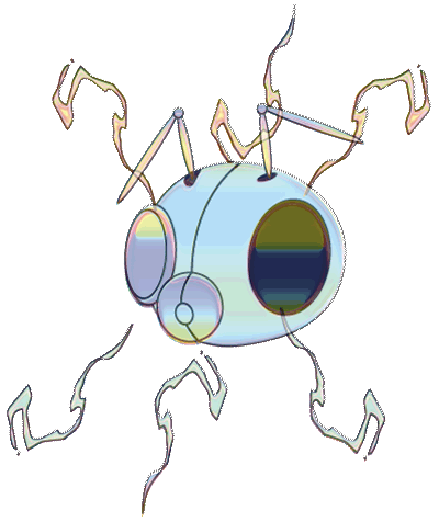


The term “glitch”, coined in 1962 by former U.S. astronaut John Glenn, originally referred to a spike or change in voltage in an electrical current. The meaning of the word glitch has since expanded to refer to any unmistakable yet unexplainable hiccup in what would otherwise be a smoothly functioning system. When referring to computer glitches, they range from the merely annoying to the panic-inducing symptom of a full-scale systems breakdown (e.g., the “blue screen of death”). On the other hand, glitches can also be about serendipity, a full-on happy accident, embracing a mistake and running with it, or functioning as a veritable readymade. In the case of artists Dimtre Lima and Iman Morandi’s Glitchbrowser, a fascination with glitch-as-metaphor serves as a conceptual basis for a work of Internet art.
Generally speaking, Glitchbrowser is not the first of its kind in that it is preceded by other alternative browsers, or what some have referred to as “browser art”. Some of these predecessors include the work of Jodi, I/O/D’s Web Stalker, Mark Napier’s Shredder, and Maciej Wisniewski’s Netomat. Like its predecessors, Glitchbrowser shunts aside notions of how the web (or even computer interfaces in general) is “supposed” to look or “supposed” to work. Therefore, in order to discuss Glitchbrowser, I feel it would be helpful to construct a brief art historical context, as well as a brief description of the aforementioned examples.
What was the initial impetus to create alternative browsers? By the years 1997-1998, a handful of net artists and theorists had already begun voicing concern about how information was being presented and organized on the web, particularly in regards to how it was quickly being codified according to standards dictated by 2D print media (e.g., magazines, catalogs, newspapers, books) as if web pages were paper. They also began critically examining how data space is presented on the web and how this presentation directly shapes the user’s experience. Furthermore, they also endeavored to call attention to how users’ expectations of web browsers’ functions were already becoming shackled by commercialization. Popular discourse about the web reinforced, rather than questioned, notions of Internet use based on information gathering, information hierarchies, and information organization. In an effort to openly challenge what was quickly becoming the status quo, some net artists wanted to explore what they considered the Internet’s connective, tactical and dynamic potential.
The artist duo jodi (Dirk Paesmans and Joan Heemskirk; 1995-present) created what could unarguably be considered the first example of browser art (http://wwwwwwwww.jodi.org/), if not an alternative web browser per se. What was particularly groundbreaking was their use of HTML scripts to turn the browser into art, as opposed to using the browser to display works of art.
Mark Napier, an Internet artist strongly influenced by the work of jodi, was intrigued by their use of the web as a medium. One of his early works, Shredder, is an example of browser art that plays with the web-as-print-media metaphor. With Shredder, he created a browser that would “tear up” web pages via a cgi script that would retrieve and alter the HTML before displaying the page on the screen, resulting in a collaged mixture of code fragments and disassembled images. Shredder succeeds in turning a number of web conventions on their head: what is normally hidden is displayed, text becomes image, organization becomes abstraction.
The members of I/O/D (Matthew Fuller, Simon Pope, Colin Green), creators of Web Stalker (1997), one of the first publicly available standalone alternative browsers, are explicit in their political and critical intent, dubbing Web Stalker an “anti-browser”. Once up and running, it disassembles web pages into discrete parts as opposed to displaying data as a seamless whole. Averse to what one of it’s creators (Matthew Fuller) deemed “eye candy” – the preponderance of visual imagery on the web – Web Stalker portrays a stripped down, minimalist rendition of an Internet browser; earlier versions did not read or display images, although later versions were able to read GIF files. In a 1998 interview with Tilman Baumgaertel, the members of I/O/D explain they were inspired to create Web Stalker from observing how people do not necessarily use the Web the way it is “supposed” to be used, such as turning off images or blocking cookies. Adhering to a DIY ethos, they wanted to create an application that allows the user to create a web suited to her or his preferences, rather than settling for a commercial browser that dictatedthe nature of one’s Internet use.
The first incarnation of Netomat (1999), originally created by Maciej Wisniewski, was a “meta-browser” which treated the Internet as an open source, free-form application that permitted the user to create their own browser interface using what is referred to as netomatic markup language. An alternative to point-and-click navigation, structured and hierarchical information distribution and passive browsing of authored information, it was meant to foster an exchange between the user and the Internet. It functions by permitting the user to type in a question or keywords, who then receives independent bits of data in the form of images, text fragments, and audio files which can be recombined and recontextualized according to the user’s wishes.
Fast forward to 2006, the year Glitchbrowser is released. This work is evidence that the ethos fueling the creation of alternative browsers and the like is still very much alive and kicking. Functionally, visually, and metaphorically, the work has a bit more in common with Napier’s Shredder than it does with the other works mentioned. Like Shredder, it functions relatively straightforwardly: the user is taken to a minimalist first screen containing a text field for a URL to be entered by the user, along with a button to press to trigger a “glitch”. Above the text field are the words “Quick links”, “BBC News”, “Webshots”, “Flickr last 7 days”, and “Statement”. When the user enters the URL and hits the return key, the web page appears in altered form. The glitch does not impact the text on the page, nor does it affect the page layout; it is the imagery that is altered. As a result, my experiences with viewing more text-heavy pages such as BBC News were different from those with image-heavy pages such as those on Flickr. The BBC page, with its small thumbnail photo images meant to elicit not much more than a glance, looked as if it was pockmarked with little photographs that had been washed over with multicolored strips of varying transparencies. Looking over the page, my eyes felt like they were hiccupping, or like a break in my stride when my feet twist slightly over a large crack or chunk of asphalt in the sidewalk.
Viewing Flickr pages via Glitchbrowser gave me more of an opportunity to ponder the aesthetics of glitches. Many of the photographs on Flickr are beautiful in their own right, of course; Glitchbrowser transforms them into small, digital versions of abstract paintings created with bands of rich, saturated colors. The degree to which the images are “glitched” varies. Sometimes the original image is still recognizable – it looks as if someone had superimposed variably sized strips of multicolored acetate onto the image’s surface and haphazardly rearranged a smattering of small pieces that had been cut out from the surface as well. At other times, especially when the page is refreshed repeatedly, the recognizability of each image disintegrates into angular, pixilated swatches of color, almost resembling a collection of miniaturized electronic renditions of Diebenkorn paintings.
While the creators of Glitchbrowser appear to be motivated by a desire to jolt the user’s expectations of the function of Internet browsers, just as its predecessors, the aesthetics of Shredder tend toward the raucous and blunt in its metaphorical intent in comparison to Glitchbrowser. Although the glitched images are themselves playful and spontaneous in appearance, I perceive the aesthetics of Glitchbrowser to be ultimately more restrained because the layout of the glitched page is preserved and the dimensions and placement of the glitched images remain unaltered. Based on this, one might be tempted to argue that this restraint undermines a clear intention of presenting an alternative to commercial browsers. However, I would point out that glitches do not necessarily refer to what is large, grandiose, or overwhelming; at times they allude to the small, a subtle jerk, a wrinkle.