


In many of the projects by French Vancouver-based artist Nicolas Sassoon, space and how we perceive it are two of the most inquired questions; it could seem casual that he mostly makes GIFs, but looking at his works you’ll realise the necessity of reflecting on environments, both artificial and spontaneous, using such a specific format. His works ask the viewer to not stop just at the first impressions; sure, most of his GIFs are astounding in terms of animation, use of colours and shapes, but all this technical skill is employed for inquiring our position within environments – not just laptop monitors, but real, concrete buildings and dreamy contexts as well. This is just one of the many introductory points from which we can start talking about INDEX, his latest work which has been featured on the homepage of Rhizome in the first weeks of October and that can be viewed here, on his website.
FL: One of the first things that struck me about this project is the relation between hypnagogic dimensions and the technical features of GIF format. The never ending loop of events and the way in which you can change your perception of the same object are important aspects of both; I wonder what you do think about this, especially from your point of view as an artist.
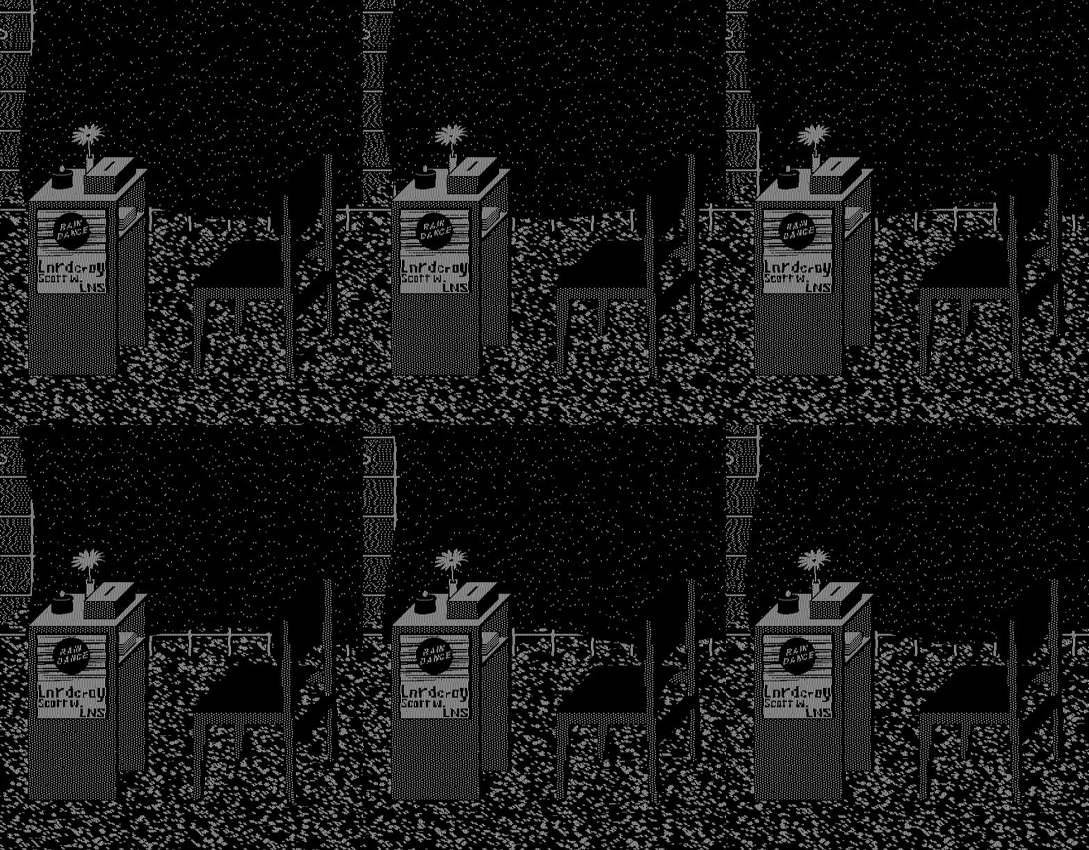
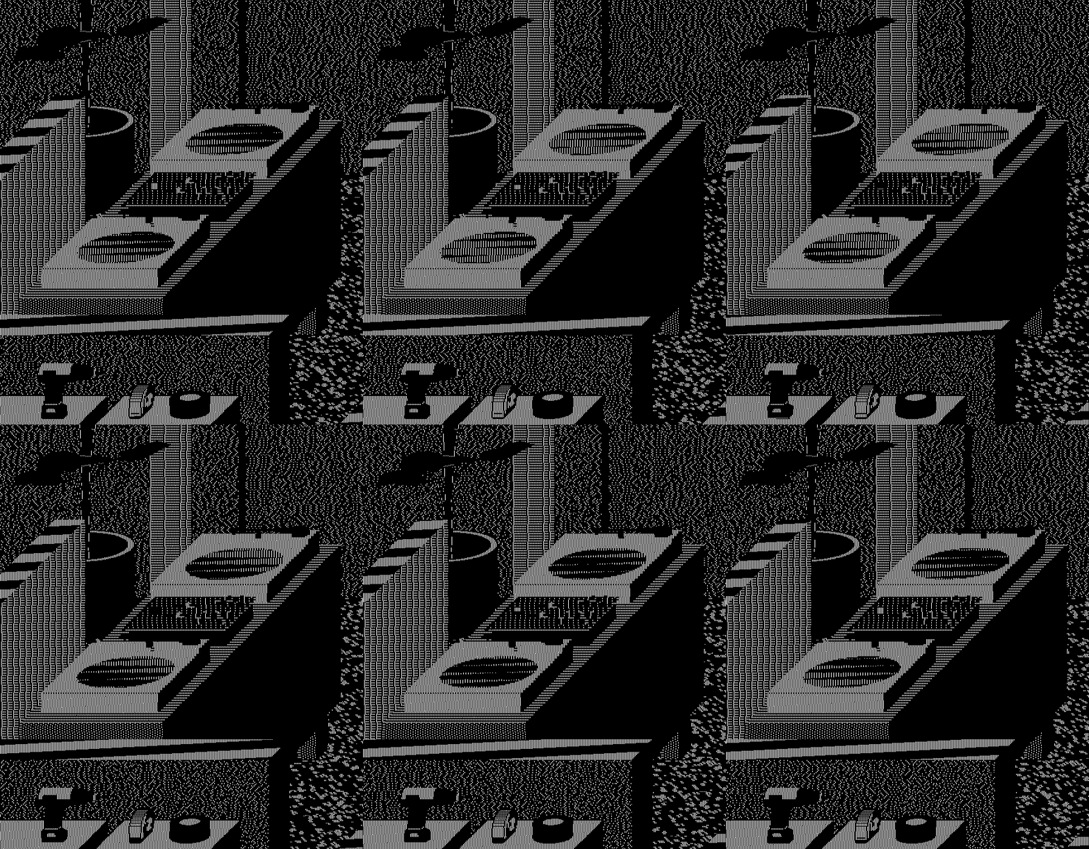
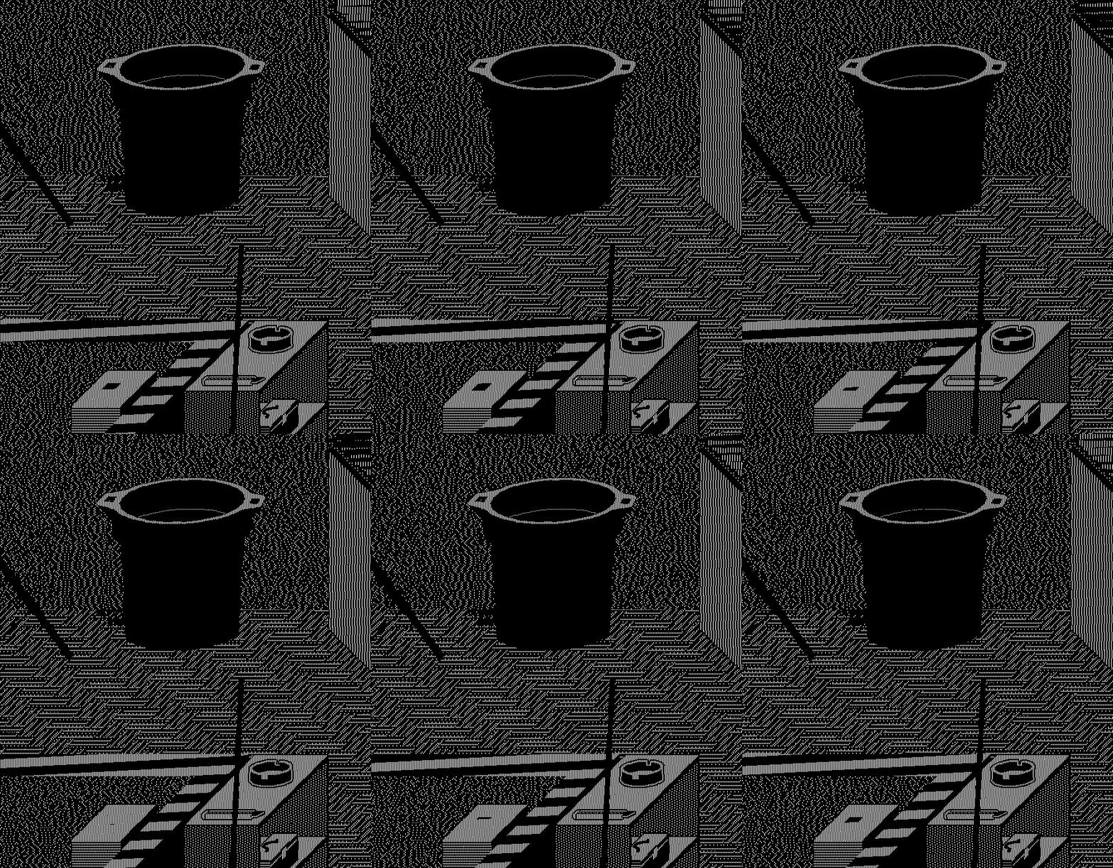
NS: INDEX is representing a project space/music venue in Vancouver BC where I co-organized electronic music events in 2015. It is depicted in the process of being setup for an event titled Rain Dance which happened in August 2015. When I started working on INDEX I was curious about the process of rendering a detailed scene from memory. I had many memories of the venue during the installation phase, a few days before the event. I began to render these memories and details from the installation period within what I could remember of the overall architecture. In that regard, INDEX is an effort to recollect and fixate details about this particular space at this specific time. Some parts of the work are relatively accurate while some other parts are imaginary. The hypnagogic and effervescent visual aspect of the work is informed by this process. It’s also informed by the nature of the events that took place at this venue.
FL: Speaking of memory, what could be a connection between it and GIFs in your own opinion? What are the technical features of this format that could it make appropriate as mean to show memories? Since you mostly worked with GIFs for many years, I wonder if you started to experience events and places as objects suitable to be translated into this format.
NS: The most tangible connection I can think of between GIFs and memory has to do with the history of the web since GIF is an image format that has survived throughout the evolution of the Internet; it is an ancient species that has survived numerous cataclysms. In my work, the connection between GIFs and memory comes from a desire to reconnect with specific moments and places, to create a form of record of these memories. The representation of these memories is an opportunity to formulate mental images of architectures, landscapes and other elements into visual forms that are minimal, incomplete, and encoded. I also enjoy using the GIF format as a very subjective archive; for example, in opposition to the objectivity of 3D scans from historical artefacts. INDEX contains some historical and factual data but it’s also completely skewed by my own perspective.
FL: This is an interesting reflection; I like the concept of the GIF format behaving as a selfish gene, in terms of adaptability throughout many different contexts and times. In your own opinion, what is the reason behind the fact it has so much importance in the last 20 years (and counting)? I can’t help but think about the relation between the ways we use to connect to the internet (ie the devices we use, the span of time we stay connected, the reasons we’re connected, etc.) and the faster and faster speed of our internet connections. What do you think?
NS: The continuous presence of GIFs online has to do with the format being perfectly adapted to web environments and its relentless user applications. If you look at early HTML pages, GIFs were always a highlight; they allowed users to add dynamic elements throughout their content. Inserting animations in the middle of text, images or diagrams was a novelty. GIFs embodied that novelty; they were a simple and accessible display of something “multi-media” so they became instantly thought after, heavily used, and stored into databases. GIFs are still pervasive today in forums as image profiles or as punctuation in comments; DUMP.FM personified that within the net-art community, but if you look at any forum or social medias platform it’s still present. From a technical standpoint, the GIF format is attractive because it works like simplified video editing; you set up an image sequence, decide on the speed, and loop it forever. Aside from the APNG format – which never really took off – no other image format offers these capabilities. It covers fundamentals, from traditional animation (frame by frame) but also offers flexibility in terms of input since you can make GIFs from literally anything. The looping function has infinite fields of applications and is impactful visually, which is perfect for the attention seeking nature of Internet space.
FL: Yes, GIFs have been very important in the first years of the Web especially because they bring depth to Web environments; the fact that artists like you are bringing this format from the usual contexts (ie laptops’ monitors, smartphones’ screens, etc) to physical spaces totally makes sense to me. In both cases, we’re talking about fixed environments where the never ending GIF’s movement affects their perception. What do you think? What does it change when you work on a project that will be on display on a Web site and another one which will be hosted on the facade of a building? I’m especially thinking in terms of spaces and perception of shapes and colours…
NS: It has been a challenging process to exhibit screen-based works into physical space, mainly because screen space and physical space are so different in terms of experience. Looking at something on a laptop screen feels intimate, but watching the same thing in a gallery or museum is more of a social experience determined by the immediate architecture. I think a lot in terms of experience in my work and I’ve come to adapt this thought process for installations. I determine the scale of my installations based on the architecture in context. I work primarily with projections whose shapes and sizes references windows, doorways, or other architectural features appearing in the space. These referential elements articulate my work in space like an environment adjusted to the architecture; an added layer which plays with the configuration of the space. I often see my installations as projected sets, or giant digital props injecting imaginary scenarios within architecture. It feels like a natural extension of what I’m trying to do with screen-based works, but it also really engages with the architecture in context.
L: Speaking of the importance of GIFs in our daily online routines, I wonder if and how the so-called GIF art has been influential in respect to the broader use of this format by general public; I’m especially thinking to Simple Net Art Diagram (1997) by MTAA, to the way it used the features of this format to add a little magic to what would look like as a diagram – in other terms, do you think the irony, the cleverness and the experimental approach of the first artists working with GIFs have been understood and implemented by non-experts?
NS: I find early GIFs made by artists as influential as the GIFs made by early web designers, scientists, and other random users involved with the format. GIFs are created from pretty much anything and there has been an infinity of cross-overs in terms of influences. So many users have gone beyond the typical level of involvement with this image format, it would be presumptuous to give credit only to the artists. Still it’s amazing to see the format being acknowledged in the recent historical work on Internet Art, and I’m hoping to see many GIFs in the new Rhizome’s NET ART ANTHOLOGY! I also believe the history of GIF is a history of the vernacular which would deserve its own separate study.
FL: When you see the work, you can’t help but think of ’80s computers; in other terms, the black background and the blinking white dots and lines suggest this association. Can I ask you why you did choose this specific aesthetic?
NS: One of my interests for this type of early computer imaging has to do with the formal and optical properties of these graphics; the way they behave on screens and how they produce kinetic experiences. This is visible in works like PATTERNS where I focus on abstracted animations. Working with these out-dated graphics feels similar to working with an engraving technique or a type of craft that belongs to a certain time period. Some crafts and imaging techniques tend to be associated with specific eras. In the case of early computer graphics, their era is the end of the 20th century which I feel strongly connected to. I also look at these graphics for what they generate in terms of aesthetic experience. They are the primary visual language of the display technology we use today, and they’ve generated many revolutions in the way we perceive contemporary images.
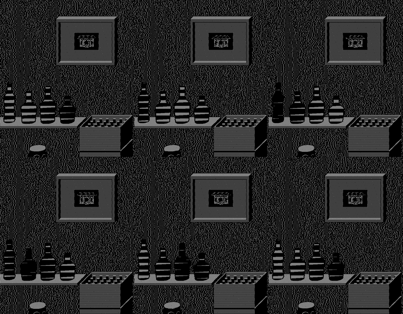
FL: You just highlighted one important aspect of your works as whole; This makes your projects, on one hand, to look modernist as they explore how minimum information can create a kinetic effect, rooted in the belief that objects can be reduced to quantifiable patterns and shapes; and on the other, they are nostalgic, reminding us of the times when when creating digital pictures was not so dissimilar from artisanship. What do you think? Am I wrong?
NS: I’ve always been attracted to the idea of developing a craft or skill as far as possible. My focus on early computer graphics was a conscious choice in that sense. It came quite late in my practice when I felt the need to make art for my own sake, without professional incentives. My generation grew up with the first home computers and there is often a generational shift of perception when it comes to early computer graphics. For me, this aesthetic is linked to childhood, fantasy, entertainment, while for other generations it doesn’t have the same emotional input. But no matter the generation, this aesthetic has a definite “time-stamp” and most audiences will associate this aesthetic with that “time-stamp”. The early stages of my practice were very focused on how to appropriate this aesthetic, to turn it into my own visual vocabulary and to articulate it with elements inside and outside of this specific “time-stamp”. I feel many affinities to painting because of this relationship I have with the visual components of my work.
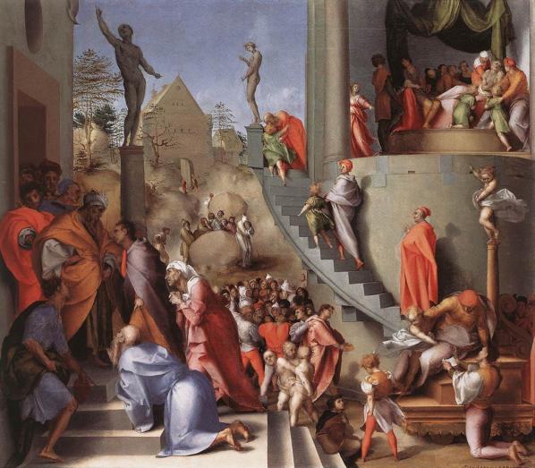
FL: Speaking of painting, the other day I was reading The Social History of Art (1951) by Arnold Hauser and one text passage struck me in relation to INDEX. “[Mannerism] allows spatial values, different standards, different possibilities of movements to predominate in the different sections of the picture. […] The final effect is of real figures moving in an unreal, arbitrarily constructed space, the combination of real details in an imaginary framework, the free manipulation of the spatial coefficients purely according to the purpose of the moment. The nearest analogy to this world of mingled reality is dream.” Now, I’m not suggesting the idea that your project is mannerist, but I can see some shared features; the way you constructed the space makes me feel a set of arbitrary rules working underneath the blinking white lights, the objects you depicted are somehow real but fixed in a non-realistic dimension. What’s your opinion?
NS: When I began this project, I wanted to develop a new direction that I approached with previous works like STUDIO VISIT. I wanted to portray a real space and make it exist within a different dimension. I was picturing an animated relic, completely isolated and playing itself indefinitely. I focused on my memories of the space and on the reasons that led me to render it. Index was a project space which felt important in the cultural landscape of Vancouver, it also had its own personality. I knew the venue would eventually disappear and be forgotten for the most part. I wanted the work to become an expressive record of this, charged with energy and subjectivity. There is also a form of nostalgia expressed in the visual language I use, and I wanted to articulate this sentiment with the work. This is what led most of my formal decisions. I worked with mental images of the space seen through a lens revealing the energy of each object, and how these objects were infused with the activity of the space. For instance, some parts of the floor were made of these very small sections of hardwood flooring, and it was an area where people used to dance. This translated into a very dynamic area in the work, like a multitude of small conveyor belts imbricated into one another.
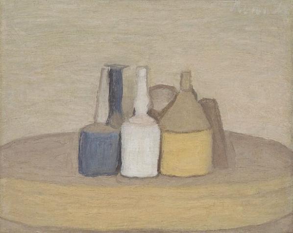
FL: It seems to me you used isometric projection to depict the objects, a technique employed mostly in technical and engineering drawings; in fact, the scenes look real but not physically reachable, as if they exist on their own – in other terms, they look eternal, recalling the still life paintings by Italian painter Giorgio Morandi. In his case, unlabelled bottles and unrecognisable objects make the scenes unhistorical and closed in themselves; I think it’s interesting the fact you both employed similar devices to depict still life objects – although it’s clear there are many important differences between your works. What do you think?
NS: I’ve always been interested in using screen-based graphics to express the materiality of physical objects or imaginary structures. This is very apparent in early works like FREE CUTS. These works were created as sketches for sculptures, but in the end, they embodied the sculptures on screen. Like paintings, digital images exist on their own plane, and they can develop their own materiality. In my work, this materiality often manifests as a tension between the flatness of the screen and the sculptural properties of the graphics. Sometimes the work feels like it resides in its own plane of existence, like an object stuck between two worlds. This image of something stuck between two worlds is dear to me because it feels so relevant to my experiences on screens. Things can appear so tangible and so distant at the same time, so desirable yet completely unattainable. With isometric perspective, I find a lot of interesting ideas in ancient Japanese works. Isometric perspective is nothing new but it seems to hold a stronger imprint from engineering drawings and video games than from these much earlier art forms. In the case of INDEX, works like The Tale of Genji – a scroll depicting Japanese interiors from the 12th century – were very inspirational. The scroll depicts social scenes with a good level of detail, and it gives the feeling of overlooking the architecture. The vision is fragmented like in INDEX, and you have to unroll – or scroll – to see the rest of the space. These old works feel very contemporary, probably because isometric perspective has been so used in computer graphics.