


Featured image: F.A.T. Lab (Free Art and Technology Lab) were found causing trouble at the Transmediale.10 this year.
An interesting outsider project at Transmediale.10 this year, was F.A.T. Lab (Free Art and Technology Lab). A collective of artists, engineers, scientists, lawyers, musicians and trouble-makers who have been working together for two years, on the intersections of Pop culture and Open source. Their stapline describes them as “An organization who is dedicated to enriching the public domain through the research and development of creative technologies and media”. Beware, they love using the word ‘Fuck’. A lot! Which means they are cool, and some you grown ups may feel slightly unnerved by their over generous outpouring of flippant explitives, but the kids out there just love it!
You can read an explanation of their work in the about section on their website, and view a video presenting some of their ideas and works. With a simple rap base with nasty yellow and pink colors, it could be considered as a joke. Perhaps, to some degree it is, but at another level they are playing around with social contexts of the Internet culture’s, presumptions and acceptance of things. Through an omnipresent ludic approach they reuse what is given to us all with a contemporary pop attitude – showing us the many contradictions from these given systems. Proposing other possibilities in order to loosen and to free things up from the copyright laws and prescribed rules of both big companies and clumsy governments.
One of their projects called Public Domain Donor, consists of D.I.Y stickers saying “In the event of death please donate all intellectual property to the public domain”. They write “Why let all of your ideas die with you? Current Copyright law prevents anyone from building upon your creativity for 70 years after your death. Live on in collaboration with others. Make an intellectual property donation. By donating your IP into the public domain you will “promote the progress of science and useful arts” (U.S. Constitution). Ensure that your creativity will live on after you are gone, make a donation today.”Simple and humurous.

Yet, behind their process of cultural detournment exists a reference to earlier net art critique, by Critical Art Ensemble who way back in 1995 said “Each one of us has files that rest at the state’s fingertips. Education files, medical files, employment files, financial files, communication files, travel files, and for some, criminal files. Each strand in the trajectory of each person’s life is recorded and maintained. The total collection of records on an individual is his or her data body -a state-and-corporate-controlled doppelganger. What is most unfortunate about this development is that the data body not only claims to have ontological privilege, but actually has it. What your data body says about you is more real than what you say about yourself. The data body is the body by which you are judged in society, and the body which dictates your status in the world. What we are witnessing at this point in time is the triumph of representation over being. The electronic file has conquered self-aware consciousness.” The Mythology of Terrorism on the Net. Critical Art Ensemble Summer, 95
Also as stimulating, is the idea Graffiti Markup Language, an XML file type specifically designed for archiving graffiti tags, and easily reproducing them.
For Transmediale.10 they presented a project called Fuck google, one of their more involved works, appropriating the image of Haus der Kultur der Welt, the futuristic bulding hosting Transmediale, formerly known as the Kongresshalle conference hall, a gift from the United States, designed in 1957 by the American architect Hugh Stubbins Jr. as a part of the Interbau exhibition. John F. Kennedy spoke there during his June 1963 visit to West Berlin. Fuckgoogle focuses on reminding us all how this big company has become omnipresent in our digital lives, refering to the risk that too much data is owned and is going to be owned more and more, just by Google alone. It exists as a collection of browser add-ons, open source software, theoretical musings and direct actions.
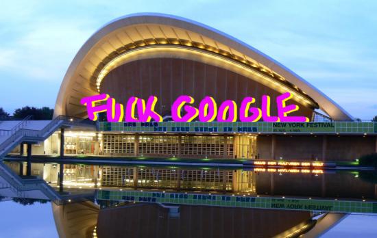
Not necessarily trying to be a definitive solution against the big G in any sense of the word, but more a reminder, a provocative virus to diffuse. So we have a graffiti firefox skin, fuck google pins, The F.A.T Pad or some plugins to reclaim your public individual space on your browser. Everything is D.I.Y and opensource, so you can easily replicate it. The approach can be find with FuckFlickr a free image gallery script offering everyone who visits a Flicker-like image gallery.

The F.A.T. Lab is an example of technological sabotage. Of course, it’s not a new thing in respect of the hacker community: using the instrument, medium directly, in order to change perceived assumptions of our reality. What is quite new is F.A.T. Lab’s blatant exploitation of everyday Pop culture and its language. The hacker counterculture has always had it’s own way of communication, built in the late 80’s and 90’s. These days, more and more people use the computer, not just hackers. Using Pop culture in order to communicate one’s message could be one possible way to escape the duality culture/counterculture. On the other hand, F.A.T. Lab could be creating a fresh paradigm which allows others who would not normally appreciate hacker culture or even media art culture, filling a space beyond art culture which could be considered as too refined.
Marcello & Gaia: Can you describe who you are and how do you connect each other?
Evan Roth from F.A.T. Lab: We are a group of friends. There’s not any formal application process or open call, many come from typical art organizations. It started out as a group of friends and then slowly, more friends joined. We also made more friends, collaborators on line. Here at Transmediale.10, it’s actually our first chance to meet face to face and some of us have not met before. There are two things that mainly characterize us. On one side, there is the open source culture and advertisement free culture, but also the idea that this all should be fun. Art and political activism doesn’t have to be a boring, the interface of it all, can be accessible to more people. We try to push this candy coding, get the those audiences who are using youtube videos, that is our primary audience. We like it when art organizations pay attention to us but really our main audience is at the borders of things, using different networks, commercial networks out there, happening outside of the gallery.
M&G: If we look at the projects you are showing here there is a kind of aesthetic in common, the colours are really interesting, the pink and the yellow remind us early 90’s spam. Is that aesthetic a primary decision, is the style you choose to define you, or has it just happened in the progress of your work.
E: I answer that in two. There is a thing from open source development culture that is ‘release early and release often’, we try to apply this model to the media production. We try to release ‘early and often’. If you are on the fence where you should release something or not and it is not quite ready, just push out the door, because it is better to have it in the public counter system than not. So the aesthetic of the website is in part probably pushing out the door rather taking care of the nuances or the color it is. We just try to get this thing published quickly. Someone could be sitting on their brilliant idea and waiting for years to release, waiting for some details and then you find that no one really cares about this in the end. But there is also an aesthetic interest in common, that comes from this ‘dirty style’. There is an artist friend, Cory Arcangel who is one of my favorites, and he describes the dirty style as ‘either you take little interest in design so it becomes so un-aesthetic or you over-work it to a point that the work itself becomes something too trivial’. We don’t have meetings about how the website is going or what it looks like.
M&G: Don’t you think that this “dirty style” is somehow hiding the real content or the message? The use of ‘dirty style’ is obviously an answer of the hyper sensibilization, concern of the form but at the same time this makes your work splitting in between the no-attention of form and pushes content in the corner.
E: The way our websites look matter’s less and less now, because people don’t go to websites for content anymore. Most of the traffic in the websites do not even see the pink and the yellow, design. There is some kind of form/function relationship going on. We are interested in rolling up this web 2.0 idea a little bit, and that’s what this installation here is about at Transmediale. The early 90’s aesthetic was with people hand coding html and making tables, not downloading a WordPress thing. In that sense, there is a sort of connection to the DIY, rolling back to the way of 1.0 – where the files are hosted in your own server and not google or yahoo.
M&G: Isn’t it more interesting to try and critique in a more constructive way, creating something else, not just another google appropriation but other kind of net platform for a community? Could that be one of the important challenges for artists now?
E: Open source is a big movement and free culture is even bigger and so we know that there are people out there hacking in this way right now, but we are not programmers, there are programmers taking part but these are not our skills. Our place in this movement is in the media side. We do have programmers in our group but we feel more like media makers. We make these videos and they are kind of funny and taking something from the pop/culture, twisting them, possibly people have a look and pass them around. But there are messages in them. And the messages are trying to reveal the money and the branding business that google is making and saying it is not cool, and being involved in an alternative open source culture looks better. We also have a development tool like fuck flicker and flv player where you can have your own videos up like you tube.
M&G: Why are you are supposed to win this year’s Transmediale? You stood up on the stage during the award claiming the award for yourselves!
E: Oh no, we don’t think we are supposed to win. Do you know Kanye West? This is a USA story, we joked about Kanye a little bit. We’re always trying to pay attention to what is going on in pop culture and surf a little bit. Kanye was notorious for interrupting a ceremony whenever he lost, grabbing the mic. As we were for this fuck google project – last night, the winner was a youtube related project, and google is a sponsor. The message we tried to get across last night, was a reference to this, and we are gonna have an official press release on it soon. But I think that for Transmediale, our project was an anomolie, showing this fuckgoogle in contrast to accepting web 2.0, which is actually a range of projects. We were surprised to be invited, who know’s what for? But we think that it was a very wise decision, and we are really happy to be here.
On their website you can get a clear impression of their feelings towards Google “So, what is so “fuck-worthy†about Mother-google? It is the fact that a corporate entity, even one as beloved and competent as Google, is in control of such a large stake in the digital network and public utility upon which we have all grown so reliant. And, that as a publicly traded company, it doesn’t have to answer to anyone but its largest shareholders, despite the fact that its decisions effect the lives and private information of millions of people. Few even question or raise a voice in opposition to the Google-ification of the Internet.”
There were more than 1,500 submissions for the Transmediale.10 awards, nine art projects were nominated and F.A.T. Lab was a runner up amongst them. Showing contemporary, activist art within a larger more incorporated festival is to be commended, it is not an easy thing to do. And we all know how easy it is to criticize rather than make something ‘real’ and positive happen. F.A.T. Lab are a tangible byproduct of a culture, caught in the trappiings of Hyperreal situations, a confused world losing itself even further into a perpetual state of denial. Pop culture and celebrity related banalities are constantly distracting our gaze. It is an interface which can only handle life via mediated proxy. F.A.T. Lab know’s this, and have adapted themselves to literally scrap with it on their own terms. Their role and place in the world is to get out there on the front line and go places where the common people reside. They want to be on the main stage battling it out, whilst challenging the interface presented to us all – making it their playground.
You can also read Marcello Lussana and Gaia Novati’s article about this year’s Transmediale.10 here…
Curated by Carolyn Kane for Rhizome September, 2009.
#60605 plus #20101 does not equal black, but it looks like it to me. And despite Newton’s insistence, a rainbow is never made from seven colours in neat lines, nor can I see millions of colours on my calibrated monitor. It is more likely that each day I engage with the screen as a greenish-blue glow infused with hits of magenta. Or as it is today: a summer grey of sea fog glimpsed through the rain. Is that a colour? Carolyn Kane curated HTML Color Codes in order to ask these questions of the relationship between colour, code, and subjectivity. Tracing a carefully structured path through twelve artworks Kane seeks to examine whether artists working with the Internet are limited to a ‘ready-made’ colour palette. Asking if digital colours reflect the programming languages that have been adopted, Kane considers whether the Internet adds its own rules for colour through the adoption of the hexadecimal system of colour values. Does the language determine the content?

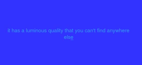
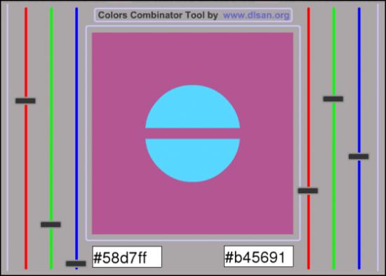
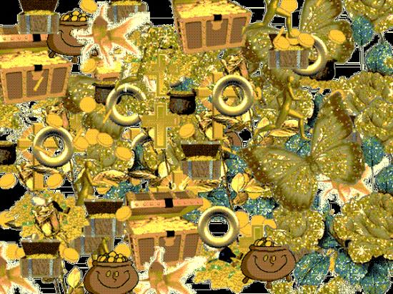
The answer is, not quite. It all depends on where and how the viewer approaches the screen. Rather than trying to be paintings these works engage with the materiality of digital colour and the manipulation of a different kind of flat predetermined surface – the screen. Chris Ashley gives us rectangles within rectangles, Dlsan manipulates circles within circles, and Michael Atavar offers the blue screen of an empty window with text written as if in the condensation of a cold morning. It is the noise of the digital image embraced by the inadequacy of a gif representation of a treasure heap of digital gold in Jacob Broms Engblom’s “Gold”, or the absence of any controlling frame in Owen Plotkin’s “Firelight” and the flickering spaces nested within and alongside one another in Rafael Rozendaal’s “RGB” that suggest different rules for the digital image. In these latter works the illusion of immediacy raises a spectre of some kind of phenomenological directness.
Twentieth century colour field painting was never a single set of experiments yet it carried within it a set of cultural and formal presuppositions. The digital colour field has its own baggage set. It is inbetween: inbetween code and software, browser and window, network and bandwith. More often than not the experience of the digital colour field is the result of an image within an image or a screen within a screen. Despite its origins in hexadecimal notation digital colour is not a ready-made, but an experience and a process of light and interaction. Anyone who has attempted to capture or translate a colour between screens knows that accidents occur. Noah Venezia’s “The Rainbow Website” suggests that a kind of synaesthesia can be experienced through the screen, that colour exceeds the values assigned to it. Andrew Venell’s “Color Field Television” mimics the flicker of experimental film from the 1970s. Perception becomes a process of seeing the colours inbetween, the work turns back on itself mirrored within a screen. Structural film experiments were about exploring more than perception they too turned back to the medium. Morgan Rush Jones gets even closer with the phased colour space of “Number of ManufacturingIndustriesbyNumberof Product ClassesinanIndustry”. The work is simultaneously overloaded with image and abstracted from it. There is a strange congruence reflected here: in their formality these works do not push new experimental boundaries but reflect older ones.
Michael Demers explicitly engages the materiality of the digital medium by establishing a series of systems within which abstraction can occur. Sampling Morris Louis’s oil painting “Where” from 1960, Demers generates a sequence of flat colour planes (windows) from left to right that disappear as quickly as they appear. The drip and movement of Louis’s work is rendered temporal. Brian Piana’s “Elsworth Kelly Hacked my Twitter” also addresses the temporality of the digital. Real-time data orders the compositional frame in a direct chronological sequence. Each square is a representation of an invisible network. Manipulation of the scale, size and shape of the frame is left to the viewer. For me it is Elna Frederick’s “@ = landscape” that allows an interactive experience of the subjective dimension of colour that is specific to the digital. The click of a mouse becomes the experience of putting a finger into a stream of water and disturbing the flow. It is not necessarily the colour that makes the rain but the movement and the belief instilled in us from Super Mario that onscreen fluffy white blobs potentially contain rain. There is a cool sensuousness to the trickle of pixels as it becomes water and when left alone returns to simply being yet another onscreen blue.
There is a risk of over determination in this show, the kind of visual parity that results from too many works looking at the same thing and becoming somewhat redundant. It is the quiet spaces between the works, the mutable changing structures of the blue screen that resist this limitation. As long as bandwidth remains with us, and the links stay live, these works are infinite and through their repetition we experience an abyss of generated colour and code. These are predominately forms consisting of colour alone, and surprisingly, that is enough. This is how the medium of digital colour should be approached. There is no translucency, but there is an unlimited interplay of substitutions.

Featured image: An interview with Chris Dooks, a ‘Polymath’ exploring various creative avenues, making his art using different media.
One of the many interesting and rewarding elements of being deeply involved in what, I’ll loosely term as ‘media arts’ practice, is the breadth of imaginative people you meet along the way. We first met Chris Dooks in 2005-6, when he worked with us on a project by Furtherfield called 5+5=5. We commissioned 5 short movies about 5 UK-based networked art projects exploring critical approaches to social engagement. These pieces offered alternative interfaces to the artworks and the every-day artistic practices of their producers. Including the motivations and social contexts of artists and artists’ groups working with DIY approaches to digital technology and its culture, where medium and distribution channels merge. Chris produced a film-work for the project called Polyfaith. A Psycho-Geographical Web Project introducing the beliefs and philosophies of his (invented) friend Erica Tetralix.
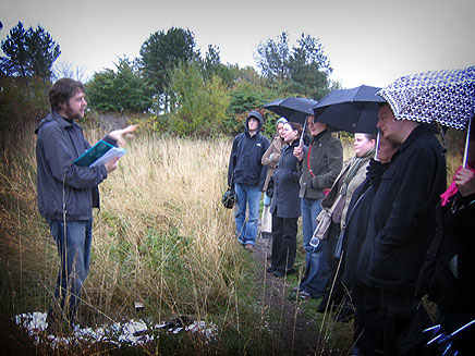
“My friend Erica Tetralix died. She gave me the task of fulfilling her dream which was that people would enjoy the parts of Edinburgh that were so dear to her in her life. She also loved tourists and sympathised with people on a budget, so she devised, with my posthumous help, this free way to enjoy the city. It’s a beautiful gift for both transients and residents. It’s popular with backpackers, parents and children, cultural groups and well, basically anyone.”
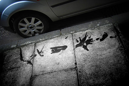
Later on we discovered that the name Erica Tetralix, is actually a name of a plant. Often called a cross-leaved heath, a species of heather found in Atlantic areas of Europe, from southern Portugal to central Norway, as well as a number of boggy regions further from the coast in Central Europe.
To view Polyfaith visit link below:
http://furtherfield.org/5+5=5/polyfaith.mov
The value of an interview is that it can serve as a useful documentation, a process allowing a kind of unfolding of time, All layed out in front of you. The reader can experience not necessarily a retrospective, but a dynamic and creative life and a personal history openly shared, on their own terms.
This interview reveals various levels and approaches by Chris Dooks. An inquistive and playful mind is at work here, engaged in exploring across different forms of personal agency, as well as redefining his practice in relation to the world he exists in, and the people he comes across in connection to various projects. His art is not a singular activity. Meaning, he does not rest in one particular art genre or movement. Instead, we are asked to acknowledge a personal enquiry formed from different engagements and choice of mediums, which happen to meet his creative intentions and questions at the time. We are all relational beings and Chris Dooks is a clear example of how this can work in an artistic context.
The Interview:
Marc Garrett: Many out there will already know you as a professional film maker, directing arts-based TV documentaries such as The South Bank Show in your twenties. Since then, you have developed other skills involving design, composing and making music, audio visual installations, explorative psychogeographical projects, as well as continuing making films, and you’ve even got a record deal. You have as far as I can gather four different music projects curently on the go, your electronica group BovineLife, an architecture music project known as As Ruby’s Comet, Feible for laptronica and also the Audiostreet project featured at The Leith Festival.
Chris Dooks: It’s amazing how many people still know me from Bovine Life which was a moniker I used for an internet audio project way before broadband in 1999. It’s the tenth anniversary of my bip-hop album SOCIAL ELECTRICS and I would like to make all my albums available for free for furtherfield readers. Don’t let itunes rob me of any money! The transition to musician was down in part to the South Bank Show when working with Scanner. I was really frustrated at making work about musicians. And the technology was making it easier for folks like me without a classical training. Here are three for you for free – check links below for free tunes at the bottom of the interview.
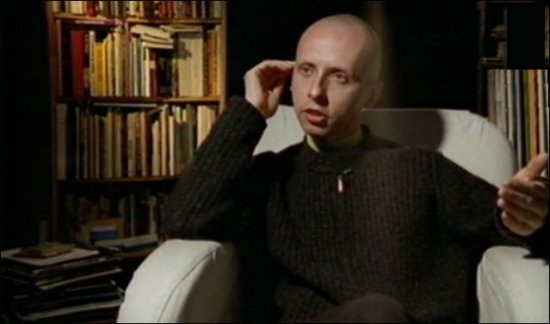
South Bank Show UK television documentary directed by Chris Dooks, featuring Robin Rimbaud speaking about his practice and ideas. 1997. Click here to watch video.
MG: In The Glasgow Herald, in Scotland a journalist called you a Polymath. Even though you were delighted to receive such a compliment in the local press, you decided to re-edit the term, reclaim it so to make it less seemingly mathmatical. Prefering Polymash because it sounds “friendlier, resourceful and potentially charming.” Sticking with this notion of you being a Polymath or rather a Polymash. Your diverse approach in creating art works in a non-singular approach, is a core element of your practice. I was wondering whether this is a deliberate decision or a natural and overall state of being?
CD: It’s weird though, I learned more in my background as a wedding videographer aged 14-19 (35 weddings at weekends!!!) than on any other course. Doing weddings gives you various skills as a digital artist. Fuck a film degree! As a wedding videographer, you need to be able to mike the vows in difficult audio environments (i.e. reverby spaces), film it about fifty feet away, liaise with highly emotional temperaments, be like a war photographer – it’s only gonna happen once, miss it at your peril – and stay sober. Not to mention edit it at a time when non-linear editing was non-existent, (I remember the heady days of “crash editing” between two panasonic VHS machines) white balancing everything on manual heavy equipment and creating all the graphic design and labelling of tapes. I was like a teenage record label!
So in 2009 when I made www.studio1824.com – making a record (netlabel) for an icehouse in Sutherland (remote Scottish Highlands) I got a kind of deja vu experience. Only with an education and life experience in the mix now.
When I was 8 years old, I had two epiphanies. One was that death is really gonna happen, and two, that cinema is wonderful, emotional and that it offers us a naive form of immortality. Cinema was the only artform that even at that age, I felt could make me feel…spiritual, for want of a better term. I became quite religious.
I was obsessed with super 8 cameras and video. And now I am trying to get all my pre-teen works tracked down! But even at this stage there was always a healthy distraction in other areas. I wouldn’t get involved with narrative and this has never been my strong point, even though I was reasonably good with words. My uncle played a lot of classical music and my dad took me all over the UK in his lorry, and at this time I won a scholarship to play the cello at school with the posh kids, being the other three. (It was a working class music “initiative”) But alas, I didn’t realise how lucky this was for me. So I went back to making videos, this “poly” approach was probably set quite early. I remember doing a kind of pre-Blair Witch thing when I was 14 and I would get sidetracked into filming the shapes of the leaves and the sound of the wind. Then I realised that the material didn’t make sense in the conventional sense. So I became an aesthete of kinds at an early age. And in every way, from Granny’s trifles and an early lust for Kate Bush, I was concerned with the sensual world. But until 22 I was monogamous to film projects and would work as a corporate director in the art school holidays to fund my college life, with the odd wedding video thrown in. By the time I did my film degree at Edinburgh College of Art, I was much more interested in people like video artists Bill Viola, Gary Hill and Daniel Reeves – (I met all three) via the “team-building” world of film shoots. Bill Viola’s THE PASSING changed my life.
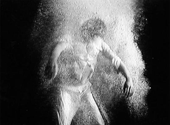
The Passing, 1991. In memory of Wynne Lee Viola. Videotape, black-and-white, mono sound; 54 minutes.
Pre-degree, in those days (1989-91) you had to REALLY know your kit and be a good all rounder. I trained on huge Umatic machines and did a BTEC before a degree. I was from a part of a culture where there was no film degree, and I was a couple of years behind my peers. But by the time I hit ECA, I could mix radio programmes, edit timecode, black and white balance studio cameras and location kit and I spent most of the time buggering off to the hills to film Scottish waterfalls. I might have been techinically proficient and this was behind the poly approach to an extent, but I had bugger all conceptual skills. These have only really solidified in my thirties…
MG: Lets talk about the Surreal Steyning psychogeographic audio tour, part of the The Steyning Festival in 2009. On the web page for the project is written “This tour is simply a different way to skin the proverbial cat. In this case, the cat is Steyning. In fact, if you think of Steyning as a cat, you are already a psychogeographer. Well done. You’ve engaged your psyche with geography. You’ve mapped the town conceptually. The High Street becomes the cat’s spine with the head chasing Mouse Lane. Now you are in the same company as such artist groups as the Situationists, the Dadaist Movement and other high fallutin ripples in art tourism, and even The Ramblers.” Did those who took part manage to understand and appreciate where you were coming from? Also, how did it work?
CD: There was a tiny degree of spin with the site’s headline Traditional English Town Embraces Conceptual Art Walk but by and large folk did embrace it and it would have been patronising not to drop a little sand in the vaseline, not to deliberately challenge, because the Steyning Festival, was, I felt, in danger of being a little like a tasteful village fete. A good fete I might point out, so this year, there was something brave about them putting a conceptual artist at the heart of a residency in the village. English villages like Steyning were not and are not, all tasteful. Whenever I encounter these tasteful expectations in the arts, I think of that Stereolab song, Motoroller Scalatron with it’s chorus “What’s society built on? It’s built on blood. (some say the lyric is “bluff” not blood but either way it works)” So I saw my role not as a socialist historian, because I wouldn’t have a clue, but as someone who encourages an enquiry per se into unusual histories, paganism, aesthetics and philosophies of very local travel. I mean, I don’t think there’s anything angry or unloving in the tours. In fact, I try to make them about folk being nicer to each other. These activities have a small socialist agenda but as a performer, I am not exactly Stelarc, slashing my wrists in the street. I’m not about shock! However, this tour had a couple of “jaw droppers” (See The Steyning Star on the tour). The main outrages came from people who wanted a straight history tour and were not given one, depsite my first words on the tour saying “this is NOT a history tour!”
Example taken from section 4 of the The Steyning Star on the tour:

“This is Brotherhood Hall, built in the fifteenth century and now part of Steyning Grammar School. Look closely at the symbols which adorn the gables. They may look like simple decoration to us, but these markings are rather unusual. They have been the subject of no fewer than three PhDs, and for a century the world’s leading symbologists have engaged in hot debate over how to read the meaning of them. One of the most important questions is what shape we are dealing with. While some people see predominantly circles, others see squares and diamonds, rather like those tiles that everyone had in their bathrooms in the 1970s.”
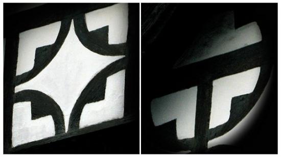
“Was this a pop premonition? For some time it seemed so, and this remains a strong theory. But in the mid 90s the school took part in a German exchange programme, and visiting German students proposed yet another alternative. When they looked at the patterns on the gables they saw a cross drawn within the circles, or a gammadia, to be more precise. A gammadia is a cross voided through, or a cross formed with four of the Greek letter Gamma. It looks a bit like an ‘L’ to us. The swastika is the most famous example of a gammadion. The German students believed that this was not a pop premonition at all, but a foretelling of the success of German heavy metal band Gamma Ray. This theory also gained popularity among members of the school’s very active astronomy club.”

The festival had hired a PR person to market aspects of the festival and commission an artist, and so I was brought there with a little Arts Council of England fund, so felt obliged to make work with the tools I’ve been developing – or my “brand.”
Nothing was watered down simply because it was a village (it’s actually a town but it feels like a village) because it would have meant compromising the ideals or enquiry, of looking deeply and into the areas of my interests of paradolia (faces in chaos) and simulacra formations (things that appear to be other things).
Most of them got it! I mean, it was nearly two hours long and they stayed till the end, although it did split the audience, but not badly. 2-3 out of 20, left. We had to do it again the next day due to popular demand! The ones who stayed had smiles on their faces by and large, which made me very happy. The weird thing was, not once had it been stated that it was a “straight history tour”, and it should have been obvious within the first thirty seconds that I make some of the stories and hypotheses so outrageous that surely this is tongue in cheek? However, I had written some slightly anti daily mail sentiment in it and two or three people angrily walked out of the tour. I got that wrong. It’s a Tory (conservative) heartland, and I don’t think you can be an artist and right-wing, you are just too aware of the world, but I should have considered this aspect more.. My landlady was one of the people present in the audience and she walked out, that upset me a wee bit.
But there’s something about my personality that makes people trust me in my tours, folk are quite sweet and gentle perhaps. The message behind the tours is one of re-imagining everything you hold to be true. The motivation behind these tours is to see travel as something that can be done anywhere. People go to the other side of the world to enrich their lives, many don’t even journey over to the other side of the street, or drive through a different part of town! I find that hilarious. So for me, psychogeography is about the chicken crossing the road..
If we can’t even do that, what hope is there for atheists like me (who find Buddhist philosophy and its practice the only religion without the conceit of the other big hitters) who are forced to approach the world from multiple angles, because we can’t accept the idea of monotheism and monotheistic thinking. This single mindedness of approach, when challenged (not just in religious people, but people stuck in their ways) is bound to create a bit of friction even on a playful level like in Steyning.
I became invloved in Surreal Steyning based on another project, in Brighton, where I made several songs about a building on Brighton sea front. This was a song cycle, based on a very specific bit of geography.
There is this idea that psychogeography is only urban – but I prefer to bring this intense work to the home counties! After all, the whole point of being an artist is to see through the privets, the darkness of the forests. So while I was in Steyning I was reading about Alistair Crowley and witchcraft and when Steyning used to be a port – it’s now land, ten miles inland! In the middle ages everything was different. I think a lot about how many contemporary English folk in these wee villages don’t realise their own foundations. I found Steyning a really charged place and not just a twee place to get (admittedly excellent) cream teas and real ale (a bit flat for my northern British palette).
This was, without a doubt though, the most successful public psychogeography tour I had done, even more than Polyfaith. There have only really been three tours – Polyfaith, Select Avocados and Surreal Steyning. And Surreal Steyning learned from the other two – so I had my schtick by then. I think it’s the best executed one so far. Let me be clear, I care about the audience. I adapted to their demographic, their language and their refinery in this tour, but I really care about people, but what I hate is bigotry and there was a little bit of friction about some of the left-wing ideas in the work and some of my own goals. But they needen’t be upset by a Middle East reading of a thatched cottage, the similarities of Tudor graphics and the 1990s version of the Take That logo, and the roof of some flats that might look like an arrow.
MG: This critical approach of consciously making room within yourself to understand or at least appreciate the sensibilities of others, surely it must be a difficult task to accomplish? What I find fascinating about your engagement with the public is the measure of respect for them, mixed with a healthy level of detournement.
Thanks! I actually think it’s a big complement to have the public stay on a tour for up to two hours, or buy one of my records. So I’ve really tried to attack attention-deficit tendencies whenever possible. It’s also my grammar. I don’t really do critical theory, although to apply for money you need to know where your bit of culture fits in with others. I really dig a good bit of popular culture. I think the best stories in our culture in the UK can all be seen on Jimmy McGovan’s The Street. He is a master of audience respect. Also, I feel confused by a lot of art, so I like to call a spade a spade, unless I am in a surreal mood and I’ll call it a Sad Ape (Sad Ape is an anagram of A Spade).
I had a slightly uncomfortable childhood and adolescence That “public” thing comes from Teesside. I also particularly like North of England humour – and actually I really like it when “clever shits” (to quote my Granny RIP) get usurped by that kind of spit-and-sawdust philosophy. There’s something survival-like and super-clever about grass roots humour because it comes out of neccessity. So I think my own personality is a bit of art school but with angry chips on both shoulders. It’s why working in Scotland is great, because the Scots hate bullshitters – especially the Nathan Barley set. I always found that very attractive. I remember seeing and being heavily inspired by Vic Reeves and Bob Mortimer’s first series and thinking, this is a dangerous combination! Northern swagger and charm! Dada! but with more academic kudos than might appear at first glance. And it was bloody funny! It was both alienating and accessible at the same time.
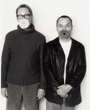
I grew up in Teesside and North Yorkshire and school never encouraged me really. I never had a bohemian upbringing, but I believed in the soul and went to Sunday School (my own choice – I was very religious for a kid). But I probably owe my interest in orchestral and “difficult” music to my uncle, and this was partly my first exposure to other worlds – I was particularly inspired by Bach’s Toccata and Fugue in D Minor. And I liked that piece because it had something I could relate to (the church organ), it felt something otherworldly – both the sustained drones and mechanical math-like, transcendental nature about it. And no words. I remember talking to my music teacher about it. She got all excited and presumed I could play it so she got me the sheet music to learn it. But I could never do it, I had no discipline. Anyway, that piece was amazing, spiritual to me. When you thought it couldn’t end, it changed scale and key and ascended to even more articulate heights, clever and gorgeously aesthetic at the same time.
I failed art. I grew up around lorry drivers, grandma’s trifle and Christmas at working men’s clubs. A lot of nice memories but I’ve always been looking for ways to sweeten the sour ones. And then, a huge affliction came. Around twelve, I started to have these really strong life changing shocks, like my psyche being ripped to shreds – just by thinking, enquiring, looking deeper. I would call them “dark epiphanies” later. They are still with me. Adulthood has not softened them. I’m always on the lookout for liberation! Like Russel Crowe in A Beautiful Mind he learns to live with his Demons and accept they are there! I’ll never get over these mortal messengers, but it’s what underpins all the puns and humour in the work. Tears of a Clown maybe? At the time, (aged 12-15) there were pennies dropping about mortality – real hopelessness of mortality. I’m still dealing with it. The problem is, because these visceral thoughts will never go away, I have started trying to make them my teachers. And all I want to do across all of my works is reduce anxiety – mainly my own – and look at multiple universes – and I think we forget that your street is part of the universe. That’s where the work begins, in your block, your local Lidl – these places should teach you as much about our ridiculous situation as anywhere else. It’s like that idea that “the environment” is outside somewhere, when really it’s in the most mundane places. The mundane is “supramundane” at the same time. It’s no wonder I became a Buddhist in my early thirties. I need to get back into it. I’m getting somewhere maybe.
MG: Perhaps, it is not just about re-inventing a selection of different mythologies, histories in relation to localities, whilst exploiting contemporary mediums; which includes elements of satire, a certain level of hyper-reality.
CD: I think it’s about a hatred of authority, not because we don’t need order, I think we do, but authority takes all the colour out of our history and culture. I watch X-factor, like Peter Kay (underrated surrealist like most comedians – despite the professional Northerner get up). I never liked punk and thought anarchy was really stupid! Civil disobedience maybe. I hate it when I see musos on the telly talking about punk, getting all nostalgic. Maybe the Clash. Maybe it’s the patronage of culture by high fallutin’ types I don’t like. Because patronage kills proper culture doesn’t it? And because of that, I never got passionate about history at school. It was a bit grey. So what do I do without the arsenal of the passionate historian? I make bits up and flirt with it. These projects mean I have to know bits of history now. And this bit is really telling – the bizarre thing about the hyper-reality aspects of my tours and other works – is that the bits I make up and flirt with – those bits are often scarily close to the truth. Also you say I’m really respectful to the public, but I like to push it a lot. In Edinburgh, on the Polyfaith tour, folk were swallowing my wildest tales about the city when they’d lived there all their lives! I came in under the radar I suppose. I like usurping the pompous stuff with a passion though, I really do, I feel it’s my duty!
MG: There seems to be a kind of niggling question in this work. I get a sense that this question does not only relate to asking those who take part, but also yourself. It touches upon something quite raw, authentic and complicated, and untouchable at the same time. I am not referring to the sublime here, it relates to all of our collective histories, on this earth. A Genealogical form of re-assembling, re-knowing and perhaps not knowing. Are you trying to make contact, or reconnect some how to a type of authenticity; if so, what does this look like in respect of your intentions?
CD: I want to find spiritual relief. That’s a terrible word – maybe the sublime is better. Fuck it, I want it back from the New-Agers. Even though I am a total Dawkins fan, and am partly liberated by looking deeply, I just want a bit of peace really. And the tours train me to think outside the box, that’s it. I suppose it’s like doing my own philosophy degree “in the field.” But there’s a bigger box I am being prepared for (see what I did there!). There’s not much relief. I am a highly charged person – some would say high maintenence! I’ve just seen the Andromeda galaxy from the back garden. I want more of that. This is a really hard life. I want to be less fat. I’m sick of having M.E. My wife is pregnant. Christ, I am going to be a father. Maybe that will help my afterlife woes. Men aren’t supposed to moan. I’m being genuine here though. I forgot to mention Derren Brown. I’d love to do a project with him. I am sorry these answers are not very articulate. It’s in the tours! Do them!? Seriously, do the tours.
MG: What qualities and values do you think or feel this form, process and working offers yourself, the world, art and culture on the whole?
CD: I look at my place in the digital arts as a priest being sent to a remote parish – so hopefully we’ll clean up here in Ayr, our new home! ha ha! A lack of funding might make that difficult but it hasn’t stopped me before. My current thoughts are… Paradolia and Simulacratic Forms as narrative agents for psychogeographical tours. The benefits of the sustained drone in music. “Dayglow” hues and man made fibres in landscape photography. High hills. The idea, place and value of the troubador in the present age and the potential of “singing the news” as a deterrent for media-saturation. My next project may be about folk-music and psychogeography, using local folk clubs to make popular songs based on themes by bloggers. Some of the things I think of, I sometimes see being made around the time. A bit of Zeitgeist, collective unconsciousness awareness maybe! I am also still digging around popular atheism and the atheistic roots of Buddhism. Folk-Art and the search for genuine Scottish culture as opposed to the much-touted facsimile. These are my daily concerns. A project that I should mention is Ayrtime. A series of eclectic cultural events presented in the heart of Ayr, Scotland. Gigs, Theatre, Literature, Astronomy & more – on this site you can find archives of the events with beautifully crafted podcasts!
My work offers me the stuff I was told at school really. No different to building or plumbing on one level. Just a sense of achievement and pride I suppose. Quite traditional aims. I remember a conversation with my dad in the last few years (we row a lot) in The Ship Inn in Marske. I asked him why he never wants to know about all these fantastic projects I’d done! And he said “Well that’s your work isn’t it? If you were a plumber we wouldn’t be sat here discussing U-bends” and at first, I felt slighted, I’m not a plumber I’m an ARTIST goddammit!! It made me think of The Cohen’s Barton Fink, human and pretentious character “The life of the mind, there’s no roadmap for that territory” but on reflection it’s quite good to be making this mad work in working class areas, to take my artist ego down a peg or two. Lord knows I need it sometimes because I have two fights generally – the first is the fight to get work funded and made and promoted and so on and it be stimulating work. The second is the fight with M.E. which I feel like I am totally on my own with a lot of the time. I get really unpleasant symptoms, often with no break for weeks on end. Sometimes I can only do 30 minutes of work in a day. Sometimes, even that is a pipe dream. I’ve had twelve years of this shit. I was directing arts documentaries for telly when I was well. The upside of the M.E. is that it is humbling. I’d probably be that Nathan Barley wanker by now, and I wouldn’t have touched the Buddhism, the philosophy, proper art and gotten arts council funding without the lessons I have learned.
Social Electrics 10 year Anniversay edition 1999 – bip-hop.
You Know, You Love Something Little – Lost Vessel 2002.
The Aesthetic Animals Album 2008 – benbecula records.
www.eleanorthom.com
www.karencampbell.co.uk
www.alanbissett.com
http://www.louisewelsh.com
Digital Pioneers
Victoria And Albert Museum
7 December 2009 – 25 April 2010
(Illustration – Herbert W. Franke, Squares (Quadrate), screenprint, 1969/70)
Digital Pioneers is a deceptively modest exhibition hidden away in two rooms upstairs at the Victoria and Albert Museum. It contains some of the earliest examples of art produced using electronic devices and computing machinery along with some creative later work.
The bulk of the art in the show was produced between the 1950s and the 1970s. This means that it was produced or recorded as photographs from cathode ray tubes or as print-outs from teletypes and pen plotters. Some of this work will be familiar to students of the history of art computing through reproductions but as with most art reproductions do not tell the whole story.
Seeing the actual work itself is as important for art made using the paraphernalia of early digital computing as it is for art made with linseed oil and cotton duck. What Digital Pioneers drives home is just how deeply and intentionally involved early computer artists were in manipulating the aesthetically limited but socially and ideologically key technology of computing machinery. This leaves both social art historians and code aesthetes with some explaining to do, or at least some catching up.
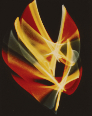
The show starts in the 1950s with the algorithmic and electronic but non-digital and non-computational photographs of oscilloscope patterns by Ben Laposky and screen-prints of photographs by Herbert W. Franke. Most of the works included in the show are prints of one kind or another, and these are no exception. They record the movement of a beam of light on a cathode ray tube as other prints in the show record the movement of a plotter pen or a laser in a laser printer.
If Constructivism was socially realistic for revolutionary Russia then these works are socially realistic against the backdrop of NATO’s military-industrial-educational complex. They turn the technology of that culture back on itself, using it not to produce weapons or market products but to produce aesthetics. This reclaims a space for perception and contemplation that is not simply militarily or economically exploited. The obsessively quantitative managerial culture of spreadsheets and inventories yields uncomfortably to the qualitative culture of aesthetics, productively so. These strategies continue through the show. Technology is pushed beyond its intended uses to address cultural tasks.
Many of the prints in the show have a similar number of stages of production to Franke’s process of screen, then photograph, then silkscreen prints. His later plotter-drawn work is also screen printed, as are Klee-inspired generative images by Frieder Nake, and Charles Csuri’s random montage of flies. I don’t know what to make of this. It feels like something should have been lost in the move from an original to a print but plotter drawings aren’t particularly originals, being already representations of data structures in the computer’s memory.

Csuri’s lithograph of randomly placed vector outlines of toy soldiers was produced in 1967 during the Vietnam War, a war that ran as long as it did in no small part due to game theory and computer simulation. There are two armies, one plotted in red and one plotted in black. They meet and presumably battle inevitably but only by chance. There’s more of the outside world in art computing than is often assumed.
William Fetter’s wonderful three dimensional vector images of human figures produced for the aircraft manufacturer Boeing, a lithograph from the Cybernetic Serendipity show of 1968, also deal with the human figure within the military-industrial complex. We should not be confused about the status of such images as art by the use and funding of computer graphics by corporations any more than we should be confused about the status of painting as art by the use and funding of oil painting by the Catholic church.
Ken Knowlton’s cheeky nudes and other typographic images of the 1960s and 1980s are an effective escape or release from the constraints of corporate information culture. I’d seen them many times in reproduction but again they are much richer visually as prints.
More detailed systems-based patterns emerge in the 1970s in the work of artists such as Manfred Mohr, Paul Brown, and Vera Molnar. This era that epitomises the approach of rule based serendipity so beloved of later Generative artists. These images are pleasurable to look at but also contain visual or psychological complexity. They also continues to push the performance of computer systems outside of their intended use cases.
By the late 1980s the technical achievements of computerised mass media were exceeding those of art computing. Pen plotters, where they were still used, were no rival to laser printers. Rendered images had to compete with the earliest rumblings of Pixar and Adobe. The increasing availability of digitally designed fashion and entertainment meant that far from being the exception, digital elements in the lived visual environment were becoming the rule.
The reactions to this that art computing in general have made are the subject of the Decode show that is also running at the V&A. Digital Pioneers instead follows the printmaking thread of art computing into the present day where artists such as Roman Verostko, Mark Wilson and Paul Brown have continued with the systems art all-overness of print-based art computing.
To continue in this way marks such work out as something different from the all-pervasive presence of digital imagery in the visual environment. The work has to look different from graphic design and new media rather than from CAD plots or teletype reports, and it does. These works remind us of the history and of the wiring under the board of digital culture. They successfully resist any attempt to reduce them to digital mass media images comparable to the output of the design software that they exist in the same era as.
This switch away from early adoption is necessary to maintain a figure/ground relationship (or a critical distance, or a constructive difference) between the general level of technology in society and the level of technology in art computing. It is not the only solution to this problem, as the Decode show demonstrates, but it is not a retreat.
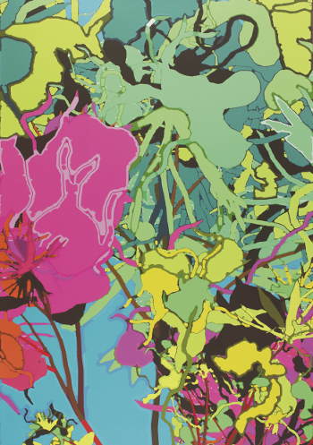
As a long time fan of Harold Cohen, I found the show’s inclusion of computer generated works from his very earliest 1960s felt-tip-on-teletype-print experiments with generating figure and ground relationships computationally to a recent large-scale full-colour inkjet abstract was a real treat. Plotter drawings of abstract shapes from the 1970s and of human and plant forms from the 1980s show the progress that Cohen made in using computers to rigorously explore how art and images are created and function. Being able to study this work close-up reveals details such as debugging information in the teletype prints and the operation of the collision-detection algorithm in the 1980s images. And it provides the pleasure of seeing detailed, well-composed drawings.
This is a recurring experience in Digital Pioneers. Despite the uniformly dismissive attitude of both popular and academic criticism towards art computing the fact is that when you actually see the work in the flesh it rewards sustained attention. Not as historical or technical curiosities, but as images with cultural and aesthetic content and resonance. To ignore this and to continue to claim that this art is less than the sum of its parts would ironically be to fall prey to a particularly extreme attitude of technological determinism.
The show also contains displays of ephemera including magazines and books such as back issues of the Computer Arts Society’s “PAGE” and William Gibson’s supposedly self-erasing story on a floppy disk “Agrippa”. I’d not seen an actual copy of “Agrippa” before. PAGE back-issues are available online, but their presence here flags an important point.
The revived Computer Arts Society has been key in promoting and deepening understanding of the history of art computing in the UK. The Digital Pioneers show and its excellent accompanying book are a good example of how CAS’s project has spread out into more traditional cultural institutions, and many of the images and exhibits in the show come from the archives that CAS has donated to the V&A.
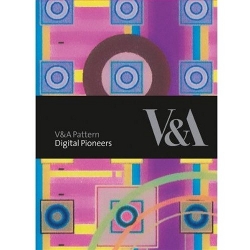
The “Digital Pioneers” book (by Honor Beddard and Douglas Dodds, V & A Publishing, 2009) serves as a catalogue for the show . It contains an informative introductory essay and printed images of many of the works on display as well as a CD-ROM with 200dpi scans of them. These scans are high-resolution enough to be able to examine the images in some detail, although they are no substitute for seeing the images in the gallery. A slightly excessive copyright licencing notice is the only indication that the book has in fact been produced as one in a series of pattern books from the V&A. It’s a must-have if you enjoy the show or have any interest in early art computing.
Digital Pioneers is an opportunity to really look at the work of early computer artists and to evaluate that work directly rather than through the medium of poor reproductions or through the fog of received critical opinion. As a slice of artistic history that just so happens to have been produced on computer it contains much to reward both the eye and the mind.
Update: Two recently published books provide more extensive background to the period covered by the show, making the history of this fascinating era available to current practitioners –
White Heat, Cold Logic: British Computer Art 1960-1980‘ edited by Charlie Gere et al covers the history of British computer art and the Computer Arts Society.
A Computer in the Art Room by Catherine Mason describes the relationship between British art schools and computing (which is how I became interested in this area in the first place).
The text of this review is licenced under the Creative Commons BY-SA 3.0 Licence.
Mark Napier’s Venus 2.0
Angela Ferraiolo
February 5, 2010
“Now that I’m done’ I find the artwork disturbing. It freaks me out. Maybe I’ll do landscapes for a while to detox.” — Mark Napier
Artist Mark Napier, well-known for the net classics Shredder, Riot, and Digital Landfill, recently exhibited his latest work Venus 2.0 at the DAM Gallery in Berlin. A sort of portrait via data collection Venus 2.0 uses a software program to cross the web and collect various images of the American television star Pamela Anderson. These images are then broken up, sorted by body parts put back together and — as this inventory of fragments cycles onscreen, a leg, a leg another leg — the progressive offset of each rendering of Anderson’s head, arms, and torso makes her reconstructed figure twist, turn and jerk like a puppet. It’s odd looking. Even her creator is a little afraid of her:
“I have to say’ if I ever meet Pamela Anderson in real life I think I’ll completely freak out and run away. I don’t think I could have a conversation with the woman after this project … I started with a sympathetic view of the actual Pamela Anderson. She is part of the spectacle of sexuality in contemporary media. She’s caught in that ‘desiring machine’ as much as any other human’ probably even more so. She has surgically modified her body in order to have greater leverage in the media. Does this put her in control? I think not.”
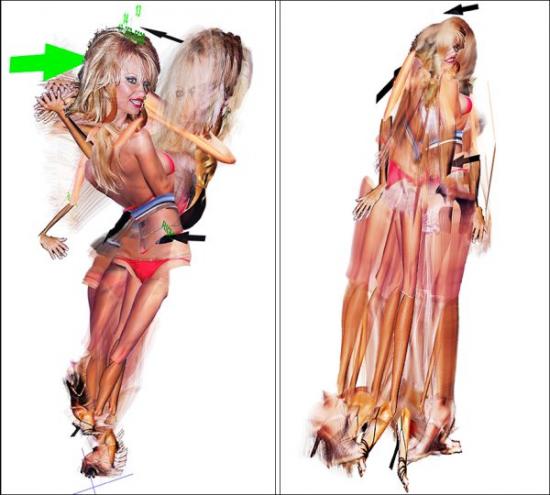
Napier’s project doesn’t answer or intend to answer the question of who is in control either, but it plays with the possibilities. Although I wasn’t able to see the portrait at its exhibition. I did track down part of the series Pam Standing at a private location here in New York. Napier has also posted video excerpts of the work online. Unfortunately, these still images and clips are a bit too static to really do the piece justice. If you get to see the real thing and if you look for a while, you’ll see what I mean. Venus 2.0 is an amazing jigsaw puzzle, a deceptive surface of shifting layers – part painting and part search result.
The effect is translucent, lyrical, mathematic and creepy. When I implied that it must have taken an awful lot of precision and calculation to get something like this to come together, Napier insisted that focusing on the technology behind Venus 2.0, its algorithm, or even on the unique materiality of networked art in general, is a way of missing the point. The way he relates to Venus 2.0 is through the painter’s hand. What counts is not the data feed, but who were are, what we want and how we behave:
“The artwork is a riff on sexuality as an elaborate hoax played by a precocious molecule that builds insanely complex sculptures out of protein, aka, meat puppets or more simply, ‘us’. These animate shells follow a script that’s written and refined over the past half billion years. And that script is in a nutshell: 1) survive 2) reproduce 3) goto #1. So sexual attraction is the carrot to DNA’s stick. Attraction is part of the machine. In art history this appears as the tradition of Venus. And more recently: Duchamp’s ‘Bride’. Magritte’s ‘Assasin’. Warhol’s ‘Marilyn’. The focus of digital art is still the human being. Don’t be distracted by the gadgets.”
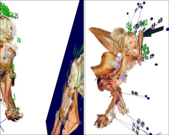
Hi-tech or not, new media artists are by now well-practiced in the technique of unraveling a familiar image to expose an occluded, yet equally valid identity. In Distorted Barbie, Napier relied on a repeated process of digital degradation to blur both the literal and conceptual fiction of the Mattel franchise. Another early project stolen, took the female body apart, presenting attraction as database. Years later these kind of approaches, pixel manipulations and indexing without comment, as well as parsing and remixing have become a sort of standard operating procedure in new media. So much so that as technique becomes more well-known and more accessible, it can be hard to tell one work from another or one artist from the next. With this in mind’ it seems important to note that in the case of Venus 2.0 it is not so much a choice of subject or an organizational scheme that guarantees the final effect, but the manner in which Napier investigates the image and the ways in which Napier illustrates and manipulates both the visual elements of portraiture and his relationship to the figure involved.
Napier builds and destructs, assembles and tears apart, but in doing so tries his best to keep us focused on these activities as processes. At times Pam’s contortions are allowed to expose the wireframe which allegedly guides her construction and at certain key points on the interface, there is also a steady stream of vector coordinates to embody the idea of data. But Napier makes less of technology than another artist might by effacing what some would tend to elaborate on, in order to draw our attention elsewhere – usually towards evolution, gradation and the ways in which images evolve, and by extension the ideas that inspire those images which reflect how unstable elements are, even treacherous:
“I work at probabilities: what is the likelihood that the figure will be totally opaque? How often does it get murky and undefined? How often should I let that happen and for how long? How often does the figure jump? How long till the figure lands and stands up again? How much time is spent in chaotic motion and how much in stillness? How often does something completely messy happen? Like the figure gets tangled up in a ball that has no structure. I don’t know how the piece will play out each minute, but I know what kind of situations will arise in the piece. I can plan those likelihood, and then let the piece play and see what it does.”
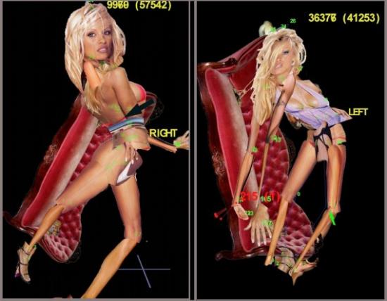
So, like the woman who inspired her. Pam Standing is beautiful, but more unsettling. What makes Pamela Anderson the most frequently mentioned woman on the Internet? Why do we mention her? What is it we want when we give our gaze to celebrity? What has celebrity done to attract us? Whatever your answers, what Napier privileges in his response is not a fixed portrait of a star, but a cloud of iteration that produces its own image and reproduces that image, jangled, confused and full of surprises. A portrait whose finest moments are accidental and whose design is an accumulation of fragments that tense and dissolve, floating like clouds one instant and then sinking like lead the next. This is where the imagination takes a step forward and Napier the artist or Napier the geek becomes Napier the puppetmaster, a networked Dr. Coppelious:
“My favorite moment with the PAM series was when I finally got all the math to work so that the body part images displayed correctly and the correct side of the body showed at the right time and the stick figure suddenly started to look like a ‘real’ puppet that was starting to come alive in the golem-esque way that I thought it could when I was sketching out the idea. I had that Dr. Frankenstein moment: ‘She’s aliiiiiiiiiive!!!!!!!!!!!!!’ which was really the point all along, to create this virtual golem that is clearly not alive at all and yet teases us all with this false appearance of life. Venus 2.0.”
Until the layers of arms, legs, breasts and hips collapse in on themselves and Pam is back where she started, a manipulated beauty unable to escape presentation as a collaged monstrosity.
Note: Mark Napier has been creating network art since 1995. One of the earliest artists to deal thematically and formally with the Internet, Napier has been commissioned to create net art by the Solomon R. Guggenheim Museum and the San Francisco Museum of Modern Art. His work has appeared at the Centre Pompidou in Paris’ P.S.1 New York’ the Walker Art Center in Minneapolis’ Ars Electronica in Linz’ The Kitchen’ Kunstlerhaus Vienna’ ZKM Karlsruhe’ Transmediale’ iMAL Brussels’ Eyebeam’ the Princeton Art Museum’ la Villette’ Paris’ and at the DAM Gallery in Berlin.
Featured image: Annie Abrahams creates an Internet of feeling – of agitation, collusion, ardour and apprehension.
This essay accompanies If not you not me, an exhibition of networked performance art by Annie Abrahams at HTTP Gallery in London. Where social networking sites make us think of communication as clean and transparent, Abrahams creates an Internet of feeling – of agitation, collusion, ardour and apprehension. This exhibition presents three new collaborative works alongside documentation of recent networked performances created and curated by the artist.
2002. My expectations and behaviour have been shaped by years of work and play at my personal computer. I have habitually ignored my hunched body whilst my attention is projected through key-stroke and mouse click into a social space made of people, digital technologies and the cables, hubs and protocols of the global network.
separation/séparation: A click on a blank web page, displayed in a tall, thin browser window, is like a poke at the body of a sleeping animal. “Do something then!” On the first two clicks, the words “lonely soul” appear in a standard font at the top of the screen. More clicking calls up the following words “…not knowing how to differentiate between you and me, you don’t feel my pain…” Accelerated mouse taps provoke an imperious message on a new screen. “You don’t have the right attitude in front of your computer, either you clic (sic) too fast or with too much force…” With more measured interaction I am allowed to continue with the soliloquy, interspersed with instructions drawn from Workpace, an exercise programme used to assist in the recovery and prevention of Repetitive Strain Injury. The first illustrates a facial work-out. An animated download bar sets the duration of the exercise. I wrangle with the regimen to find a way to skip the prescribed exercises, to get to the end of the story. Finally I comply, performing the therapeutic stretches by the light of my machine. In my imagination other viewers/participants, located around the world in their various domestic settings, are roused from their physical inertia, illuminated by their PCs, in animated, undulating fleshy frills at the edges of the Internet. Returning to the screen for the next chapter, one gentle click at a time, a story of unrequited love unfolds; between an implacable machine and a human-being laid low by their own computer-inspired dreams of control and unlimited power.
This is the first time that my body has been directly addressed, indeed disciplined, by a Net Art work. This is made possible by its complex composition. separation/séparation is made of many parts: a web interface, an economical visual aesthetic, texts (the monologue, the instructions, the commands), human-to-machine interaction. Most of these ingredients are also active in the real-time installations and documentary videos exhibited seven years later in If not you not me at HTTP Gallery. The addition of human-to-human interaction, physical space and objects produces ever more complexity in the structure of the work. However while its many different parts often remain visible, separate and present for the viewer/participant, the effect is not one of disconnected components. Abrahams continues to connect them with the sociality of viewers/participants, generating powerful, singular, artistic affects. More recently her favoured vehicle for artistic exploration is collaboration without which there is no relationship: no me, no you, no other and therefore no artwork. If not you not me asks visitors to explore how relations constitute identity and consider the corporeal implications of an emerging human sociality mediated by complex digital networks.
In 2007 One the Puppet of the Other/ L’un la poupée de L’autre explored the experience of solitude on the Internet while straddling both physical and virtual public space. In this collaborative telematic performance at the Pompidou Centre, Paris, Abrahams and co-author Nicolas Frespech each sat in an igloo tents on stage. Their shadows could be seen moving about within, and who communicated via a system of webcams and microphones. They improvised according to a simple rule where each had to respond to the other’s instructions – “sing a song” or “say something sweet” – to make each the living doll or avatar of the other. The webcam images and amplified conversations were streamed into the auditorium and displayed on a simple double screen projection above the tents. The hazy, flesh-tones of the webcam images had a unifying effect giving the impression of a shared dream. At the same time their physical proximity on stage reemphasised the way in which they were separated by their attempts to control and resist each other as they chose whether or not, as Abrahams writes, “to give flesh to the projections of the other.”
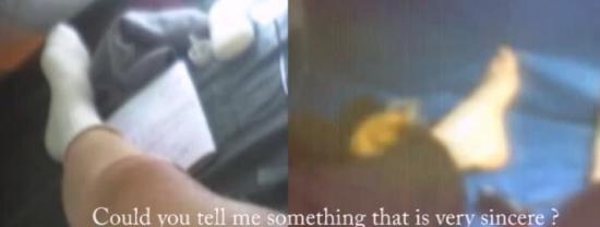
The artists collaborated to negotiate the co-evolution of both a relationship and a performance. This was the first of Abrahams’s networked performances that scrutinised real-time intersubjectivity. More recent works in this area include The Big Kiss with Mark River and Double Blind (Love) co-authored with Curt Cloninger. Distinct from pointing and clicking to control a machine or a game, performers adopt the more complex and subtle rituals and tuning-in techniques of improvising musicians and lovers. This requires them to acknowledge the similarities and differences in the nature of the sentient-other and to accept the other’s autonomy. Unlike Paul Sermon’s reassuring installations such as Telematic Dreaming that invite participants to cooperate within familiar and intimate domestic spaces connected by videostreams, Abrahams’s stark interfaces amplify the performers’ awareness of their solitude. They are alone in their physical space and yet they are responsible for co-constructing an image or a soundscape to express their experience of a relationship with a distant other. The unexpected result for the viewing public can be a disconcerting impression of intense intimacy. Viewers (as voyeurs) witness the emergence of boundaries as they are made and remade in the co-creation of the performance – each piece is a dynamic double portrait of every negotiation, every partnership.
Abrahams’s fascination with collaboration and participation means that she has a strongly developed sense of the context for artwork (not uncommon with artists who work with the Internet – think Jess Loseby’s Digital Kitchen, Andy Deck’s Panel Junction, Avatar Body Collision’s Upstage). She understands the many subtle ways in which curatorial and technical infrastructures impact on the meaning of the work and others’ experience of it. She knows that in order to best familiarise herself with the mechanics and affects of collaboration she has to move through all positions from initiator and director, to participant, to viewer. Her two series of curated performances Breaking Solitude and Double Bind (which she created with technical partner Clement Charmet and Panoplie.org) are remarkable in that they demonstrate the power of a simple interface, a curatorial frame and an extended community of artists experimenting across networks. Breaking Solitude was simply set up as “Web-meetings of about twenty minutes long using chat and streaming to experiment (sic) new ways of being together.” For Double Bind Abrahams creates a more focused context based in her own earlier experiences as a biologist, where she came across the concept of the Double Bind; “a situation with no exit, whatever one chooses one looses [which] leads to illogical, inhibited, ambivalent and misplaced behaviour. Double bind is the result of conflicting cues about a particular situation. An animal that cannot decide between attack and flight is going to eat or scratch.” For this series she asked six artists to reflect on whether double bind describes our relation to technology, within a double webcam performance which could be viewed online and commentated on by up to thirty visitors within a simple message window. Abraham asks: “Is our relation to the computer and internet double bind, bound, bond?…Remote presence, ubiquity, multiple personality, absence of the body? Does this make us schizophrenic? How do we adapt?”
We are unaccustomed to experiencing either art or online social interaction in this way. Most artworks do not require us to participate with so many aspects of ourselves. Most social media interfaces are designed to smooth out the disconcerting glitches and vacuums created by the inevitable interruptions in data-flow. They aim at transparency to give an impression of irrepressible and unproblematic social exchange – as if the last thing we should be aware of when “using” technology is its impact on our physical and psychological well-being. On the one hand this transparency creates an exciting speed of exchange and a froth of production. On the other, however, the bandwidth of our communication is eroded and along with it the range of things that might be conveyed and relations evolved. If it can’t be said in 140 characters, it can’t be said. A voice disappears – no-one notices; the babbling stream of confabulation bypasses, drowns out – bleaches out – absences and depressions. With these ubiquitous interfaces we interact less with other people than with the social utility itself and with our ideas of ourselves.
Abrahams’s work always invites us to acknowledge, feel and imagine in our interactions the many aspects of the machine and the other human being speaking through it. Her current artistic research project Huis Clos / No Exit directly addresses how each person will react in a context of collaboration, at the same time as studying its technical and formal limits and possibilities. Her work’s place in the proliferating network of machines and human-beings (their emotions, desires, even their hormones) makes us aware of the artwork’s simultaneous openness and resistance to our contribution. It encourages us to bring our whole selves to the question of the part we play in the co-evolution of future relations.
Annie Abrahams was born to a farming family in a rural village in the Netherlands. She obtained a doctorate in biology in 1978 and found that her observations of monkeys inspired curiosity about human interactions. After leaving an academic post, she trained as an artist and moved to France, where she became interested in using computers to construct and document her painting installations. She began experimenting with networked performance and making art for the Internet in the mid 1990s. Her work has since returned to the questions raised by the monkeys, concentrating on the possibilities and limitations of communication on the Internet. She has performed and shown work extensively in France, including at the Pompidou Centre, Paris, and in many international galleries including among others Espai d’Art Contemporani de Castello, Spain; the Museum of Contemporary Art, Tokyo; and the Armenian Center for Contemporary Experimental Art, Yerevan; festivals such as the Moscow Film Festival and the International Film Festival of Rotterdam, and on online platforms such as Rhizome.org and Turbulence.
Data Soliloquies
Richard Hamblyn and Martin John Callanan
London: Slade Press, 2009
112 pages
ISBN 978-0903305044
Featured image: Data Soliloquies is a book about the extraordinary cultural fluidity of scientific data
Although much has been said about C.P. Snow’s concept of a “third culture”, we haven’t actually reached an understanding between the spheres of science and humanities. This is caused in part by the high degree of specialisation in each field, which usually prevents researchers from considering different perspectives, as well as the controversies that have arisen between academics, exemplified by publications such as Intellectual Impostures (1998) in which physicists Alan Sokal and Jean Bricmont criticise the “abuse” of scientific terminology by sociologists and philosophers. Yet there is a growing mutual dependency of both fields of knowledge, as the one hand our society is facing new problems and questions for which the sciences have adequate answers and on the other scientific research can no longer remain isolated from society. Some scientists, such as the astronomer Roger Frank Malina, have even argued that a “better science” will result from the interaction between art, science and technology. Malina presents as an example the “success of the artist in residence and art-science collaboration programs currently being established” [1], and considers the possibility of a “scientist in residence” program in art labs.
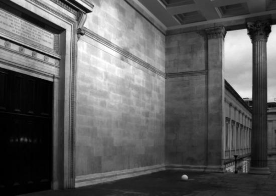
Our relationship with the environment is certainly one of the main problems we are going to face during this century and it is also a subject that brings up the necessary communication between science and society. The UCL Environment Institute [2] was established in 2003 to promote an interdisciplinary approach to environmental research and make it available to a wider audience. While being representative of almost every discipline in the University College London, it lacked an interaction with the arts and humanities. This gap has been bridged by establishing an artist and writer residency program in collaboration with the Slade School of Fine Arts and the English Department. Among 100 applications, writer Richard Hamblyn and artist Martin John Callanan were chosen for the 2008-2009 academic year: Data Soliloquies is the result of their work.
Despite “belonging” to the field of art and humanities, neither Hamblyn nor Callanan are strangers to science and technology. Richard Hamblyn is an environmental writer and historian who has developed a particular interest in clouds, and Martin John Callanan is an artist whose remarkably conceptual work merges art and different types of media. This may be the cause that Data Soliloquies is by no means a shy penetration into a foreign field of knowledge but a solid discourse which presents a richly documented critique of the apparently ineffective ways in which scientists have made society aware of such a crucial problem as that of climate change. The title of the book has been borrowed for a term that Jon Adams, researcher at the London School of Economics, coined to refer to Michael Crichton’s novels, who uses “scientific” facts to give his imaginative plots an aura of credibility. With this reference, the authors state that the way scientific data is presented actually constitutes a narrative, an uncontested monologue: “…scientific graphs and images have powerful stories to tell, carrying much in the way of overt and implied narrative content (…) these stories are rarely interrupted or interrogated.”[3]
As the amount of data regularly stored in all sorts of digital supports increases exponentially, and new forms of data visualisation are developed, these “data monologues” become ubiquitous, while remaining unquestioned. In his text, Hamblyn exposes the inexactitude in some popular visualisations of scientific data, which have set aside accuracy in favour of providing a more eloquent image of what the gathered evidences are supposed to tell. On the one hand, Charles D. Keeling’s upward trending graph of atmospheric carbon dioxide concentration, which according to Hamblyn is “probably the most important data set in environmental science, and has become something of a freestanding scientific icon”[4], or Michael Mann’s controversial “Hockey Stick” graph are illustrative examples of the way in which information displays have developed their own narratives. On the other, the manipulation of data in order to obtain a more visually effective presentation, such as NASA’s exaggeration of scale in their images of the landscape of Venus or the use of false colours in the reproductions of satellite images, call for a questioning of the supposed objectivity in the information provided by scientific institutions.
In the field of climate science, the stories that graphs and other visualisations can tell have become of great importance, as human activity has a direct impact on global warming, but this relation of cause and effect cannot be easily determined. As Hamblyn states: “climate change is the first major environmental crisis in which the experts appear more alarmed than the public” [5]. The catastrophism with which environmental issues are presented to the public generate a feeling of impotence, and thus any action that an individual can undertake seems ineffective. The quick and resolute reaction of both the population and the governments in the case of the “ozone hole” in 1985 points in the direction of finding a clear and compelling image of the effects of climate change. As Hamblyn underscores, this is not only a subject for engineers: “the reality of ongoing climate change has yet to be embraced as a stimulus to creativity –in the arts as well as the sciences– or as a permanent and inescapable part of human societal development” [6].
Martin John Callanan took upon himself to develop a creative response to this issue, and has done so, not simply by creating images or objects but by depicting processes. He states: “I’m more interested in systems –systems that define how we live our lives” [6]. A quick look at his previous work [7] will show how appropriate this statement is: he has visited each and every station of the London underground, collected every command of the Photoshop application in his computer, officially changed his name (to the same he already had), gathered the front page of hundreds of newspapers from around the world and engaged himself in many other activities that are as systematic and mechanical as ironic, poetic or simply nihilistic. During his residency, Callanan created to main projects. The first one, Planetary Order, is a globe in which the patterns of the clouds on a particular date (February 6th, 2009) have been sculpted. The artist composed the readings of NASA’s cloud monitoring satellites in a virtual 3D computer model, which was then laser melted on a compacted nylon powder sphere at the Digital Manufacturing Centre at the UCL Bartlett Faculty of the Built Environment. The resulting object is a sculpture, an artwork more than any sort of model in the sense that it develops a discourse beyond the actual presentation of data. An impeccable white sphere textured by its subtle protuberances, the globe evokes the perfection of an ancient marble sculpture while presenting us with an uncommon view of the Earth, covered with clouds. The clouds, which are usually erased in the depictions of our planet in order to let us see the shapes of the continents (the land which is our dominion), become an icon of climate change and the image of an order which is, in all senses, above us. Callanan freezes the planetary order of clouds in an impossible map, a metaphorical object which appears to us as a faultless, yet fragile and inscrutable machine.
The second of Callanan’s artistic projects is the series Text Trends. Using Google data, the artist has collected the number of searches for selected terms related to climate change in a time range of several years (from 2004 to 2007-2008). With this data, he has generated a series of minimalistic graphs in which two jagged lines, one red and the other blue, cross the page describing the frequency of searches (or popularity) for two competing terms. The result resembles an electrocardiogram in which we can see the “life” of a particular word, as opposed to another, in a simple but eloquent dialogue of abstract forms. Callanan has chosen to confront terms in pairs such as “summer vs. winter”, “climate change vs. war on terror” or “global warming”. Simple as they may seem, the graphs are telling and constitute and visual summary of the book whilst suggesting many other reflections. The final conclusion is presented in the last graph, in which the perception of climate change is expressively described by the image of a vibrant line for the word “now”, much higher in the chart than the flat line for the word “later”.
Pau Waelder
Arriving at the homepage of Ten Thousand Cents, an Internet artwork by Aaron Koblin and Takashi Kawashima, a mottled image of a one hundred dollar bill slowly fades into view. Ben Franklin looks out sedately. Mousing over the large image, the cursor is replaced with a small red rectangle. And here lays the beauty of the project; with the click of each rectangle, a zoomed in portion of the one hundred dollar bill is revealed. On the left side is a high-resolution photograph of that tiny portion of the bill. On the right side, a real-time moving image plays, revealing how the image was drawn by a human hand in a drawing program created by Koblin and Kawashima. There are, in fact, 10,000 such rectangles and each was created by a Turker through Amazon’s Mechanical Turk marketplace.
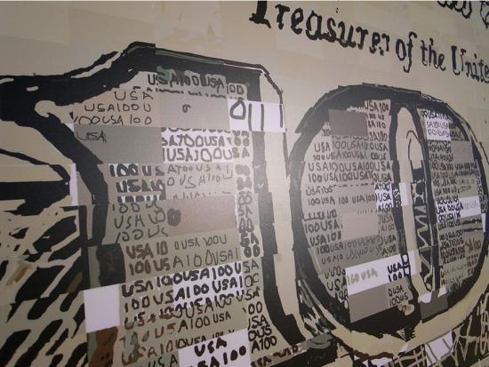
Over the course of five months (from November 2007 to March 2008) Koblin and Kawashima posted tasks, known as HITs, Human Intelligence Tasks, on Amazon’s Mechanical Turk site. Having broken down an image of a one hundred dollar bill into 10,000 sections, Turkers were tasked with redrawing their assigned section. Each Turker was paid $.01 for the task, making the total payment of drawing a one hundred dollar bill one hundred dollars. (Prints of the project can also be bought for one hundred dollars. All proceeds are donated to the One Laptop per Child (OLPC) project) Each Turker worked anonymously, unaware that what they were drawing was a section of a bill or that their work would eventually be combined with other Turkers’ work to create an art project. The variability is endless. Some Turkers methodically draw in the lines and painstakingly shade in boxes. Some quickly slash the paint tool across the page; one imagines they felt they had better things to do with their time. Some are cheeky, using the space for digital graffiti or messages like “I love U.” Most copy the image exactly. Yet, with the differing movements and tempos, every one suggests a different story and different person behind the tool. I suggest you take a few minutes and watch the unfolding scenes. They are oddly, satisfyingly banal and beautiful.
The project and its presentation on the website are undoubtedly elegant. Yet, the conceptual work behind the piece is a bit murkier. The project description states, “The project explores the circumstances we live in, a new and uncharted combination of digital labor markets, ‘crowdsourcing,’ ‘virtual economies,’ and digital reproduction.” Big and important themes. What are the implications of crowd-sourcing for creative work? For any kind of paid work? Where is the distinction between work and play? Creativity and re-presentation? In this deeply networked age, what are the evolving relations between individual and collective action?
The Mechanical Turk, made by Wolfgang de Kempelen in 1769, caused a sensation in 18th and 19th century Europe, first for its existence as a seemingly intelligent chess playing automaton – one who could beat Ben Franklin and even Napoleon in chess – and subsequently, for being an infamous hoax. Inside of the automaton was in fact a man, a skilled chess player. The Mechanical Turk was no thinking machine. It was an elaborate performance of concealment and human skill.

In 2005, in an ironic (and some might say distasteful) turn of events, Jeff Bezos of Amazon named a new business venture, Amazon Mechanical Turk. The idea was to make a digital marketplace that capitalized on the unique intelligence of human agents. Broken down into microtasks, known as HITs, Mechanical Turk provides a means to accomplish those tasks that humans can do quickly but which would take computers much longer to do, for instance, tagging images, taking surveys or transcribing audio recordings. This Mechanical Turk is also a performance of human skill, one that revels in its basis in human intelligence – Bezos calls it “artificial artificial intelligence” – but one that also operates within a mode of concealment and indeed, alienation.
As Katharine Mieszkowski of Salon wrote about Mechanical Turk in 2006, “There is something a little disturbing about a billionaire like Bezos dreaming up new ways to get ordinary folk to do work for him for pennies.” Critics of Mechanical Turk abound, and their objections point to the insidious labor relations that Mechanical Turk enforces, implying that Mechanical Turk approaches a virtual sweatshop. The system was designed for employers, not employees. The earnings of Turkers fall within a gray area of digital labor, officially being classified as contractor work, subject to high self-employment taxes and no option for benefits. Although a rating system protects employers, in so far as employers can choose to reject a work offer from a Turker or refuse to pay a Turker if the work is completed unsatisfactorily, no such system protects Turkers. As advocates of a Turker Bill of Rights have pointed out, there is no effective outlet within Mechanical Turk for Turkers to voice grievances against employers. What does exist is a vibrant community forum, Turker Nation, where Turkers advise each other on known scammers.
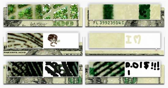
Moreover, although anecdotally Mechanical Turk is understood as more game or past-time than employment, a recent study out of University of California, Irvine’s Informatics Department points out that almost a third of Turkers rely on Mechanical Turk as a source of income. Another study found that nearly half of Turkers report their motivation for working as income related. For this population of Turkers, it is troubling to consider the possibilities of exploitation and unfair labor practices.
In this light, I find the artists’ neat appropriation of the mechanisms of Mechanical Turk unsettling. The implications and the stakes of Mechanical Turk as an economic system are left untouched. And considering that the artists chose to create a representation of money and employ Turkers, these dimensions of economy and labor are present but disappointingly unaddressed.
Yet, the moments in the project that remain in my mind’s eye like lovely specters as I glance at the dollar bill that I traded for coffee this morning, are the movements of the individuals who drew each section. On this level, the project is like a fantastic cabinet in which each drawer opens onto a new wonder. Perhaps what Ten Thousand Cents effectively offers is not a statement about labor politics or late capitalism’s continuing ability to provide structures for domination and exploitation. Perhaps Ten Thousand Cents asks us to take a different step toward understanding “the circumstances we live in,” revealing the endless variability of individual expression. In this networked age, we often act collectively, that is, together, parallel, most often without knowledge of the larger directions toward which our actions will lead. Collaboration, laboring together, is notion whose meaning is expanding and changing in the 21st century. What remains, even among protocols and code, is individuality. Though we are subsumed by larger structures, we do have spaces for self-expression and self-formulation. Leave an exploration of the limits of these spaces to others – and I surely believe we must consider the limitations. Yet we must also explore and value the spaces of possibility and the domains where we are active agents. We are called to remember that every artifact is irreducible to its mere instance in the world – it is a sum of processes and individual actions.
Of course, “the circumstances we live in” also requires us to keep in mind the bottom line. It’s all about the Benjamins, as the phrase goes. In response to a HIT, no less, requesting an answer to the question, “Why do you complete tasks in Mechanical Turk” one Turker wrote, “I do it for the money!”
Featured image: make art is an international festival focusing on Free/Libre/Open Source Software (FLOSS), and open content in digital arts
make art, one of the world’s most important free and libre art events, happens far away from the European metropolis, in the small town of Poitiers. However, it does not represent an integral piece of the ville‘s agenda to favour cultural tourism and development, as we might suppose thinking of some Brazilian film festivals and even of Bilbao’s Guggenheim. If something is to blame, it should be the grassroots effort of the native GOTO10 collective.
The name might sound familiar because not long ago they were doing a series of workshops in the UK to introduce FLOSS tools using their own pure:dyne operational system – a GNU/Linux distribution for multimedia creation. Having received some funding from the Arts Council, pure:dyne recently grew in efficiency and popularity.
Personally, the first time I heard about GOTO10 was in 2006, at that year’s Piksel festival. Some of the group’s members were there for audiovisual performances. Yes, they are artists as well – in fact, on the same days of make art, the group was taking part in the Craftivism exhibition, in Bristol. And between producing events, engineering software and, well, making art, they also found time to publish a book.
As diverse as these projects might be, they can all be inferred from the GOTO10’s creative practice, in respect of their real time interaction with people (in workshops) and machines (in live coding, etc). Given the way make art, pure:dyne and the group’s performances are interconnected, we could see them as one and the same activity, extending itself to various platforms.
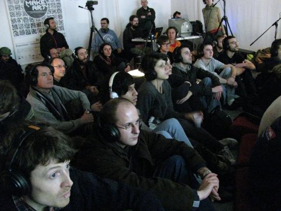
I wouldn’t go as far as to say that, similarly, GOTO10 is a poitou group that has been expanded to other parts of the world. But, now that it has members from Greece, the Netherlands, Taiwan and the UK, the localization of make art seems even more meaningful to the collective’s identity, hinting on where and why it started.
According to Thomas Vriet, one original member who is still in town and mainly responsible for make art production. The group first got together in 2003 to promote digital art performances, workshops and exhibitions in Poitiers – sharing thoughts and ideas on things they were interested in, but could not find in the local art scene or École de Beaux-Arts.
So, in the same way pure:dyne was developed to cope up with GOTO10’s own needs for a live operational system capable of realtime audiovisual processing, make art is the ideal festival they’d wish to attend in town. Both projects find their reason in the group’s artistic demands, and grew simultaneously from it: the inaugural version of the distro was released in 2005, right on time to be used in a workshop in the first make art the following year.
Even though make art’s production is concentrated locally, the event is curated online, by the whole of GOTO10. The other member directly implied in this year’s planning, Marloes de Valk, arrived from Amsterdam just in the first day of the festival. make art is a group initiative that cannot be isolated from the larger open source community – a circuit that includes not only artists and programmers, but other venues as well. It is from this sizeable repository that the pieces that constitute the event’s programme come from. The aforementioned Piksel, for instance, has previously contributed to make art with a special selection of Norwegian works, creating an unexpected interchange between Bergen and Poitiers.
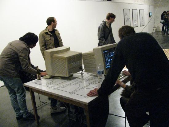
Together with the different Pixelache editions, these festivals form an international calendar of FLOSS art events, closely committed to developments in technology and aesthetics that, in many senses, are far more interesting that the new media proofs-of-concept proliferating elsewhere. But how does such package of extraordinary themes work in the traditional platform of the French countryside?
Altogether, make art seems to be the right size for Poitiers – not too small to feel incomplete, neither too big to feel overwhelming. The night programme may put you off if you are on a budget and decided to stay in the youth hostel (like me): there are no buses to that area after 8pm, forcing you to endure a half hour walk through cold streets. Apart from that, the city space is very well occupied by the festival, with the exhibition and debates in the central Maison de l’Architecture and a couple performances in other venues, emphasizing the curatorial logic. Posters are everywhere in town, competing for attention with those from the film festival.
However, the participation of the poitou community seems very restricted. So far, no local project has ever been sent in response to make art’s call. It might be that the theme is still alien to most people. Not surprisingly, the activity that attracted the majority of local public was the debate “Internet, Freedom and Creation” – which, beyond dealing with themes of more general concern (digital freedoms and copyright), was in French.
One of the efforts to increase this involvement was to open free places in the Fork a House! workshop to local students. Student volunteers could also be found mediating the exhibition and assisting production.
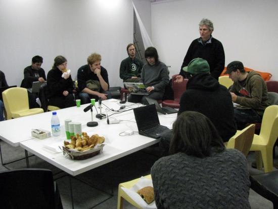
In that sense, the project that seemed to make the most of the festival’s situation was the frugal Breakfast Club. The first of these morning talks hosted by Nathalie Magnan was especially refreshing after the highly technical presentations the day before. Complex subjects were re-discussed over croissants, bringing the tone and rhythm of the event closer to the atmosphere of the #makeart IRC channel (which sometimes was livelier than the physical space).
The priority of Breakfast Club was not transparent accessibility but dialogue. Less of a tutorial and more like the public forum an open-source project cannot really do without. It made things more understandable to a laymen’s audience; it made the whole festival experience more coherent, pointing to directions in which it should grow within the city’s everyday life and structure – without having to be included in Poitiers’ tourism department masterplans.
This article is co-published by Furtherfield and The Hyperliterature Exchange.
Millie Niss, the writer and new media artist, died of swine flu with complications at 5 a.m. on 29th November 2009. Her mother and longtime collaborator, Martha Deed, was with her then. She had been in hospital for four weeks, mostly in intensive care, after picking up the virus, which quickly became serious in her case, probably because she already had respiratory difficulties due to a rare condition known as Behcet’s Disease. She was 36 years old.
The news would have been sad to hear about anyone, but it was especially sad in Millie’s case because she was one of the people in the new media community with whom I felt particularly close. I met her at the trAce “Incubation” conference in Nottingham in 2004. When I first arrived at the conference, I was directed to the part of the room where Michael Szpakowski was because he and I had already struck up an e-mail friendship, and he’d left a message for me at the door. I found him talking to Millie. Michael was only there for that first evening because he had to go and see his father, but Millie was there for the rest of the conference, and I sat next to her at many events. She was dark-haired, overweight and funny: very easy to talk to. Later in the conference, she gave a presentation about how to attach behaviours to objects in Flash, which I attended along with Jim Andrews and others. She kept saying beforehand that she was feeling pretty nervous about it, but she seemed very natural and nerveless when it came to the event. In the beginning, she asked for suggestions from the audience – I think for an initial idea on which to base her Flash piece – and at first, nobody said anything. She suddenly became acerbic – “Oh come on – don’t make me pick on someone like you were a bunch of school kids!” Immediately you could see her as a teacher and imagine how she would have controlled a classroom. I suggested spiders, which set the ball rolling, and from that point onwards, everything went very rapidly. She quickly and expertly demonstrated how to set up a drawing of a spider as a symbol, and attach a behaviour to it so that when the mouse pointed to it, a sound file played. Another thing I remember was that she was very critical of certain aspects of Flash – how you had to import things into your library and then drag them from the library to the stage before you could do anything with them. You could feel her personality’s force, her opinions’ sharpness, and her sense of humour and fun.
From that time onwards, she and I regularly exchanged e-mails. She knew that I worked in the National Health Service, and because she was very much in the mill of health care herself, we had some lengthy correspondence about how the UK system worked, compared with how things worked in the USA. She also sent me two glass unicorns through the post – occasionally, she would run little competitions on her “Sporkworld” website and offer glass unicorns to participants as prizes. The first of these unicorns went to my daughter Rachel, and the second is still sitting on my study window-ledge in a white cardboard box. He used to stand out on his own four feet, but unfortunately, he had an accident with the curtain, and one of his legs got knocked off. I stuck it back on with Superglue, but it fell off again. Millie knew all about this, and I sent her a photograph of the unicorn on my window-ledge – I think I even sent her a second photograph, showing how he looked after his accident and temporary repair. She was always very interested in Rachel and liked to hear my stories about her. Perhaps they reminded her of her childhood, or perhaps she just liked kids.
One thing which came across from Millie’s correspondence, as well as from her work and her occasional online commentaries, was her sense of perspective on new media art. She was grateful to it because it provided an outlet for her creativity which she had never managed to find through traditional print; but all the same, she remained aware that it was a small and specialised field and that a good deal of new media work might seem incomprehensible to “ordinary” people. Her comments about other new media artists reflected this grounded attitude. She preferred work which didn’t reach for the hi-tech solution that a lo-tech one would do – work, in other words, which didn’t employ technology for its own sake, and where the form was dictated by content rather than the other way round. Likewise, she wasn’t particularly bothered whether her output complied with the dictates of new media theory – whether it was interactive, non-linear, coded or networked. The pieces on her website exhibit a cheerful mixture of genres and media: Flash, video, poetry, prose, photography, sound files and plain old HTML rub shoulders in much the same way that political commentary, literary criticism, observations of places and people, food appreciation, nature notes, raucous humour and occasional obscenity rub shoulders in her blog. The groundedness of her art, and her sense of responsibility towards her audience, is demonstrated by the way in which she habitually presented videos on her site in different sizes and resolutions – for example, “Warhol’s Campbell’s Brodo” is available 8.85mb, 6.23 MB and 2.43 MB – so that people with slower connections could sacrifice a bit of quality to save a long wait if they so desired. Similarly, her introduction to “Warhol’s Campbell’s Brodo” explains that “brodo is the Italian word for soup and the restaurant’s name”. Without talking down to her audience or limiting what she wanted to say, she was always at pains to be as clear and user-friendly as she could – and this insistence on clarity and user-friendliness, her desire to reach out to an audience of “ordinary” people whenever possible, was one of the things which made her voice such a distinctive and refreshing one in the new media world.
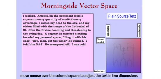
However, this is not to say that she was any Luddite or uninterested in the theory of any description. One of her best-known pieces of work – a collection of six pieces – is the Oulipoems, reproduced in Volume One of the Electronic Literature Collection in 2006. As Millie explains in her introduction, “Oulipoems is a series of six interactive poetry Flash works… loosely based on the Oulipo movement in French literature, which focused on texts based on constraints… and also on mixtures of literature and mathematics.” One of the Oulipoems is “Morningside Vector Space”, which rewrites a description of a simple incident in various ways, depending on how we move the mouse cursor over a coloured square. The source text reads:
Yesterday, I was walking on Amsterdam Avenue. There were cracks in the sidewalk. I looked up and saw the tall and unfinished Cathedral of St. John the Divine. A man approached me. ‘Excuse me, do you have the time,’ he said. I told him at 5:47. He walked (sic) away. It was windy. The coloured square is marked to indicate the inflexions this text will be given if we hover over different areas – from “Simple-minded” to “Pretentious” on the x-axis and from “Sociological” to “Melodramatic” on the y-axis. If we point to the “Simple-minded” corner, we get this:
I walked. On the sidewalk. By the big church. There was a man. He wanted the time. I gave him my watch. He left. I was cold.
The intersection of “Pretentious” with “Melodramatic” yields this:
A vagrant in tattered clothing invaded my personal space, filling it with his odor. ‘Hey, man, got the time?’ he whined…
The intersection of “Pretentious” with “Sociological” produces:
The sidewalk, unmaintained by the municipality, contained evidence of substance abuse…
– and so forth.
A number of observations come to mind about this piece. First of all, although it isn’t tremendously technically sophisticated, it does reveal a very competent grasp of Flash and object-oriented coding. This grasp is also displayed in many of Millie’s other pieces. Secondly, it demonstrates the “mixture of literature and mathematics” to which Millie refers in her Introduction to the Oulipoems – the idea that different styles of writing can be mapped onto a graph and summoned by pointing at different vectors – and in doing so, it demonstrates a willingness to experiment with text, and an openness to the idea that text in digital literature may sometimes be manipulable by the audience, rather than fixed into a single unquestionable form by the author. Thirdly, “Morningside Vector Space” is funny and accessible. The labels with which Millie marks out her vectored space are humorous, and the texts with which she illustrates these different writing styles are exaggerated for comic effect. At the same time, there is an undercurrent of social observation, with a suggestion of political edge: “I was observing a mixed-income neighborhood on the borders of a low socioeconomic enclave… Lacking funds for a watch, he had to rely on others in the community to be on time for his appointment with the social services…”
Lastly, perhaps least obvious is a powerful sense of place. The piece’s title refers to Morningside Heights, an area of Manhattan in New York. The texts allude to Amsterdam Avenue, a street in Morningside, and the Cathedral of St John the Divine, which stands there. St John the Divine is also known as St John the Unfinished because although it was begun in 1892, it remains incomplete to this day – hence the description of the cathedral as “tall and unfinished”. The coloured vector space in Millie’s piece contains another reference to the cathedral, in the shape of a wobbly but recognisable line drawing of its facade. This sense of place is an important aspect of Millie’s output – not only in videos about places such as “Jewel of the Erie Canal” or “A Hecatomb in Cheektowaga” but also in new media works such as “The Talking Escalator at Penn Station”and “Unscenic Postcards” – and like her interest in politics, it demonstrates her commitment to the “real” world, as well as her talent for observation and comment.
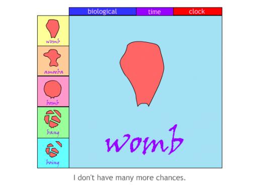
Another of Millie’s Flash pieces, and one of her most personal artworks, is “Biological Time Clock”. In a central pane, the words “womb”, “amoeba”, “bomb”, “bang”, and “boing” appear, accompanied firstly by Millie’s voice intoning the same words, and secondly by drawings of a womb, an amoeba, a womb inflated to the point of bursting, a womb breaking into pieces, and another slightly different drawing of a womb in bits. Underneath this pane appears a randomised sequence of phrases, arguing both for and against getting pregnant and giving birth: “It’s not for me”, “I’d be nurturing”, “I’m more than a womb”, “I’m not together enough”, “maybe I should do it while I can”, and so forth. There are also buttons that allow you to add extra sound effects, such as Millie saying “tick-tock” or chanting “biological”.
There are feminist aspects to the piece – one of the anti-pregnancy phrases is “I don’t want to be a breeding cow”, and another is “I’m more than a womb” – mixed with what seem to be more autobiographical notes, such as “why am I alone?” and “I don’t want to lose my creativity”. However, a question that seems to go to the heart of the piece is what is the word “boing” doing in there? The drawing which accompanies this word is enigmatic. Still, it may be meant to suggest that the womb, which broke apart at “bomb”, is now somehow bouncing back together again – and by implication, that no matter how many times the author talks herself out of childbirth, her consciousness of her womb keeps coming back to bother her afresh. But the word “boing” serves another purpose by introducing into the piece the quirky, unpretentious, comical note essential to Millie’s art. If the word sequence at the heart of the poem were simply “womb, amoeba, bomb, bang,” then both the message and the tone would seem much starker. With “boing” on board, there is a playful and funny element to the piece, a release from serious description into exaggeration, which seems to suggest that Millie herself isn’t taking it completely seriously, and we don’t have to take it completely seriously either.
In some ways, this insistence on the quirky and the wacky might be considered a weakness or a limitation in Millie’s art, flinching away from completely direct and honest engagement with her subject matter, symptomatic of a tendency to let both herself and her audience off the hook, especially if her subject-matter happens to be personal. But it should be borne in mind that Millie had more personal subject matter to deal with than most of us, and her insistence on humour was an essential part of her strategy for dealing with it. One of the anti-pregnancy arguments on “Biological Time Clock” is “I’m not well…” and it is impossible to write about Millie’s art without taking her mental and physical ill health into account, if only because so much of her art deals with it. For many years she was considered – and considered herself – to be mentally ill with Bipolar Disorder. Millie’s experiences of mental illness and the health and social care professionals with whom it brought her in contact are memorialised in “The Adventures of Spork, the Schizophrenic Skua”. As described on Millie’s site:
Millie Niss created Spork… to be a sympathetic and intelligent character who was also an indigent client of the mental health system. The cartoons began to express frustrations about how mentally ill people and welfare recipients are treated, but later on, other issues and pure silliness were added to the Spork series.
Eventually, after years of treatment for mental illness, Millie was diagnosed with Behcet’s disease, a severe disorder of the immune system which can cause depression along with ulcers, skin lesions, stomach problems and inflammation of the lungs. Before this diagnosis, however, she suffered attacks of dangerously acute depression, and one part of her website is devoted to suicide (http://www.sporkworld.org/suicide). The way in which she tackles this subject makes it clear how her sense of humour, far from demonstrating an unwillingness to confront her inner demons, was really evidence of her mental toughness and self-discipline in dealing with them – a refusal to give in to self-pity:
I was often, very often ready to kill myself, but I hate guns and wouldn’t want to use one. And lying on a gun license application was out of the question: I would not sign my name to a paper which said I was not intending to kill myself or was not mentally ill… Hanging was reputed to be painless and so we thought getting sentenced to death was the perfect out: that way you could have the benefit of dying without the guilt of doing it to yourself. It was unfortunate that you had to do something awful to get sentenced to death, though… A big question was the suicide note. Should you leave one or not, and if so what should you say in it? The argument for not leaving a note was a strong one: someone might find the note and stop you from doing it… The desire to write a suicide note that was a literary masterpiece kept me alive at times. I couldn’t kill myself until I thought of something good enough.
In these passages, Millie combines a sharp, satirical, almost gleeful insight into the ironies and self-contradictions of the suicidal mindset with an understated – but nevertheless essential and genuinely tough – conviction of her individuality and status as an artist. As she insists in “Biological Time Clock”: “I have a brain”, “I’m more than a womb”, and “I don’t want to lose my creativity”. In “Suicide”, the idea that she doesn’t want to kill herself until she can devise a sufficiently well-written suicide note is a good joke at her own expense. Still, it also points to something deeper: her writing is her way of dealing with depression and her reason for not succumbing. It gives her a sense of self-worth, and the discipline of art allows her to detach herself from her feelings and sublimate them, thereby gaining some form of control over them.
In an article entitled “Suicide, Art, and Humor”, which she published on Michael Szpakowski’s website “, Some Dancers and Musicians”, Millie wrote that “The artist has a duty, some might say, to produce art. But with that comes the more fundamental duty to stay alive.” This is a typically grounded remark: the artist’s duty to life is “more fundamental” than her duty to art. Referring to her own “Suicide” piece, she goes on: “I was at least trying to be funny… Art is a force that tends towards life… While you are writing a despairing poem, you are, in the act of writing, temporarily suspended from the act of despairing.” The effort to be funny and thereby entertain an audience, art as an affirmation of life, and art/humour as a defence against despair – all of these ideas were essential to Millie’s work.
The same values are apparent on the Sporkworld Microblog, which Millie shared with her mother, Martha Deed. They are present even in the very last days of her final illness. Here is an entry from 16th November: “We like to keep a chipper tone here, and we do not intend this to be a place to list complaints. We also insist that any personal events must be… transformed from raw anecdote into something with literary intent.” Martha actually wrote this, but Millie approved it, and it reflects a shared philosophy that runs right through the site’s contents. “Raw anecdote” is inadmissible, not only because it may lack the “chipper tone” that the Microblog seeks to maintain, but because it also lacks the discipline and detachment of real art. The word “raw” suggests something of the harshness of unfiltered experience. The artist’s job is not to pass on this harshness to the audience direct and unmediated, but to control it through an effort of will, to fit it into a composition, to comment on it, reason about it, make jokes about it and turn it into an element in discourse; and thus to humanise it.
After Millie’s death, Martha published a poem on the Microblog entitled “Travelling with H1N1”, which contains the following lines:
even if it is difficult to be funny
while intubated, you will fight and fight and fight…
you will be sending email on your way to the fluoroscope
with subject lines like
I never thought I would write email while intubated”…
The sense of humour, the refusal to give in, and the determination to fight back against her difficulties by finding something to say about them were all there until the very end. Martha relates that in the intensive care Unit (ICU), although she couldn’t speak because she was on a ventilator, she kept her lines of communication open by writing things down. She struck up a friendship with a nurse supervisor, Tom, who “was astonished at her ability to tolerate the ventilator and keep up a running conversation in her notebooks… He continued to visit her in the ICU and received her candid evaluations of her care there – both good and bad – and he found her to be very funny and brave.”
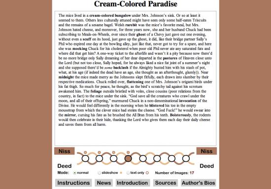
Mentioning the Sporkworld Microblog, and the fact that it was shared with Martha Deed, brings us to Millie’s frequent and long-term collaborations with her mother. Millie is known as “Spork Major” on the Microblog, while Martha is “Spork Minor”. Apart from the blog, they collaborated on many other works – Martha co-wrote the “Oulipoems” texts, for example, and “Jewel of the Erie Canal” is credited to them both. But one of the largest, most ambitious and most formally developed of their collaborations is News from Erewhon, a series of parallel surreal fictions created by the process of “guided free association”.
News from Erewhon is by no means a perfect work of art. Firstly, the title makes a rather distracting reference to Samuel Butler’s satirical, pseudo-Utopian novel “Erewhon”, which doesn’t really seem to have much to do with the rest of the book. Secondly, each chapter is accompanied by a number of images which zoom up in front of the words and then quickly fade away to allow us to read on. The Introduction argues that these add “another level” to work and that the pictures “appear only briefly to affect the viewer in an almost subliminal manner”. In fact, their main effect is to make you lose your place. Luckily, Millie provides a button which allows us to switch the images off.
Nevertheless, the texts themselves are fascinating. They were written in an almost Oulipo-like manner. Several words were picked randomly from chosen books; then, using these words as “seeds” and incorporating them into their writing as they went along, both Millie and Martha produced a series of eight “miniature fictions, situated halfway between poetry and prose”. As the Introduction says, these fictions suggest “a bizarre alternate universe, whose characters and settings evoke themes such as war and peace, the workplace, and religion. These themes… weave in and out of the texts like strands in a braid. The two authors can also be seen as separate, interacting strands.” The image of strands in a braid suggests both the closeness with which Martha and Millie were able to work together and the fact that they always retained their distinct identities and styles, and News from Erewhon is a good demonstration of this. Millie’s sections are generally longer than Martha’s and more narrative in style, whereas Martha’s tend to be more surreal and poetic. Both, however, display a constant flow of inventive wit. One of the funniest of the lot is Millie’s fourth:
The mice lived in a cream-colored bungalow under Mrs Johnson’s sink. Or so at least it seemed to them. Others less culturally attuned might have seen only some half-eaten Triscuits and the remains of a sesame bagel… “God save all the creatures who crawl under the moon, and all of their offspring,” murmured Chuck in a non-denominational invocation of the Divine. He would feel differently in the morning when he blistered his toe in the empty mousetrap from which the clever mice had stolen the cheese. “God Fuck!” he would swear into the mirror, cursing his fate as he brushed the All Bran from his teeth.
Seed-words for the passage are shown in bold. Here is an extract from Martha’s equivalent passage:
A cream-colored bungalow? How could you? It will curdle in the sun, and this is July, she said… Your invocation of natural disasters has blistered the mirror of my mind, he moaned.
Both writers, it will be noted, start by cheating: instead of introducing the “cream-colored bungalow” into their stories in a literal-minded way, they bring it in obliquely. Martha imagines a bungalow, not the colour of cream, but actually painted with cream on the outside – hence the objection that “it will curdle in the sun” – while in Millie’s story, the bungalow only exists at all in the collective imagination of a family of mice. Martha sticks more closely to an underlying structure suggested by the seed words, producing a more densely written text and poetic texture. This is particularly evident in the alliteration – “colored”, “could”, and “curdle” or “mirror”, “mind”, and “moaned”; but also in the lilting rhythm – “Your invocation of natural disasters has blistered the mirror of my mind, he moaned”. Millie, on the other hand, shows something of the novelist’s delight in incidental detail – “Triscuits”, “sesame bagel”, “under Mrs Johnson’s sink”, and “he brushed the All Bran from his teeth”. Her passage seems to take a serious turn with the phrase “God save all the creatures who crawl under the moon” – simultaneously poetic, literary and religious – yet this moment of gravity is almost immediately reversed by an explosion of comical blasphemy – “God Fuck!”
It would be too simplistic to suggest that Martha was always the more focused and disciplined partner in collaborative work. It should be remembered that Millie was the techno-savvy one, and therefore the design and construction of the Sporkworld site, the Microblog and News from Erewhon were all carried out by her. Her work in this area is always individualistic rather than textbook. Still, at the same time, it exhibits both a powerful emphasis on user-friendly functionality and a considerable visual flair. She may have presented herself as the mercurial, comical, slightly wacky half of the partnership, but there was always a sharpness, toughness, self-discipline and a determination to succeed just under the surface.
On the other hand, Millie’s work undoubtedly has an impulsive element, and in the collaborations, this makes a compelling contrast with Martha’s more studied approach. “God Fuck!” is one example; another is “Voting”, a video made in November 2008 showing Millie’s difficulties, as a disabled individual, in trying to deal with her postal vote form. Her ballot paper combines a list of presidential, senatorial, and Congress options and several constitutional issues specific to North Tonawanda, the town in which Millie and Martha live. As a result, it’s a huge sheet about the size of a tablecloth, with as many creases as an Ordnance Survey map, and just as difficult to flatten or re-fold. Step by step, Martha takes Millie through the different options on offer, with Millie keeping up a gunfire of questions and acerbic commentary, interspersed by short periods of silence during which she gasps for breath. Both Martha and Millie are represented on-screen mainly by their hands – first Martha’s, as she manipulates the ballot paper and fills it out in accordance with Millie’s instructions; then Millie’s, towards the end of the process, as she signs the outside of the envelope to authorise her vote. Apart from this, they are represented by their voices: Martha’s calm and methodical, Millie’s staccato and satirical, but both become increasingly impatient as the difficulties of dealing with the ballot paper become increasingly apparent. Ultimately, Martha can’t get it folded to fit the official envelope. Then Millie has to rehearse her signature because her hands are so afflicted with arthritis that she struggles to hold a pen. Then the envelope is difficult to sign because it’s so fat and unshapely with the ballot paper inside it. Then it turns out that the envelope will have to be taken to the Post Office and weighed because it isn’t pre-franked or freepost; at which point –
MILLIE: Okay, so we’re gonna have to pay postage on top of this… and it has to be weighed because it’s so fucking heavy!
(Slightly shocked pause.)
MARTHA (elaborately self-restrained): Did you mean to put the word “effing” in?
MILLIE (immediately): I did! I absolutely did! I mean, it’s a matter of free speech. The Supreme Court would have upheld my right to say fucking on my own blog. There have been efforts to make it impossible to say that.
MARTHA (holding up the envelope, with a noticeable change of subject): Okay, I think we actually have it done.
It’s a wonderful piece of film-making. Whether or not you agree with what Millie seems to be hinting, that there is a deliberate attempt on the part of the establishment in the USA to discourage people at the margins of society from taking part in the democratic process, or whether you prefer the view that bureaucrats have no conception of the difficulties faced by the people on the receiving end of their bureaucracy; the point that the postal ballot, which is supposed to make it easier for disabled people to vote, actually makes it almost intolerably difficult, has been well and truly established by the end. But the real strength of the video lies partly in the interplay between the two main characters and partly in the underlying theme of Millie’s disability and how they handle it. As with Millie’s work, her illness is central to the meaning of the piece, yet it isn’t about the experience of being ill. It’s about how illness changes your relationship with the rest of society – one of her most powerful themes. But it’s also about coping with that situation through the help of others – in this case, Martha – and through a supreme effort of will.
Much of the poignancy of the piece lies in the soundtrack: Millie gasping for breath on the one hand and Millie rattling off her machine-gun-like commentary on the other. You can’t ignore how ill she is and doesn’t ignore it herself, but she won’t let it shut her up. The video is a gradual crescendo of comedic impatience, culminating in the obscenities at the end. Her outspokenness is a refusal to be silenced by society and the universe, which has trapped her spirit inside such an inappropriate body. She overcomes her difficulties by externalising them. She makes them the subject of her art, and by doing so, she finds her voice.
No doubt Millie would have become an artist of some description, whatever body, circumstances and state of health she was born into. She was sufficiently remarkable for that. But without her ill health, the work she left behind would have been very different: less spiky, poignant, funny and perhaps less urgent. Her output is not defined or limited by her health, but her health gave her her most important themes and powerful moments. The supreme irony of her art is that, like the knotty grain of a piece of burr elm, the things that made her imperfect were the same things that made her unique and beautiful.
©Edward Picot, December 2009
Seven years ago, or about two years before the invention of youtube, the editors of Tank Magazine saw the possibility of an internet platform dedicated to video art. Their response was tank.tv, an Internet site that is part moving image archive, part online gallery, and part cutting edge video art exhibition.
After a quick and painless registration, tank visitors can wander by artist through a catalogue of some of the best short films of recent time, including works by Ken Jacobs, Pipilotti Rist, Vito Acconci, Hans Ulrich Obrist, Guy Maddin, Jeremy Deller, and Saskia Olde Wolbers. This archive alone is enough to make tank.tv a cultural treasure. But about eight times a year, tank also puts up shows organized by theme, and here films by emerging artists like Claire Hope and David Blandy are featured alongside more established filmmakers and more recognizable names.
“The sole focus is on the work,” explains curator and creative director Laure Prouvost, who has been with the site since its beginning. Prouvost describes tank.tv as a completely open endeavor, one that supports experimentation by accepting submissions and curatorial proposals throughout the year: “We have worked to make tank.tv a collaborative platform over time and we’re still looking for ways to open our programme as much as possible.”
After running a series of solo shows in 2009, tank decided to finish the decade with the group show Open End. About twelve films were selected from the submissions tank.tv received throughout the year. Works by emerging artists received special attention. They include Just a Quiet Peaceful Dance by Dean Kissick, a rapid, flash cut montage that cascades in one smooth glide over its upbeat house track, and the dreamy, slightly disturbing 3D animation Your Uncertain Spirit by Jonathan Monaghan.
Each of these films were beautifully made and conceived, allowing a special kind of online engagement. In the lyrically photographed Momentary Seizures, Katja Aglert gives us an allegory of war and genocide through the life of a garden snail. Filmmaker Andrew Cross uses a single shot of the landscape as a meditation on time in his film Across. In Pulcera, Nicholas O’Brien uses a series of long takes to explore the relationship between image, gesture, and memory. Filmmaker Michael Fortune exploits the conventions of the reality television and the non-fiction form to make visible the relationship between custom, ritual, and community in We Invented Halloween.
Not quite essay, but something more like the spirit of anti-narrative informs other films in Open End. Among these is Jon Purnell’s CackULike, which documents men in white linen invading the mass transit system, and Steven Eastwood’s self-reflexive and ironic examination of filmmaking in Seminar in Film and Sound.

Screengrabs: CackULike by Jon Purnell (left) and Seminar in Film and Sound by Steven Eastwood (right)
By deconstructing the war film genre, Matthew Johnstone manages a few genuinely harrowing moments in Modern Warfare, a film which combines aerial photography of a bombing run with routine and no-so-routine audio tracks depicting military training sessions. In Inadvertent Prose, filmmaker Mark Shorey distills noir down to its single essential moment of threat and violence.
Animators are also represented. There’s the completely silly and kooky Conveyor-Iphone by Oliver Michaels, which just gets funnier and funnier as it runs its six minutes – really it is just wonderfully preposterous. Simon Woolham’s The Pile creates a mysterious and idiosyncratic relationship between an odd group of objects or states and their related sounds. In The Sausage Party #2, #D animator Michael van den Abeele pairs the evolution of a wire grid that slowly increases in complexity with the sound of a desolate, blowing wind.
About twenty thousand visitors from sixty countries will see Open End. This is obviously good news for the filmmakers who show work here and audience reach is one of the main benefits of their being online. But tank curator Laure Prouvost sees additional benefits in internet exhibition: “Websites such as ours or UBU or LUX offer direct and fast access to work that would otherwise be very hard to view. It’s a fantastic way to get an introduction to an artist’s work. For us curating online gives us a lot of freedom – we have low overhead costs and can react very quickly.”
While the Internet will never replace the cinema or the gallery, Prouvost does point out its use as an extension of those spaces. As the quality of delivery improves, Prouvost believes the web will be used more and more as an introductory space for serious video art. If you watch films, a copy of Fresh Moves, the first DVD compilation from tank.tv can be ordered through tank.tv’s website.
If you make films, Tank is also accepting submissions for The Whole World, an upcoming show by curator Ian White. Prouvost explains The Whole World as a show about the idea of lists: “Both a formal device and a political strategy, film and video that deploys a list as part of its structure often does so with political intent: to subvert hierarchies, to undermine rationalism or to reveal contradiction. In contemporary culture the pop chart’s Top 10 has been replaced by an ever-expanding craze for “Top 100s” of everything from Hollywood genres to celebrity gaffes. The Whole World attempts to wrestle back the initiative. As part of the show we continue to accept submissions of list-centric videos so that The Whole World continues to grow over time.”
We Feel Fine: An Almanac of Human Emotion
Jonathan Harris and Sep Kamvar
Scribner Book Company, December 2009
ISBN 1439116830
Featured image: We Feel Fine project poster
“We Feel Fine – An Almanac Of Human Emotion” is a hardback book that in just under 300 pages of well designed montages, data visualisations, diagrams, illustrations and text presents and analyses the data gathered by the We Feel Fine project. Started in 2005 and launched in early 2006 by Jonathan Harris and Sep Kamvar, We Feel Fine is based around a database assembled using a webcrawler that searches the blogosphere for statements of the form “I feel” or “I feel like”. Any matches are stored along with as much contextual data as the webcrawler can find (a photograph nearby in the blog post, the poster’s age, gender, and location, local weather). The database contained twelve million such entries by the time the book was published.
Sections of the book categorise statements of feelings by age, gender, the location of the poster, and subject of the statement. Individual statements are presented superimposed over images found in the same blog post. The photographs presented with their accompanying expressions of emotion have a high-contrast, shallow depth of field, and highly focused look that resembles Lomography. But this is a product of the presentation of photographs on the web rather than an hipsterly ironic invocation of the contingent aesthetics of mass photography. The images are for the most part JPEGs, and show the contrast, mach banding and visual noise of that technology.
The montages of “I feel…” statements in a standard format superimposed over an image found in the same blog post serve to provide a (sometimes incongruous) context for the statements that the project is based on. They resemble Gillian Wearing’s “Signs that say what you want them to say and not Signs that say what someone else wants you to say” 1992-3 featured photographs of people holding up placards on which the artist had asked them to write down what was on their mind. Going back further into the history of art, the montages and in a novel way particularly the data visualisations and graphs bear comparison to Vermeer’s seventeenth Century paintings of bourgeois social relations and reverie. Both “Girl reading a Letter at an Open Window” and “We Feel Fine” present social class, social self-presentation, advanced communication technology and consideration of the thoughts of others in a medium and way that epitomises the way people see things in that era.
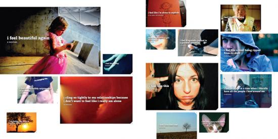
The book’s volume of data and graphics quantifying social phenomena might resemble a “state of the blogosphere” corporate social media report in some ways, but its presentation directs attention back to the emotions featured rather than trying to tie them to any corporate or governmental agenda. This is a book by, about and for individuals in contemporary mediatised society. I found reading it became quite overwhelming sometimes once I had adjusted to its presentation.
Dictionary definitions, statistical breakdowns of the kinds of words, ages and genders of bloggers and other demographic and affective data are presented in compact graphic form on every page, and larger charts show more general conclusions. Feelings, or the words used to refer to them, are shown to vary between genders and as people age. This is an exemplary application of Edward Tufte’s science of the graphical presentation of information. They even have sparklines. But that science is applied to data that is at its heart qualitative rather than quantitative.
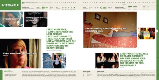
Such “data visualization” was a hot trend in 2009. Visualisations of crime rates, corruption, climate change and other issues can be produced using such data, and have become an important weapon in the arsenal of visual persuasion. On the We Feel Fine web site, feeling data is mapped to coloured blobs in an interactive user interface to the constantly updated (every minute) database. In the book, feelings and demographic information are processed to produce graphics that represent the prevalence of feelings over time, between genders, in different locations and in relation to each other. But as visual persuasion this is directed back to the vividness of human, qualitative experience rather than a more political or economic agenda.
“Sentiment analysis” was also hot trend in social media marketing in 2009 and its limitations quickly became apparent. Current systems simply cannot handle irony, sarcasm, regional differences in the usage of words and in many cases even simple negation. The We Feel Fine system is an exercise in gathering affective or sentiment data to visualise, but it avoids the pitfalls of sentiment analysis by automating only the gathering of the statements of emotion themselves, not analysis of how they relate to what they refer to. This is a classic example of well-chosen limits strengthening a project.
The problem of the relationship between qualitative (how you feel) and quantitative (how many people feel what you feel) data and how to deal with this in a non-voodoo way are avoided in We Feel Fine because of this.
Another 2009 hot trend was “big data”, the assembling of datasets that vary from many megabytes to many gigabytes in size. Datasets from regional and national governments, scientific research and freedom of information requests can be used in “data mining” to search for facts among the numbers. The We Feel Fine system is a good example of a big data dataset (and API, application programming interface, for accessing that data over the web). Unlike global temperature data it neither offers the possibility of objective accuracy nor involves any great risk if it lacks it. But it does reintroduce the human subjectivity that big data threatens to replace with numbers.
The striking thing about this is that although the We Feel Fine book is very much of the zeitgeist for 2009 the web-based system it presents started five years ago in 2005. At that time blogs were regarded by the mass media as disposable, narcissistic and somehow inauthentic. They were an unlikely subject at that time for art concerned with the authentic expression of emotion. We Feel Fine’s history, subject and results therefore both prefigure and go beyond the current state of the art in Internet social and corporate culture.
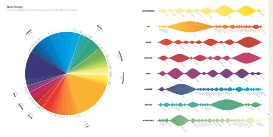
Harris and Kamvar are admirably candid in laying out the history, methodology, technology and in the case of the book’s production even the finances of their project. The code listings included in the book are tantalising glimpses into how the We Feel Fine server works, allowing a rare chance for students and artists to study such a system, and are licenced under the GPLv3. The book is under the obscure but principled Creative Commons “Founders Copyright” licence which will automatically expire the copyright on the book in twenty years time. This is all invaluable for critique and study of the project by artists, academics and anyone with an interest in art and technology, and more artists should do it.
In the FAQ and other essays contained in the book Harris and Kamvar are open about the methodological strengths and weaknesses of the We Feel Fine system. They acknowledge the limitations and demographics inherent in profiling bloggers (who are younger, wealthier and more technologically savvy than is usual). They also make a convincing case for the very real conceptual strengths of the project, discussing how the system holds up as science and statistics. And the project itself is overwhelming as an aesthetic and, strangely, somehow as a social experience.
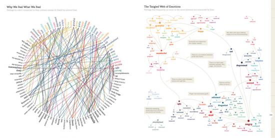
Even if we don’t deny or question the existence or status of emotions for ideological reasons, do we know what we really feel? And even if we do know what we really feel can we really express it in a way that will be understood by others? We Feel Fine doesn’t address these questions. They are outside of its scope. Its acceptance of sentiment at face value and its mechanical (re-)production of representations of sentiment might look like the hallmarks of kitsch. But that would deny the subjectivity of the original authors of the expressions of sentiment that We Feel Fine processes. And a progressive art needs to represent the masses, not merely rulers and pop stars. Not everyone will be feeling ironic or critical on any given day. Given this, the transparency, scale and effectiveness of We Feel Fine mean that ideological objections to big data, to emotional taxonomies, or to the very idea of emotion face a problem in the project’s aesthetic and affective success rather than vice versa.
Some of the stories found while researching the posts and presented in the book are heartbreaking or uplifting, but the statistical nature of the project makes these outliers – they are rare events and can be identified as such. What comes through from page after page of casual statements of feeling is an impression of the range of human experience, or at least the range of human expression. If you can adjust to the montage format and the diagrams then the book can inspire sympathy, pity, and joy for your fellow human beings.
The book ends by considering the philosophical and spiritual meaning of feelings, how they affect our lives, and what we can do about this. The data gathered to back up this consideration makes the conclusions both persuasive (this is a paradigmatic representation of humanity) and surprising (that would be telling).
We Feel Fine faces up to the challenge of making Internet art that realistically deals with the scale of the contemporary web. It does this by tackling the millions of daily new entries in the blogosphere but crucially it retains a focus on qualitative, subjective human experience. In its engagement with multiple levels and kinds of representation, from emotional taxonomies and statistical methods to digital photography, weblogs, and data visualisation, it shows just how broad are the range of systems and modes of depiction that artists can and possibly must deal with today. And it’s a project that simply wouldn’t exist if the people who made it couldn’t code.
We Feel Fine is a persuasive and insightful portrait of the individuals that make up the blogosphere. It can be overwhelming in terms of the amount of information and in terms of the volume and strength of emotion presented, but that is part of what makes it vivid. It is a paradigmatic, realistic and persuasive depiction of the qualitative experience of individuals within networked information society.
The text of this review is licenced under the Creative Commons BY-SA 3.0 Licence.
Featured image: Photograph of a creative experiment on more intelligent modes of inhabiting the planet
Open_Sailing‘s biggest achievement is perhaps to have turned our future into an open source project. Led by a group of enthusiasts, gathered around the idea of “we don’t know what will happen, but together we can invent our future and cope”, the project puts forward a very ambitious, action-driven, experiment-led, way of thinking forward. After meeting with the founder of the project, Cesar Harada, Open_Sailing proved to be a much more complex enterprise than I originally thought.
Initially the project started by mapping threats, the idea being that threats can produce something else than fear. Indeed Cesar Harada, was decided to turn threats into design constraints. This constitutes an interesting methodology to deal with the current climate of fear. The exploitation of threat has become the standard procedure to stabilize a permanent state of emergency. Mobilising virtual threats, states acquire exceptional powers that facilitate the implementation of ever more pervasive measures of control. The current case of swine flu is the last of a long list of exercises of mass modulation of fear. War on terror is the paradigmatic one. On the other hand, and following the warnings of the Maya calendar, all sorts of popular tales for an apocalyptic 2012 have started to populate the planet.
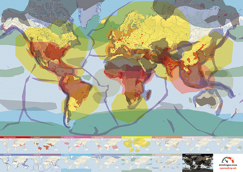
The role of Open_Sailing is to function as a catalyst that channels all this energy into the production of a better future. In short, its role is to transform fear into hope. Certainly this functioned as a strong attractor for new collaborators and soon the team started to grow. After putting together large amounts of real-time data about all sorts of dangers such as tsunami, terrorist attacks, nuclear accidents or pandemics, it became clear that the potential safest spots on earth were mostly located at sea. That led to the idea of designing the infrastructure necessary to inhabit those spots based on the concept of ‘Open Architecture’. Fear had been successfully turned into an active force unleashing the creative process. Inspired by this initial concept the Open_Sailing team started a very intense process of scientific, technological, architectural and artistic research that resulted in a first prototype awarded at Ars Electronica: Open_Sailing_01.
“A drifting village of solid and comfortable shelters surrounded by flexible ocean farming units: fluid, pre-broken, reconfigurable, sustainable, pluggable, organic and instinctive.” [1]
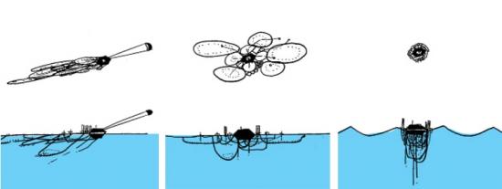
This drifting village, which is about 50 metres in diameter and can host four people, is designed to respond to its environment, being able to become compact and endure severe weather conditions, and spreading out to harvest in calm situations. Open_Sailing_01 was supposed to set sail last May 2009 but mis-coordination in the production with Ars Electronica delayed the plan. In the meantime, small intermediary prototypes of different modules are being built and tested constantly, but the Open_Sailing team hopes to put together the main modules of the International_Ocean_Station for general testing by the summer 2010.
One other important thing that came across in the interview with Cesar Harada was how soon after Open_Sailing was set in motion, it became clear that the project was not only about escaping the problematics of our society. It was definitely not an idealistic utopia happening elsewhere and starting a world from scratch. Rather than an exercise of escapism, they realised that the idea of inhabiting those sites where there is no threat had become an experimental laboratory where to grasp the future. Indeed Open_Sailing is very much about finding ways to face and deal with the very problems of our world.
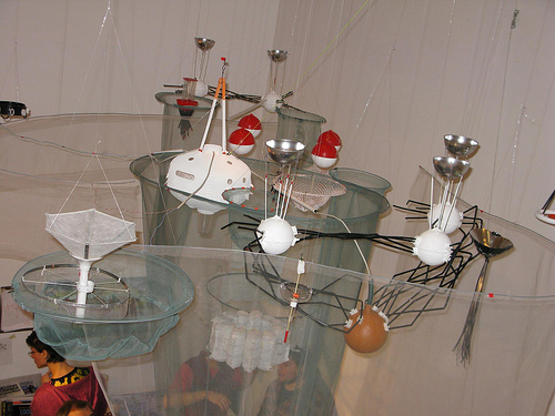
“Be it overpopulation, global warming or energy conflicts, we are living in a time where ‘Apocalypse’ beckons. We need to collectively invent and spread bootstrapping DIY technologies for the forthcoming challenges, not only to survive but to re-invent how we inhabit this planet.” [2]
This became particularly obvious when the team flew to Morocco to try out some live-saving structures. Between the coast of Morocco and the Canary Islands in Spain hundreds of illegal immigrants die every year at sea. A high-seas permanent shelter would provide a low cost life-saving facility for the migrants.
This particular instance is also paradigmatic of the way in which experimentation is carried within the project. Future thinking is developed through material instantiations. This very characteristic process of design and engineering disciplines gives Open_Sailing an exciting palpability, a materiality, a commitment with actualisation that accounts for its potential to bring about real change. Commitment with results drives the project away from the artistic disciplines, but the poetics of the project undeniably brings them back together. A project that in a year of development has acquired such a level of complexity necessarily had to go through a very intense and accelerated process of conceptualisation and experimentation. And there comes the figure of the enthusiast, an experimental survivalist who is willing to take a plane the morning after an idea has come up to participate in a military training testing life-saving technologies.
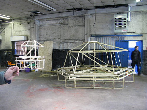
Even more interesting is perhaps how this enthusiasm becomes contagious and the project starts to work as a truly open source venture. Open_Sailing becomes a powerful autonomous entity that keeps bringing people in a dividing itself into labs. Each new lab engages a whole new group of contributors, with a new set of preoccupations and hopes. The project proves to be definitely not about the implementation of a master plan or utopian blue print, but an example of how open source can literally be applied to the construction of alternative worlds. Within these labs we find different experimental research projects focusing for example on mesh networking; pollution, climate and natural reserve monitoring; sustainable aquaculture in high seas; or energy autonomous systems that generate electricity through wind, sun or wave power.
Now, there is of course the problem of co-option. The research being done is a very useful material with infinite commercial and even military applications. But perhaps this is not something that compromises the success of the project. Rather, its value lies in its capacity to encourage people to co-design their own futures. It is more about joining people that want to create than attracting those that want to buy. Surely, it is the process of creation of alternative that’s been set in motion that is truly significant, even more than the technologies being produced. Furthermore, Open_Sailing manages to reverse the process of co-option, the same way it reverses the effects of threat. Collaborators turn to scientific institutions, corporations, military research, as a useful resource, and then open up the knowledge acquired. This is not a new ‘green design’ product for the consumerist society, it is a spark for a collaborative rethinking of the world.
Image: Wilfried Agricola de Cologne. All images courtesy Wilfried Agricola de Cologne
A person would think that, while watching the infrastructure of print journalism implode, or while noting the universal flight of viewers away from the television set, film makers would learn from the missteps of other mediums and make an early ally of internet distribution. But, for the most part, no, that is exactly what is not happening in film circles. Artists and film makers may put a trailer or a few movie stills up on a web page, but the film itself? Even in the age of broadband, it seems Netflix takes online distribution more seriously than curators. Fifty years after the invention of the internet, it’s still the case that screening a film online will certainly invite rejection from a festival circuit of jurists seeing premieres.
Since more than half the video I watch is now online video, my first question for artist Wilfried Agricola de Cologne was what he thought of these types of film festival policies. According to Agricola: “This is completely out of date. We live now in 2009, not in the media stone age of 1980. I think such a policy is principally wrong, since it is up to the artists/directors to choose and decide how they want to deal with their creative products.”
A media artist and film director himself, Agricola is also the founder and of the Cologne Online Film Festival, or CologneOFF, an online festival where I’ve lost more hours than I want to admit watching great art films from all over the world. Agricola describes CologneOFF as a new concept in art cinema – the networked festival – which includes a networked jury, networked contributions, networked screenings, and networked audiences. Now in its fifth year, CologneOFF takes place in the virtual and in the physical simultaneously, first, through the on-demand festival website, and second, through traditional screenings offered by cooperating partner festivals. In addition, each CologneOFF festival, from 2006 to the present, is permanently available for on-demand viewing online.
The ideas at work here are simple. If you like art cinema, you can watch some whenever and wherever you like. If you make art cinema, your avenues of distribution are becoming a bit more independent of external influences. If you are an absolute traditionalist, CologneOFF, and other festivals like it, show that programmers and filmmakers may not be able to avoid the Internet audience much longer and that barring online and interactive films from the festival circuit may not be the most forward thinking audience policy. After organizing over a hundred new media festivals, Acgricola questions the agenda of the anti-online curator: “Such a policy will not survive in the end or [it will survive] just as a fossil, since already now the best film and video artists use the Internet for their purposes, and some of them make currently big careers. Nobody honestly cares about some remaining totalitarian structures from the good old days.” Agricola notes that, as the CologneOFF continues, it creates its own rules, and follows those rules more and more.
Whatever your motives, the films are excellent, easily as engaging as the work you might see in a museum or traditional art cinema screening. Some have been shown in galleries. One example, Casey McKee’s cerebral chase film Corporate Warfare (2005), which pits two briefcase carrying, business-suited adversaries in a knock down drag out fight on the escalator to nowhere.

Since its beginnings, CologneOFF’s primary focus has been on films that examine memory and identity. As mentioned earlier, a visit to the festival website will give access to the festival’s earlier themes of identity, image and music, and art cartoons and animation. This year, under the title Taboo!, there was a special emphasis on the issue of prohibitions, the forbidden, and the transgressive.
Filmmakers Jaime Waelchi, Anna F.C. Smith, and Les Riches Douaniers responded with especially disturbing images. In Little Pleasures, Waelchi indulges herself in chewing gum to the point of drooling, choking, pain. Meanwhile, Smith uses Which Came First (2009) to present an ordinary kitchen chore as a scary and destabilizing sexual metaphor, drawing a link between taboo and the everyday household routine.
Image: Little Pleasures, Jaime Waelchi, USA (left) and Which Came First?, Anna F.C. Smith, United Kingdom (right)
There are notable works of machinima in this year’s program. If you can bear to watch, the film partnership Les Riches Douaniers remix Grand Theft Auto IV as a squishy critique of avatar indifference in the face of massive multiplayer game violence in their short film Motorized Ordeal (2009).
Watching movies as conceptually dense as these made me wonder when the online movie grew up and how it happened so fast. But when asked if this years entries were more complex than perhaps some of the straight plotted narrative entries of earlier years, director Agricola disagreed, reminding me that CologneOFF has always attracted challenging works. Often there is more worthwhile art cinema than even Agricola can present: “There were … too many excellent films submitted. Choosing Taboo! as a topic, we were hoping we would receive less submissions, but in the end we received 203 films and videos. This may … not sound [like] too much, but every work is reviewed several times before a selection is made and reviewing more than 200 films seriously represents a challenge for everybody, especially if so many good submissions come in.”
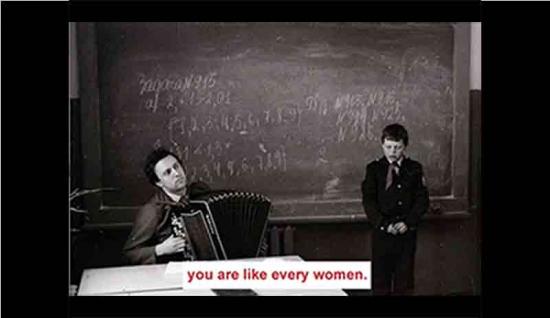
On another note, what is especially exciting is the maturing use of digital effects as an artistic medium in its own right. In Red Star (2009), Milica Rakic overwhelms history by creating a personal memoir of the past that blends archival photography, cut-up titles, and Serbian folk music. Part of the post-MTV generation, Nikesh Shukla assembled his film, The Great Identity Swindle (2008), as a video comic book that literally draws a picture of the taboos he faces as an adolescent Br-Asian. Thinking about the rules of personality led Sibylle Trickes to use video mutiples as an army of her many selves in her film cyclic islands – we and me (2009).
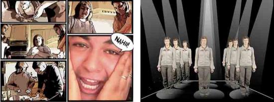
As digital tools move beyond the service of the seamless Hollywood effect to expressive mediums in their own right, what other cinematic forms might emerge from the digital film and the networked festival? Agricola says that technology is advancing so rapidly, he would need to be a fortune teller to predict the future of online cinema. However, he does point out that the Internet has already revolutionized the both viewer behavior and the distribution of art film: “Everybody can determine for himself where and when he wants to enter cultural contexts. I think, the physical live festival and the independent online availability complement each other, and make cultural experience for people, generally, much richer than it has been before ever. The development of cinema needs such different types of approaches, in order to be more attractive and future orientated. Restrictions are there to be overcome.”
A conversation between G.H. Hovagimyan and Mark Cooley conducted through electronic mail – January 2008.
MC: Over the years, you’ve had experiences with various authorities that have tried in one way or another to censor your work. I’m interested if you could identify and comment on particular sites of censorship that exist in and around Art institutions and identify some the taboos that tend to generate negative responses from potential censors (curators, board members, sponsors, politicians, and other interested parties).
GH: The most blatant example was a piece called, Tactics for Survival in the New Culture. It was a text piece. I was going to put it in the windows of 112 Workshop (the first alternative space in New York City & the US) in 1974. Since 112 depended on grants from NYSCA and National Endowment for the Arts I was told I couldn’t do the piece because it would jeopardize their funding. I did do the piece later for another exhibition called the Manifesto Show for COLAB (an artists group I was a member of). When I first started working on the internet twenty years later in 1994 I put the piece up as a hypertext work. I have also updated it from a manifesto to an interactive textual maze http://www.thing.net/~gh/artdirect . The piece is not cute. It deals with the dark side of the American psyche. It is a meditation on the psychological states that would bring one to be an anarchist. It is a New York Punk Art piece. Punk was a rebellion against the fake hippy utopian art that was being produced at the time. That type of art is still being produced. It gets a lot of funding because it is uncontroversial.

There are of course several ways to censor artists for example the simplest is to not include the work in an exhibition or ask the artists to alter the work to make it more acceptable. This happens to me a lot in the US. Several of my artworks in particular my net.art works have sexual content. One of my first internet pieces Art Direct/ Sex Violence & Politics was always raising hackles because of the sexual content. It was not included in several major internet shows because the museums were afraid that children would come upon the images and they would be liable. In this case both the government and the institution censored the work. In France the same work was featured in a centerfold of Art Press magazine in a special issue on techno art.
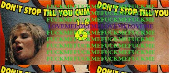
People who censor are often corporations flexing their muscle. One of the pieces in Art Direct … called BKPC used Barbie, Ken and G.I. Joe dolls. At some point the isp host, *the thing* received a letter from Mattel toys demanding that the site be removed for violation of copyright. I had to get a lawyer and send them a letter saying it was fair use and for them to back off. Luckily the people at the thing were not intimidated by Mattel so the site stayed up. By the way BKPC is about interracial sex so it makes people uncomfortable or it’s titillating. When I showed the physical work in a Christmas showed called Toys/Art/Us, I was asked by the curators to make sure that children could not view the art work. I did this by mounting the works in glassine sleeves on a podium that could only be seen by standing adults. I was lucky the curator wanted to show the work and was willing to work through the problem with me. In other cases the curator would not be that imaginative and simply shy away from showing anything that was vaguely controversial.

Another case of censorship was the Whitney Art Port an online new media projects gallery. I did a piece called Cocktail Party that featured synthetic voices in conversations as if they were drunk and at a cocktail party. I was asked to remove three sequences because of their sexual content. I wanted so much to be included in this project and the curator was a friend that I altered the piece, removing the offensive parts. The curator was afraid that the corporation would stop funding the project if I offended them with my overt content.
This happens all the time to every artist and it’s quite a dilemma. If you do the work unaltered it often means that you are not ever selected again for exhibitions. But then again Michelangelo had to paint a fig leave on the Sistine Chapel.
MC: The funding issue is interesting to me and seems to come up in many of your experiences. Censorship stories, as rarely as they are covered in the news, seem to focus heavily on the ideological component of censorship and whether public money should be used to fund controversial art. I’m interested to hear more about how anxieties regarding funding (public or private) influence curatorial decisions inside art institutions. I’m interested to hear your thoughts on this sort of economically determined censorship and its effects on art and public discourse around art. I’m also interested to know if these funding anxieties have worsened or changed as art institutions have switched over to the Arts management model and have made themselves so dependent on corporate sponsorship for programming?
GH: I did a large billboard piece called Hey Bozo… Use Mass Transit. It was five large billboards scattered around New York City to convince people to use mass transit. It was part of a competition put on every year by the MTA and Creative Time. I received an Honorarium of $500 and they produced the billboards. The piece caused such a stir that it was in the papers for a week straight and I was on TV on all the networks. One of the upshots was that conservatives wanted to know why public money was used to produce an artwork that insulted motorists and the other thing that happened was that Bozo the Clown tried to sue me for trademark infringement because I used the word Bozo. These are symptoms or indications of a deeper issue albeit a populist one. One the one hand you have a media figure (bozo the clown) who tries to sue anyone who uses the word Bozo. He’s got a sort of cottage industry. This is the way that corporations deal with the avant garde they can’t control. On the other hand you have mass media that tries to produce outrage in order to keep the attention of the population. This is also called delivering eyeballs and is a way to sell advertising. As you can see the main tool to attack an artist is money. either cut off funding or sue them. This is a way to stop them from getting their message out whatever that message might be. But there’s a flip side to this coin. We live in an information environment. There really is no way to stop information from coming out. It will be presented in a different venue for example the internet or in the case of art, alternative festivals, galleries etc.. So the idea of censorship is media specific or venue specific. It becomes a power game that is about who controls the venue and therefore controls the message. In this case it’s a reflection of the capitalist marketing system and art is a part of that system. But I see art as something beyond that system.

There are essentially two economies for art. One is the market for objects this includes galleries, museums, magazines and all the ancillary services of art fairs etc.. The other is the academic economy, which trains artists, curators and all the people interested in art. These systems shape what art is seen and what the content and style of the work is about. Both systems have self perpetuating mechanisms. In the market it is about the object. If you don’t make art that has a physical object you can’t be in the market. There is a component that has to do with entertainment and ticket sales in museums. This allows for installation and performance art as well as digital art and screen based art. Indeed, the economies of temporary museum spaces are a reflection of corporate manager style art.
The academic system on the other hand allows for artists who don’t necessarily fit the market to have some financial patronage by teaching. The problem is that the artist’s work and creativity is all about getting students to attend the university and their own class. This is another form of marketing.
I believe in a different type of art, an experimental, anarchic art that shakes things up and operates outside the existing art economies. In many instances this has been confused with the idea of an alternative life style that is a sort of well of inspiration for entrepreneurs looking for new products, ideas and people to sell to. Anarchic art is about something different it’s about challenging and critiquing the existing systems. Why? because I believe that art is about seeing things clearly and is one of the few areas that has freedom. That form of art becomes dangerous because it is uncontrollable. It can’t be packaged and marketed. That is why there is always a move towards censorship of radical art works.
There is also fake censorship or more precisely using outrage as a way to manipulate the art market. This is used successfully by people like Maurice Saatchi who had a show of his Young British Artists at the Brooklyn Museum. This show was also shown in England and there was outrage in London as well. The outrage in the US was about Cris Ofili’s use of elephant dung in a virgin mary painting. A nice piece of art that was about his African roots. The outrage in London was about a photograph that portrayed a famous criminal child murderer in England. The public and the press demanded the works be “censored.” The works themselves went up in monetary value because of the outrage. The position is that of an artist that uses an epatez de bourgeois position in their art. This reinforces the patron’s sense of being better than the masses. It is an elitist position. I happen to like the art works but the content of the pieces are standard for the art world. The Ofili piece is multiculturalism and the other work is punk. Both styles were first presented in the late 1970’s and I view these latest pieces as stylistically conservative.
As you can see the notion of censorship is more of an unfulfilled demand by an outraged person in the street than any sort of actuality when it comes to the marketing of objects. Those works that are actually censored one never sees or hears about.
MC: I’m interested in what you call “fake censorship” or the use of public and media outrage as a marketing tactic. I’m reminded of an article – http://rtmark.com/rockwell.html – by Jackie Stevens concerning “Paradise Now: Picturing the Genetic Revolution,” a 2000 Exit Art show concerning biotechnology. The article points out that, though the show included some very hard hitting criticisms of the biotech industry, it was nevertheless sponsored by biotech companies – companies that would have much to lose if consumers in the U.S. had the same sorts of concerns about biotechnology as some of the artists in the show. The obvious question of why would the biotech industry sponsor exhibitions that are openly critical of the industry’s practices is answered with the help of interviews with the chief biotech investor behind the show. Stevens writes, “The reason is simple: art about biotechnology, especially with a critical edge, serves to reassure viewers that serious concerns are being addressed. Even more importantly, biotech-themed art implicitly conveys the sense that gene manipulation is a “fact on the ground,” something that serious artists are considering because it is here to stay. Grotesque and perverse visuals only help to acclimate the public to this new reality.” I am also reminded of a transcript I used in a piece once in which a Sara Lee Corporation executive, speaking of the corporation’s “gifts” of impressionist art to the Art Institute of Chicago, stated, “Sara Lee’s art collection has made a statement – a quality statement – about our company. Art is all about excellence and vision and striving for perfection – the same standards that we uphold for our portfolio of leading brands. We are quite certain that the ‘brand names’ of Monet, Renoir and Degas have been a great complement to Sara Lee and have become icons of excellence that reflect our approach to doing business.” It seems that the mythology of fine art or the aura produced around fine art itself (namely, mythologies concerning artists being prophetic or ahead of their time, that art is about transcendence, universals, timelessness and so on) is a very useful context for the deployment of marketing schemes. Cases like these I’ve mentioned could almost make one nostalgic for old school censorship – the kind in which an authority comes down on an artist for producing work that is perceived as being offensive. At least in these scenarios the content is working – the work is having an effect. All this raises a couple of questions that I’d like to know your thoughts on. Firstly, do you agree with Stevens’ assessment that the content of an artwork as intended by the artist can be eclipsed (effectively censored) by the curator, sponsors and institutional framework surrounding the show and fine art itself, and if so, should artists be trained (in academia and elsewhere) to be able to anticipate how their work is being used in a larger context and be prepared to engage in content production beyond the frame (so to speak)? What are the lessons you have learned over the years in these regards?
GH: This goes back to Wittgenstein’s Dictum, “the meaning of a word is its’ meaning,” and “The meaning of a word is its’ use.”
Look at it another way Steve Kurtz http://www.caedefensefund.org was creating some bio-art that was also political when he was arrested. The event caused the USGOV to come down hard claiming he’s a bio-terrorist. The art world has rallied around Steve and is doing what it can to stop his persecution. Steve’s artwork was in process and never exhibited so you can’t say that it was censored and yet the USGOV is trying to pin a terrorist label on him. The context here is fluid between a media occurrence, freedom of speech, and forces of unreasonable paranoia. Steve and the people around him now have an ongoing performance work that is a cause celebre about free speech. In the end it doesn’t matter if anyone ever sees the actual work, the censorship and repressive activity of the USGOV is the key factor. When realpolitik comes up against art, art always loses. On another level both sides of the Steve Kurtz dilemma are winning because they are using the event to create meaning for their separate actions.
Back to your initial question which is the context created by the venue and the funders. There is always a deal struck between the funders/patrons/venues and the artists that show in the venues or accept support from the patrons. The patrons are seen as progressive and open because of their support of the arts. The artists are seen as giving their support/approval of the patron and the gallery system by participating in it. That’s the simple deal. The complex deal has to do with the content of the artwork. When the church is your patron you do religious paintings. When the Dutch merchants are your patrons you do domestic scenes. When the government is your patron you do heroic art that glorifies the government and its programs. In America the market has become the patron or more correctly corporate marketing capitalism and its technocratic bureaucrats/ managers are the patrons. The content of art reflects that reality.
However, there are many forms of art that operate outside these realities. The notion of experimental art is an art that doesn’t function in established arenas. Maybe we can call this theoretical art because it posits an art that can function outside of the normal venues set up for art.
In terms of censorship it may be more of a case of power and control. If one chooses to work in theoretical art one can expect no support from the existing patrons of the arts. This is a very fundamental struggle about who controls the meaning of art (content). Who controls the how, when and where of art? That is one of the reasons that I choose to work with the internet and digital art. The venues are much freer. There is little or no market action attached to this type of artwork. Indeed, this very interview is an artwork that uses the internet as its vehicle. I can state that it is an information/meditation that comes from the use of the networks. In this case it is an outgrowth of all the other communication artists that have come before me such as Fred Forest or, Joseph Bueys or Allan Kaprow.
MC: Earlier, you spoke of an anarchistic art practice that would function in opposition to the status quo. I’m assuming that this art practice would take on the political economic structure of an anarchist community. What might this look like? Are there examples of art subcultures that operate on anarchistic principles like anti-authoritarianism, free association, nonhierarchical organization, consensus decision making, egalitarianism, etc? I’m also interested in your estimation of online communities and new media art portals (like Rhizome.org for instance) who seem to reference some of these concepts in their mission statements yet seem to fall short in their editorial structure and policies. Perhaps, the concepts that sites like Rhizome imagine – decentralized and nonhierarchical – and indeed the internet itself seems to offer – would work in such stark contrast with what the dominant values of the fine art establishment (and our dominant political economic systems) that it becomes impossible to maintain funding, affiliations etc. Do you think the openness and opportunity for alternative systems and practices that electronic networks offer(ed) is now closing up, or do you see as much opportunity now as in the mid-to-late 90’s when it comes to networked art practice?
GH: There are many artists groups that are functioning at the moment. There is always a struggle and a dynamic where groups are involved. Rhizome has set up a sort of blog/news reporting website that has a brand name and a loose community around it. They have a mailist that functions somewhat as a place for critical discussion but the fundamental question is how does one move from discussion to action. The answer for rhizome is to be techno-centric and highlight emerging artists and technologies. They also spend a lot of time fundraising. The original project of rhizome by Mark Tribe was a simple anarchic mailist. This was also happening with nettime and thingist lists. There is one functioning now that is called [empyre] that comes out of Australia. Empyre was one of several list/communities that was featured during the documenta 6 in Kassel. I was actually involved in the discourse. My position was that I wanted to have my thoughts presented at the documenta http://magazines.documenta.de/frontend/article.php?IdLanguage=1&NrArticle=1718 .
There’s a back and forth flux on the internet that has some onerous aspects of fake digital democracy and fake creative freedom. This is web 2.0 where everyone can be creative and be content providers ala blogs and youTube etc.. This is the corporate bullshit of Facebook and Second Life. There’s an interesting piece in the Guardian about facebook that has be re-published on post.thing.net http://post.thing.net/node/1883 .
In any case, I am involved with three very vital digital art groups that have online/offline communities. One is called [PAM] http://perpetualartmachine.com – this is a video-artists community that has a physical kiosk presentation mode that is very much about non-hierarchical presentation. Another is locus sonus http://locusonus.org in France – that is an experimental sound art lab. I’ve also organized an artists group called Artists Meeting http://artistsmeeting.org that is just beginning to pick up steam. Part of what these groups are about is using the technology to create a media space for group interactions to occur. The funding model is pooling resources. I maintain the server nujus.net that Artists Meeting and locus Sonus use. The sysadmin is an engineering student in Split Croatia who is donating his services. Locus Sonus is funded by the French Cultural Ministry as an experimental lab. [PAM] got its’ start by being included in the SCOPE art fair and artists Meeting is bootstrapping it at the moment.
What these groups have in common is the notion of doing projects together rather than having an individual artists’ voice. I like to engage in both positions, that is, I do individual pieces and I do group works. Two previous projects are accessible on the web right now. One is called rantapod http://spaghetti.nujus.net/rantapod and is a series of performance/meditations that is downloadable to ipod. The other is called Art Dirt Redux http://spaghetti.nujus.net/artDirt, which is a podcast/sound art piece. These all challenge the art market in some way because they exist and are seen by large numbers of net audiences without any artworld support whatsoever. So I can say that the internet does still function as a good venue for experimental anti-hierarchical art.
MC: In preparing this conversation for publication I noticed that in one of your initial emails to me – before we actually started the interview – you stated that you’d been censored for not using particular software or hardware in the production or display of your work. I think this ties in nicely with our discussion concerning corporate funding, but something that seems more of an issue in new media art then anything else (I can’t imagine a paint company sponsoring a show and requiring the artists to only use their brand of paint). Perhaps you have some thoughts on this.
GH: There’s a lot of net.art and digital curators who set up defining parameters for new media shows. These often focus on a piece of hardware or a type of coding as an organizing principal. This plays into or is a symptom of the computer/technology scene where there are *platform* wars such as internet explorer vs. netscape or mac vs pc. There are software wars such as Dreamweaver vs GoLive. These competitions are about dominating a market. This also happens in digital art where a group of artists insist that for example they are the only net.art artists that exist and try to corner the market with the willing help of a number of curators. Often artists working in new media believe that you must write your own code in order to be a digital artist or you must use JAVA or you must use open source software or …. You get the idea. I remember once speaking at a panel where there was a net artist who was using perl and php and Peter Sinclair and I were using Max MSP. The other artist talked only about the coding structure. Our piece used custom built software as well but we were interested in the content and the user interactions. This happens all the time where a person mistakes writing code for art or insist that digital art is only code. It’s a rather boring discussion about hardware and software.
The original interview with G.H. Hovagimyan by Mark Cooley in 2008, can be seen here: http://flawedart.net/conversations/hovagimyan
G.H. Hovagimyan – nujus.net
Mark Cooley – FlawedArt.net
Main top image is from ‘A Soapopera for Laptops- A Soapopera for iMacs – Exercises in Talking’. A collaboration between Peter Sinclair and G.H. Hovagimyan. http://nujus.net/~nujus/html/soapopNu-2.html
This interview is licensed under a Attribution-Noncommercial-No Derivative Works 3.0 Unported
“Mapping CCTV around Whitehall”, 2008, is, as its name implies, a performance of mapping Closed Circuit Television (CCTV) security cameras around the UK’s parliament in London and a video record of that performance by Ambient.tv’s Manu Luksch.
Starting with a HAL 9000-like image of a CCTV lens, the video of “Mapping CCTV In Whitehall” has a glitchy techno aesthetic of sound and images with a post-MTV-Style Guide reportage feel. The first half consists of a recording of the police stop-and-search interviewing Luksch under anti-terrorism legislation, with a map of the area superimposed. The second half consists of CCTV views of the range of Camera number 40 being taped out, and of the people caught within those bounds. Words flash on the screen to identify the subjects of CCTV (….Artists! Sexy Arses!). This redeployment of the language of mass media visual persuasion opens up what we see rather than closing it down, making it a very effective encapsulation of the project’s ideas and aesthetics.
(One tiny criticism is that the video ends with a Creative Commons logo but doesn’t specify the licence. Artists, please at least give the licence URL, and do choose the copyleft BY-SA licence if you can…)
Wandering around to locate CCTV cameras may seem like a cosy techno-fetishist performance, a post-cyberpunk flaneur’s stroll around the streets of London with a pencil, an A-Z, and a tri-field meter. But the creeping authoritarianism of still-Thatcherite Britain makes it an act of protest against a specific law and a reversal of the assumptions of our seemingly unstoppable surveillance culture.
The Serious and Organized Crime and Police Act of 2005 criminalized political expression within an exclusion zone for a kilometre around Parliament Square. It is an indicator of the authoritarianism and assumption of privilege that has come to define political culture in the UK. It is too easy to become cynical in the face of such brazenly opportunistic ideology. If art can help to defamiliarise this in a playful and aesthetically rewarding way then it can help to undo that cynicism, and even more to go beyond it.
The assumption that the State needs to know where you are at all times, just in case you are a terrorist or a paedophile, but that you must not know the workings of the State, just in case you are a terrorist or a paedophile, is at odds with the idea of an open society. The area of London that Luksch has mapped is the SOCPA exclusion zone. A map of CCTV cameras is clearly useful to terrorists, and a map of the CCTV cameras near Parliament is clearly an act of dissent against the political consensus that constitutes domestic extremism. The police who interview Luksch touch on these ideas.
A political elite that is fearful both of and for its polity has retreated into managerial, authoritarian, paternalistic risk-management. That polity is conceived of, post-cold-war, not even economically, more nihilistically. This produces the very loss of freedom that it claims to protect against. The paradigm of government has become the watchful parent who is seen to be good by their watchful neighbours because they prevent their child ever straying into danger. But it is impossible to protect the population against all risk and this knowledge leads to impotent fearfulness. “Something must be done” and so security theatre, the spectacle of impossible systems and behaviours designed to reduce the perception of risk to zero, is used to reassure. Although whether the populace or the politicians are meant to be reassured it is hard to tell.
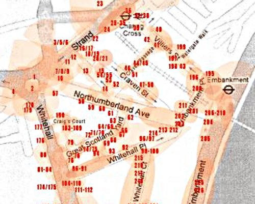
CCTV is part of that reassurance, of the spectacle of security theatre. The UK has the highest density of Closed Circuit Television Cameras (CCTV) in the world. The average Briton is (allegedly) captured on CCTV 300 times a day and there are more cameras in the supposedly open society of the UK than in notionally communist China. Not per head, in total. The area that “Mapping CCTV around Whitehall” focusses on is ground zero for this tendency.
CCTV doesn’t solve crime, it is used to spy on legal protest and it has been placed in school classrooms and pubs.
CCTV recordings are subject to the Data Protection Act, and from 2002-2008 Manu Luksch used personal data requests under the act to obtain the CCTV recordings of her going about her business that she used to make the film “Faceless”. The videos usually had other people’s faces blotted out to protect their privacy, which gave the resulting film its science fiction plot of people starting to lose their faces. But as Luksch was making “Faceless”, the responses to her personal data requests became rarer as the authorities adjusted the balance of power back in favour of themselves.
In 2008, Luksch returned to the subject of CCTV with “Mapping CCTV around Whitehall”, this time mapping out the CCTV cameras themselves within a particular area of London over two days. On the first day she located hundreds of CCTV cameras, on the second she measured the range of the wireless broadcasts of one of them. Part performance, part land art, this has a number of artistic precedents, from the 1960s conceptual artworks that consisted of magnetic fields or patterns of heat, to Situationists strategies for recontextualising the city by navigating it using the wrong map.
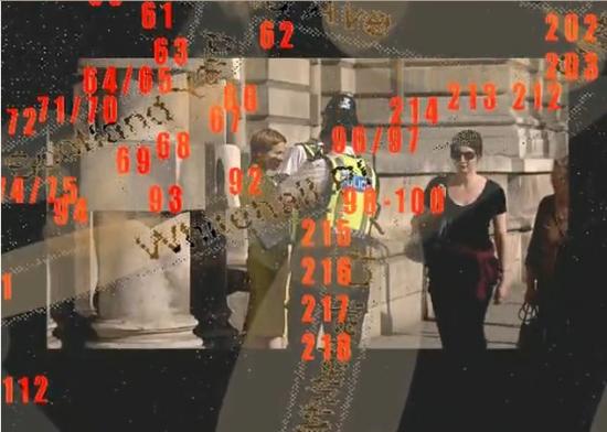
Mapping unseen electromagnetic forms was a strategy of some Conceptual Art, whether Art & Language’s landscape art infrared photograph of buried hotwires under a field or gallery-based magnetic and radio-proximity devices. Contemporary artists have used RFID tags Intangible form is irresistible for post-Duchampian attempts to keep the philosophy of art about aesthetics, and for conceptualism it is a way of keeping the artwork open. But the range of a CCTV camera is both definite and, if you have access to the camera, visual. The unseen form of the limits of its observation and the transmission of what it sees tie form to power quite directly.
In “Mapping CCTV around Whitehall” these forms and their composition are part of the landscape of the city. The city is obviously an artificial environment. In contrast, nothing might seem more natural than a painting of the landscape of the countryside. But landscape painting are depictions of valuable property for the landed gentry who commissioned them. They show and by showing make real the products of the ideology of the ruling class using aesthetics. They extend the domain of taste, a novel and socio-economically exclusionary concept, to the presentation of nature as property. They are as artificial, as culturally determined and laden, as cityscapes.
The successor to landscape painting is the “land art” of the 1960s and 1970s with its photographs of walks, mud and stones. Viewed cynically, the ‘land art’ of the 1970s is less about one man’s journey through nature than it is about cheap transport and expensive large-format cameras. It is a predecessor of the logistics art of Relationalism. The Romanticism that it shares with landscape painting is for its audience, not its commissioners. As with much art, those are two separate constituencies.
Art creates visual order and visual form for the unseen ideological order and form of the ruling class. Religious icons, jet-age land art and neoliberal Relationalism all serve this function. Critical art also depicts this ideological order, ideological form, aesthetically but to make it strange and criticise its production or content rather than to promote and naturalise it.
The Situationists treated Natopolitan 1950s Paris as a landscape to be made strange through art in order to critique the ideologies that sought to capture its population. Wandering its streets using the wrong maps was a way of challenging the authority embedded in its layout by the old regime and the new order that sought to impose its own new way of looking at things. Creating rather than using a map again re-arranges an equation, not just the equation of ‘derive’ but of the mass-media mass-politics spectacle that the Situationists were so opposed to. CCTV cameras may not seem like generators of spectacle, but their footage is used to sensationalise media reports of crime and terrorism, and their presence and visibility enforces the message that we are all part of an observed spectacle.
Radical land art sounds oxymoronic. But the aesthetics projected onto a landscape can be used as links to the ideology flattered by those aesthetics. And re-arranging the terms of land art can critique that ideology, or at least expose it to critique. “Mapping CCTV around Whitehall” re-arranges the equation of land art to make art of travelling to cameras in order to map the landscape they observe. This is a kind of critical, urban, reverse land art.
George Orwell’s vision of a mediatised totalitarian society from his novel “1984” is often used as a reference point for Britain’s surveillance culture. But this can obscure as much as it illuminates. Bringing out the true, novel, problems with CCTV surveillance as the default solution to the ruling class’s perception of society’s ills is an urgent and difficult task. As CCTV is a matter of the production and control of images, it is an area that art can usefully comment on. “Mapping CCTV around Whitehall” uses the status of art to represent the dark heart of surveillance ideology. Look upon its works…
http://ambienttv.net/content/?q=mappingcctv
Public screenings include ‘Films by Manu Luksch’ at Cinema2, Centre Pompidou (2009)
Betting on Shorts (2009)
http://ambienttv.net/content/www.bettingonshorts.com
NHK Japan (Japanese National Television, 2008), LIFT (2008)
Watch the video (160 sec, mp4) online at low-res.org
http://lo-res.org/~manu/MAPPINGCCTV.mp4
Or on Vimeo
http://www.vimeo.com/3802118
Featured image: A group of Australian media artists known as Horse Bazaar produce Digital Fringe at the festival
Every year as part of the Melbourne Fringe Festival (September 23rd – October 11th), a group of Australian media artists known as Horse Bazaar produces Digital Fringe. This is a nonstop digital playlist of short form video, sound, and images, some of it made by artists, some of it not, uploaded to the Digital Fringe website from around the world. Once individual entries are catalogued, the work is assembled into feeds and DVDs, and then streamed or delivered to a network of public and private locations. As expected, the festival’s general stream is sent to museums and galleries but, in an effort to commandeer every available space, Horse Bazaar also sends Digital Fringe to bars, cafes, public squares, libraries, restaurants, and pretty much any other location that will allow them in. You can see the festival online, along with an interactive map of this year’s screen locations, at the Digital Fringe website, http://digitalfringe.com.au.
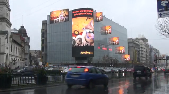
According to festival co-producer Simeon Moran, an estimated half-million people saw this year’s festival which was broadcast on about 250 screens. Most of these showings were in Australia, but there were also screenings in Africa, Europe, Asia, the US, and the UK. To project at locations where there is no existing equipment, on a street or in a public building, Horse Bazaar gathers donated screens from schools, community groups, and private supporters. To project across key buildings or monuments, Horse Bazaar calls in its mobile unit, also known as the MPU. Other than that, the festival can be, and is, about anything. There’s no jury. Submissions are not restricted to a theme. There’s just a global call for work followed by a global response.
As a result, one of the most enjoyable aspects of Digital Fringe is the range of sensibilities it manages to present. Emerging artists especially stand out. Among the more lyrical of this year’s entries is Waveform (2009), by the Amsterdam based French photographer Federico Campanale. Using video shot in Finland, Campanale lays an ambient track of digital pops and clicks against a perfect, languid, 360 degree pan of a line of trees reflected in a lake at dusk. The harsh, guttural rasp of the soundtrack set against the blue infinity of the horizon forms a direct commentary on environment and endurance, and on nature’s coexistence with the manmade.
There is the moody, existential narrative The Man in His Tower (2009) from Tone Gellein of Oslo. In this video, one of those tough guy movie characters walks down the street while suffering jump cuts and odd camera angles. He ends up swinging from lampposts in a cinematic expression of an existential state of mind. Other films may be less accomplished, but are equally philosophical. For example, filmmaker Joe Tusley sent in Spud & Amp in the Barra, Part 2 (2009), a no-frills documentary about a few minutes of fishing in the Apsley Straight, Bathurst Island, NT. Maybe it’s a personal reaction, but it’s hard not to think about the big picture as, on camera, Spud reels in a huge, silver barramundi, then slits its throat.
Digital Fringe also streams sound pieces, music videos, machinima, and performance films. There is a good amount of 3D modeling and animation. Colliderscope artist Zennor Alexander and musician Fiona Soe Paing submitted Thayn Tyha Hai (2009) from New Zealand. In this work, the sun and moon follow each other across a wispy, ethereal sky that lies somewhere between dreaming and waking. If you prefer something more scientific, there is the stop-motion simulation Every Second Equals Forty Million Years (2009) by animator Gregory Crocetti of Melbourne. In just under two minutes, Crocetti uses children’s blocks to build the Tree of Life from the beginning of time to just a little while ago.
There is software art such as Turkish programmer Tahir Un’s screensaver project Concepts and Images (2007). Ãœn chooses words ending with the suffix ‘ism’ as the query strings for an internet image search. After collecting images for 90 minutes, a software program fixes a random sampling of that data set into a collage.
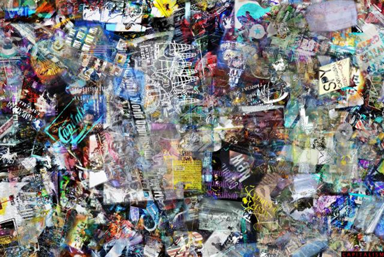
Another interesting aspect of Digital Fringe is its continued support of open source computing and shared culture. Artists uploading work to the Fringe website keep all rights to their projects and are able to license their work in a number of different ways. These include the traditional ‘all rights reserved’ copyright, the Creative Commons ‘some rights reserved’ license, and the completely unrestricted category of ‘public domain’. Creative Commons says that about 75 percent of the festival’s participants choose the CC license, which secures rights of ownership while allowing for mash-ups and remixes. This shows that many emerging artists are willing to distribute under non-traditional copyright provided there are a still few small protections.
Ultimately, Digital Fringe, is a festival that intends to include everyone, play everywhere, and show it all from the dreamscape of the perfect virtual environment to the underlit reality of the amateur video guy. Aside from its inspiring generosity, we get a lot of interesting experiments, the unmediated juxtaposition of the professional and the amateur, and a kind of yearly almanac of what up and coming digital media makers seem to have on their minds.
—
Link: Digital Fringe Trailer.
Image by Alice Alexandrescu.
This year’s edition of Artivistic brings the fields of art, politics and academia together under the theme of TURN*ON.
Eventually, the investigation about systems of representation – be they semiotic, informational or political – might slip into the one psychoanalysis considers the most elementary and surreptitious of them all: sex. That’s precisely where the Artivistic gathering got into in its fourth edition, which happened in Montreal from 15th to 17th October. To be exact, the theme under which the event tied the fields of art, politics and academia together was TURN*ON – according to its curatorial statement, ‘a fragile bridge extending, over a valley of which the depth you cannot see, to a life centered on pleasure, consciousness, togetherness, understanding, and joy’.
Formulated this way, the concept seems to be a response to the well-worn verses by journalist Eduardo Galeano, in which he states that utopia ’causes us to advance’ only because it ‘lies in the horizon’. With turn on, Artivistic proposes that the forces that move people forward and bring worlds into existence are not far away: in a scenario emptied of grand narratives, the desire (of the self?) should gain preponderance over any masterplans (of the party?).
So, if libido is the why, could we say that art is the how? As crude as it can be, this comparison makes clear that aesthetics, just as politics, mainly operate in the level of methods. They are more concerned with the way desire is manipulated (often repressed or enhanced) than with its ontological truth. Language cannot explain affect, and it shouldn’t pretend to – the best it can do is create spaces for its continuous exercise.
In that sense, what really stood out during the event were the workshops. I wouldn’t go as far as to agree with the idea that such activities are a distinct genre within the contemporary art circuit. Workshops indeed revitalize the exhibition space – however, they do so not by occupying it with new forms, but by proposing new forms of occupying it. In Artivistic, these interfaces ranged from diy electronics and card game design to pornographic filmmaking and even a kind of un-workshop on workshops! Among those, there was a remarkable amount of projects concerning the performative of one’s own identity.
In fact, the workshops punctuated Artivistic in a not much different way than the everyday activities of cooking and eating in group (or translating things to French or English – it was a true bilingual event). One thing led to another, keeping the gathering together in spite of the healthy excess of participant autonomy allowed by the organization crew. Of course, the concentration of (almost) all activities in the same place helped building this integration. This was a strategic option, very coherent with the intimate theme of this edition; the former Artivistic, about un.occupied spaces, had been distributed in different venues throughout Montreal.
The integration of the participants was so successful it had the minor side effect of creating an almost self-centred environment. Even though some activities would have been very interesting for people outside regular art-audience, it was hard to see among the public someone besides those that were immersed 24/7 in the event. For instance, it was a pity that the orgasmic birth workshop, which introduced alternative ways of pregnancy and labour, had no pregnant women participating.
This paradoxical isolation was imploded in the last night of the event – most ironically, not by the long-waited closing performance Resist Me Release Me: Turn On Act On, which artist Shu Lea Cheang had been organising with the participants throughout the gathering, but because of its impending cancellation. It seems that the managers of the venue where Artivistic was happening had not understood that the event would contain nudity and explicit sexual acts, and took account of this just in time of the final soiree. Since they had no public license to host this kind of activity, they said it was impossible to have the performance there: either it had to be suspended or transferred elsewhere.
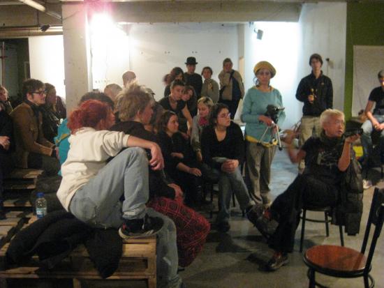
The organizers explained this incident to the participants and called for a collective decision. That immediately ignited a very intense discussion, where it became clear that what was at hand was not mere censorship, but a very subtle negotiation of the different spheres that Artivistic addressed. The autonomy people were requesting was not sexual, but artistic – ‘we do not intend to do an orgy, but performances’, as someone said. Hence, it was not a simple conflict between raw libidinal impulse and oppressive morality; it concerned more complex, structured systems – i.e. art and Montreal society, both already contradictory in themselves.
I dare say that some solutions proposed in this debate – for example, live-streaming the works from another place or ‘censoring’ performances in real-time – were way more interesting than any prescripted show might have been. These proposals were the sign of an art that was alive and kicking, ready to respond emergencies and fight back, instead of just claiming its secular, innocuous freedom (a freedom that critic Julian Stallabrass very cunningly regards as supplementary to that of the market).
The result was that in a couple hours the whole programme for the night was adapted and moved to a venue nearby, in a beautifully orchestrated, self-organized effort. Unfortunately, due to limitations of structure and space, not everything that had been planned before could be presented. Nevertheless, the accident had allowed the necessary hands-on without which a turn on just fades away, and something bigger was engendered in the process – I’d say revolutionary freedom, a kind of autonomy that, as the old leftist maxima states, must always be conquered.
Links:
Neptune is Brazil’s most powerful supercomputer. With the name of a God, its 16.2 trillion calculations per second, distributed through 256 servers with octo-core processors, are specially designed to help to model the nomadic structures of ocean currents and the surface of the deep-sea floor. With this ocean topography, it will chose the best place to install 150 million dollars of pipes, or risers, through up to 2000 meters of water, 2 kilometers of solid rocks, and then at least 2 kilometers of a fluid layer of salt submitted to intense pressure, and open a 1 cm diameter hole over 100 billion barrels of crude oil and natural gas on Tupi1 oil field2, liters of black oil that can make Brazil become the 5th largest producer in the world, overtaking Kuwait’s production. You may be asking yourself what does this has to do with art.
Since 2005, a series of radical conferences has taken place around Brazil, organized on a discussion list. The organic group of dynamic gatherings of these conferences call themselves Sub>midialogy – the art of re:volving knowledge logos by practices and disorienting practices by the immersion in sub-knowledge. Always moving through the countryside and remote regions of the country – and with very small initial support from Waag Society for Old and New Media, conferences have taken place at Campinas (2005), Olinda (2006), Lençois da Bahia (2007) and Belem (2009). At these events one could lay on the floor to listen to a passionate talk by Etienne Delacroix, join well-known Brazilian new media theorists to receive a collective electroshock, join in debates about public policies with Gilberto Gil’s advisor and friend Claudio Prado or just take a deep swim in natural rivers with the most important artists in the country. Many participants were international and national activists, artists, media practitioners, policy developers and government employees that showed up their face on those festivals. The talks and debates could happen anywhere at any time and many performances took place during each event. More than a simple meeting of friends to relax and enjoy while they discuss and work, this series of conferences were fundamental in the development and implementation of many of the governmental programs on social inclusion using new technologies and free software for media production, so-called “digital inclusion”. Many of those practices, theories, methodologies and platforms were developed with the ideologies, discussions and practices of Sub>midialogy in mind. And Brazil became a leading nation in these initiatives worldwide.

The obvious interest of the Brazilian government regarding the Tupi oil field arose in 4 different proposals: the first one changes the oil, gas and other fluid hydrocarbon exploration and production systems in the country from a Concession System – where the company responsible for exploring pays royalties over the extracted product – to a Share System, where the production is shared between government and the company that explores the reserve. The second project creates a Public Company called Brazilian Company on Oil and Natural Gas Management (Petro-sal) responsible for the administration of exploration on the same model as Norway. The third project gives the Federal Union the right to transfer exploration from Petrobras – until now the only Brazilian oil company – in change of money or public titles. And the 4th proposal creates the Social Fund that will support social (health, education, habitation), environmental and technological projects. It is important to note that only last year Brazil became a net energy exporter, mostly because of its aggressive push into sugar-cane ethanol and hydroelectric power. “All of a sudden Brazil is emerging as an energy power,” said Peter Hakim, president of the Inter-American Dialogue, a policy group in Washington focusing on Latin America. “Everything they have developed, from soybeans to sugar to oil is suddenly working. They have had amazing luck.”
Petrobras tradition of funding social and cultural activities puts it in the honorable position of the Industrial Sector Company that most invested in this field, investing R$ 205 million (around 70 million pounds) in theater, buildings restoration, cinemas, movie production, dance and even supporting actions from the Ministry of Culture from Brazil. Here, we should consider that a Brazilian cultural funding company gains discounts of up to 4% on their Annual Incoming Tax. All the selected projects to be funded should conform to the cultural policies of the Company and the objectives of Petrobras Cultural Program. This year, and for the first time, Petrobras opened a public call for projects on festivals of digital culture. And Sub>midialogy conferences were selected to be supported with 200 thousand reais (around 68 thousand pounds).
The selected project aims to develop 3 different Sub>midialogy conferences around Brazil, to be hosted at Arraial d’Ajuda, Baia de Paranagua and Mirinzal, touristic paradises almost unreachable for Brazil’s population. And it starts with some important challenges. First of all, and most important, is that for the first time this series of conferences will have major financial support. How will the collective that organizes itself through discussion list and wiki pages survive the well-known crises that shocks many cultural groups and organizations on their first big money support? The second issue is how these radical media and political practitioners will negotiate with the paternalistic and elitist machinery of support of the hated oil companies. And, at last, but not least, what ideas and practices will arise during these three editions of Sub>midialogy that will keep running this source of creativity on theories and practices on new media and politics?
We can have a clue. It is very well known in Brazil that resistance is the secret of joy. And vice-versa. We expect that different practices and ideas on sustainable development can emerge. We expect important and frank discussions and debates on socio-cultural-ecological issues. We expect to see art performances that inspire a new global order. We expect to see if ideas can still be tools of subversion of cultural traditions in the world. Of course, you are all invited to join in and help with your ideas and practices to use Neptune, the supercomputer, for a more noble mission.
The Freesound Project web site is a Free Culture sound repository similar to OpenClipArt for illustration, Project Gutenberg for text or the Prelinger Archive for film. Launched in May 2005 in Barcelona by the Music Technology Group of Pompeu Fabra University, it quickly attracted contributors and an audience from around the world.
Freesound is a sound repository rather than a music or audio repository. It contains samples of noises rather than of music or spoken word recordings. If you do want music there are several excellent music sites elsewhere on the Internet, from an artistic point of view notably Sal Randolph’s OpSound. But these focus on completed tracks rather than raw sound materials, and are limited to music. Freesound has no such limitation.
Digital recording technology is so cheap and of such high quality that recording found sound or sampling musical instruments is easier than it’s ever been before. But to record that sound you must have the experience to do so and you must have access to it. Setting up the right recording conditions for water going down a plug or travelling to a location where wolves are howling will be beyond the ability of many otherwise capable individuals. Freesound means that you can share whatever sound you can find or produce and access sounds that you could not even think of recording yourself.
The sounds on Freesound are amazingly diverse and imaginative. The first samples that I chose randomly from links on the front page were of tin cans being hit and of office background noise. There are musical instruments among the samples, and sounds that could be used musically, but there are also many more sounds that you probably didn’t imagine you would ever hear recorded. Clicking the “Random Sample” link in the navigation bar at the left of the site can be quite addictive.
Finding pre-recorded samples to use in music or as sound effects in multimedia or film used to mean a trip to the library or a larger record shop to dig out the few sample or sound effects CDs that were hidden somewhere past the spoken word section. Or paying for floppy disks and later CD-Roms to be posted to you containing files that might or might not match the sound evoked by their description in the catalogue.
Freesound makes finding samples so easy that it feels like cheating. The samples on Freesound are usually very well tagged with keywords that describe the sound they contain, and even those that aren’t have descriptive titles. Searching for a subject or a theme will provide you with many samples to choose from.
If your search doesn’t find an existing sample and you really need the sound you can make it and then give it to Freesound so that others can benefit from it. That’s how projects like Freesound grow. You will get more back from Freesound than you put in, and what you put in will make that true for other people as well.
It’s easy to search or browse samples, users and tags on the site. You can see how samples have been remixed and re-submitted to the site, a feature pioneered by the Remix Reading project but taken further with Freesound’s tree-view interface to that data. And you can discuss or request samples in the forums. Freesound has a very rich ecosystem of data and social interaction.
Any samples downloaded from Freesound are free to use – you are not restricted in how you use them and you don’t have to pay for the privilege. This is guaranteed by the samples being licenced under the Creative Commons “Sampling Plus” licence.
The Sampling Plus licence has some problems for the use it’s being put to by Freesound. It requires that you credit the original sample’s author, which could become burdensome if you’re using more than a few samples. The Sampling Plus licence is meant to apply to samples taken from a larger work, not to samples used to make a longer work. And it’s unclear how the resulting work can or should be licenced.
Ordinarily at this point I’d explain how wonderful copyleft is and recommend the Creative Commons Attribution-Sharealike licence instead. But that wouldn’t solve the problem here, as Attribution-Sharealike still requires attribution and is probably stronger than Freesound wants or requires. So I think the ideal licence for Freesound would be the minimal CC Zero. Don’t be put off by this largely theoretical discussion of Freesound’s current licence, but do remember to observe its conditions.
Samples in Freesound’s library can be tagged with words in the same way photographs or web site addresses can be in other systems. Searching on tags rather than just titles can be useful for both human and software users of the site. It enables you to search conceptually or evocatively rather than searching for a literal description of the sound you are searching for. Sounds can also be geotagged, adding the latitude and longitude at which the sound was recorded so you can search for sounds by location as well. These facilities open up new possibilities for sound art, augmented reality and machine learning.
As well as its web-based interface there is a software API for Freesound that allows you to access the library from software programmed in C++, Pure Data and Max/MSP. This is a great resource for generative art, live coding and VJing. The C++ API can be used in systems such as OpenFrameworks or wrapped by an interface generator such as SWIG for use by other languages.
Part of what the promise of the Internet has come to be is the availability of a wealth of cultural raw material that would be impractical to assemble and distribute if it had to be accessed (and paid for) physically. This is not cyber-utopianism, although it does rely on at least some individuals having enough enlightened self-interest to contribute back to projects that they use. Rather it is something that the Internet makes possible and worthwhile.
Freesound realises that promise for sound. Browsing it is inspirational. Whether you are a sound artist, multimedia designer, animator or just curious to see what kind of noises there are in the world (an idea that will sound a lot less silly after a few minutes browsing the site), Freesound is a creative gold mine. Its breadth makes it the Wikipedia of sound, a basic resource and utility to refer to and build on creatively for anyone who needs sound for their projects.
The text of this review is licenced under the Creative Commons BY-SA 3.0 Licence.
“Postmodernism is dead” declares Nicolas Bourriaud in the opening line of his manifesto for our new global cultural era – the ‘altermodern’. As a preface to the latest Tate Triennial exhibition of the same name, the French curator and theorist sets about defining what he sees as the parameters of our contemporary society and offering paradigms for artistic approaches to navigating and negotiating them.
This essay aims to identify what the birth of this new era tells us about our culture’s relationship to time. It will explore how we choose to define the periods in which we live and how our relationships with the past, present and future seem to constantly evolve. As a central focus, it brings together two examples of cultural events from 2009 which have both, in semi-revolutionary ways, attempted to define our current age. The Altermodern exhibition and its accompanying Manifesto (Bourriaud 2009b) launched at the Tate Britain on 4th February provides the first, and the second is provided by The Age of Stupid – a feature film and accompanying environmental campaign launched in UK cinemas on 20th March.
Set in the year 2055, The Age of Stupid focuses on a man living alone in a world which has all but been destroyed by climate change. In an attempt to understand exactly how such a tragedy could have befallen his species and the society and culture which they created over the course of several millennia, he begins to review a series of ‘archive’ documentary clips from 2008. His aim is to discover how his ancestors – the one generation of people who had the power to prevent the impending disaster – could have demonstrated such disregard or contempt for the future.
By focusing on two central texts – Bourriaud’s Altermodern Manifesto and a faux encyclopedia entry from the future which retrospectively defines ‘the Age of Stupid’ released as promotional material for the film (Appendix One) – the essay aims to explore the disturbing continuities between these two perceptions of our current times and the drastic consequences these could have, if left unchecked, for the future of humanity and indeed the future of art.
Defining the eras in which we live through phrases such as ‘modernity’, ‘postmodernity’ and now ‘altermodernity’, allows us a tangible way of assessing our place within the far less tangible, metaphysical concept of ‘time’. In fact, it could be argued that ‘history’ itself has been invented, documented and perpetuated as a way of helping human beings to get a purchase on their own existence and to define how they should approach their relationships to their past, present and future.
In this sense, the ‘modern’ era could be characterised as encouraging a forward-thinking outlook. According to Jurgen Habermas, its last living prophet:
“modernity expresses the conviction that the future has already begun: it is the epoch that lives for the future, that opens itself up to the novelty of the future.” (Habermas 2004, p.5)
At the very start of the Enlightenment in the mid-17th century the French philosopher and scientist Blaise Pascal portrayed an inspiring vision of humanity as progressing throughout time, by likening the development of human innovation over the course of history to the learning of one immortal man (Stangroom 2005). Scientific knowledge could be advanced by new generations building on what had been discovered before them. The humanist belief held by philosophers, and others alike, was that ‘man’ was the centre of everything; that man could control nature and could master his own destiny.
This optimistic idea was so new, compelling and widespread that it assisted in propelling the project of modernity as it ploughed relentlessly through the centuries – the French Revolution, American Independence, the Industrial Revolution, the rapid expansion of capitalism and the birth of bourgeois society. It was rational, logical and, as though guided by an ‘invisible hand’, was the way things were meant to happen. At the start of the 19th century, Hegel was still convinced; we were getting somewhere, history was progressing through a dialectical process towards its logical conclusion – towards perfection. People’s relationship with the future was one of hope; as though things could only get better.
Reason, however, appeared to have its downsides and catastrophic human developments of the 20th century, such as the holocaust and the atomic bomb, led to a loss of faith in the humanist approach. Towards the end of the twentieth century, a general consensus developed among cultural theorists (Habermas aside) that modernity was no longer working. Its ‘metanarratives’ had resulted in authoritarianism, totalitarianism and terror; minorities had been victimised or marginalised; the ‘differends’ of society smoothed over (Malpas 2003). And so, ‘postmodernism’ was born and with it began a systematic deconstruction and disownment of what were now considered the somewhat embarrassing ideals of its predecessor. The reaction was severe; inciting a series of symbolic revenge killings: the ‘death of man’ (Foucault 1994), the ‘end of humanism’ the ‘end of history’ (Fukuyama 1992), the ‘death of painting’ and even the ‘end of art’ (Danto 1998). It was as though catharsis could be gained by the ridding of a past which had failed to live up to promise. In the wake of all this destruction, however, came a deep uncertainty of what would come to fill the gaps.
Just as modernism had done before, postmodernism “alluded to something that had not let itself be made present” (Lyotard 1993, p.13), only this time that ‘something’ felt more menacing. The decentralisation of ‘man’ from the story of history may have unearthed a hidden fear of the future. If we were no longer in control of nature or masters of our own destinies, then we could be less optimistic about what the future had in store and far more uncertain of the potential consequences of 350 years of rampant ‘progress’ that we may have to face.
The rejection of the past coupled with this uncertainty about the future gave the postmodern era a feeling of limbo within which time itself was “cancelled” (Jameson 1998, p.xii). In his critique of the historical momentum of the 1980s, Jan Verwoert refers to the “suspension of historical continuity” which resulted from the overbearing stalemate politics of the Cold War. Only when it finally ended could “history spring to life again” (Verwoert 2007) and begin accelerating away from postmodernism and into the new cultural era.
In terms of assessing the birth of altermodernism, this specific point in history appears pivotal. Firstly, the end of the Cold War meant that:
“the rigid bipolar order that had held history in a deadlock dissolved to release a multitude of subjects with visa to travel across formerly closed borders and unheard histories to tell.” (Verwoert 2007)
And, according to CERN (the European Organisation for Nuclear Research), not only did 1990 see the reunification of Germany, but it also witnessed “a revolution that changed the way we live today” – the birth of the World Wide Web (info.cern.ch). These were the nascent beginnings of an a priori globalised society in which, as Bourriaud describes, “increased communication, travel and migration affect the way we live.”
What is most interesting about this point in time, however, are discoveries referred to in the definition of ‘the Age of Stupid’. As argued in the final paragraph of the encyclopædic entry, 1988 also marked the point at which humanity had amassed sufficient scientific evidence to “become aware of the likely consequences of continuing to increase greenhouse gas emissions”. The uncertainty about the future which had characterised the postmodern era was suddenly replaced by a real-life certainty, but it was not one which we were prepared to face up to.
Rather than taking heed of these warnings when we still had plenty of time – slowing down and reassessing our lives; curbing our consumption and production – throughout the 1990s we actually did the opposite. As Verwoert suggests, the pace quickened – the population grew, we travelled more, consumed more and wanted more. Life in the new globalised world was more chaotic and less controllable. Before we knew it twenty years had passed and we had still failed to accept the facts and to act in order to avert the course of history and “prevent the deaths of hundreds of millions of people” (Armstrong 2009a) in the future.
As we stand, in the present day, we are still firmly on course to see the devastation envisaged in the film The Age of Stupid, become a reality. At the end of March 2009, a conference on ‘sustainable populations’ organised by the Optimum Population Trust took place in London. In its coverage of the issues raised, The Observer described the future which the overwhelming scientific evidence claims awaits us:
“by then (2050) life on the planet will already have become dangerously unpleasant. Temperature rises will have started to have devastating impacts on farmland, water supplies and sea levels. Humans – increasing both in numbers and dependence on food from devastated landscapes – will then come under increased pressure. The end result will be apocalyptic, said Lovelock. By the end of the century, the world’s population will suffer calamitous declines until numbers are reduced to around 1 billion or less. “By 2100, pestilence, war and famine will have dealt with the majority of humans,” he said.” (McKie 2009, p.9)
As depressing as it sounds, the message of the film The Age of Stupid is one of hope – that it is not quite too late. According to their predictions, we still have until 2015 to make the changes required in order to prevent us reaching the tipping point which would trigger ‘runaway’, irreversible climate change. These corrective measures are huge, they are global and they need to start being implemented now.
What is most terrifying about Bourriaud’s Manifesto therefore, is its absolute lack of acknowledgement of the real and dangerous future that we face. Rather than speaking out and demanding the dramatic changes that are necessary, it seems to support a continuation of the status quo of the last twenty years. In his video interview on the Tate website, Bourriaud describes the purpose of the altermodern as the “cultural answer to alterglobalisation” (Bourriaud 2009a). However, rather than questioning the carbon-heavy lifestyles that a globalised world promotes he seems to complicitly buy into them, insisting that “our daily lives consist of journeys in a chaotic and teeming universe”.
In the film The Age of Stupid ‘archive’ footage from 2007 presents the Indian entrepreneur Jeh Wadia as the ignorant villain, as he goes about launching India’s first low-cost airline GoAir. His mission is to get India’s 1 billion plus population airborne. Although an extreme example, Bourriaud’s fervent support of internationalism is not dissimilar to Wadia’s in its level of denial. He continues to encourage the movement of artists and curators around the world (clocking up substantial air miles bringing in speakers for his four Altermodern ‘prologue’ conference events alone).
What makes Bourriaud’s case worse however is his apparent betrayal of the purpose of cultural theory in providing counter-hegemonic ideas and alternatives. The theorists of postmodernism overthrew the project of modernity in an attempt to save humanity from further nuclear extermination or genocide which had proved the ultimate conclusions of reason. Their cultural vision for postmodernism was also to provide an alternative or an antidote to the new ways of life dictated by post-industrial society. Not only does the vision for altermodernism fail to provide an alternative to the devastating path to future down which ‘alterglobalisation’ is dragging us, but it also remarkably promotes the idea that we turn our backs on and ignore this future altogether. One of the paradigms for artistic approaches Bourriaud suggests is that artists look back in time rather than forward claiming that “history is the last uncharted continent” and therefore should be the focus of artistic attention.
Jeh Wadia’s excuse is easy to fathom – he is in it for the money, but Bourriaud’s seems harder to discern. He is driven by a burgeoning ego no doubt, but alongside this there seems to be a wider problem. A nostalgia for the good times and a refusal to give up privileges and luxuries appear to be endemic in the art world’s attitude to facing up to the realities of climate change. At Frieze Art Fair last year, cultural theorist Judith Williamson delivered a keynote lecture on what she called ‘the Culture of Denial‘. She outlined a view of the world not dissimilar to the definition of ‘the Age of Stupid’ (and indeed altermodernism) that this essay has been discussing, in which a denial of the impending future or perhaps an impossibility to comprehend its severity, prevents us from acting.
What was most interesting about her introduction, however, was the discussion of her deliberate decision not to mention ‘climate change’ in the material promoting the talk, but instead to refer to it more ambiguously as an exploration of “the skewed relationship between what we know and what we do” (Williamson 2008). She identifies the persistent ‘stigma’ attached to directly addressing this issue, describing the common perception of it being “annoying, gauche or over the top to bang on about climate change”. So she was forced to revert to covert tactics in order to sneak this pressing discussion onto the Frieze agenda – in the hope of inciting the beginning of a widespread realisation that the art world is walking the path towards its own destruction.
There seems no doubt that Bourriaud’s altermodernism is the cultural side-kick of ‘the Age of Stupid’. To write a Manifesto of our times at such a crucial make-or-break point in the history of humanity and not to mention the possibility of an impending disaster or offer any suggestions as to what artists and society in general can do to combat it, is not just denial – it’s stupidity.
The truth is that all the ‘ends’ and ‘deaths’ that postmodernism faced on hypothetical grounds are now fast approaching our generation as a reality. Foucault’s famous conclusion to the seminal postmodern text ‘The Order of Things’, now seems all the more poignant:
“If those arrangements were to disappear as they appeared, if some event of which we can at the moment do no more than sense the possibility… were to cause them to crumble… then one can certainly wager that man would be erased, like a face drawn in sand at the edge of the sea.” (Foucault 1994, p.422)
The main character in the The Age of Stupid is an archivist. In 2055, he sits alone in an expansive tower known as the ‘the World Archive’, which houses all the works of art, books, images, film etc ever produced by the human race. It is at this point that you realise this preservation is futile. Art is, after all, a human creation – it relies on humanity to provide its meaning. Without this crucial element it may as well cease to exist. Should it not, therefore, be art and culture that lead the way for the rest of society? To be the first to snap out of this ‘culture of denial’; to overcome the ‘stigma’; to do everything in its power to save humanity, and itself in the process.
Future Encyclopedia Entry: The Age of Stupid
The Age of Stupid constitutes the period between the ascent of the internal combustion engine in the late-19th century and the crossing of the 2c threshold to runaway global warming in the mid-21st.
This era was characterised by near-total dependence on energy from fossil hydrocarbons, together with exponentially increasing consumption based on the destruction of finite natural resources.
The institutionalised lack of foresight regarding future human welfare that held sway during this time earned the period its popular name, but scientists know this era as the Anthropocene: the period during which human activities came to be the dominant influence on the Earth’s biosphere and climate. The end of the Age of Stupid is marked by the sixth major mass extinction event, with the fifth being the K-T asteroid impact which ended the Age of the Dinosaurs. The abrupt loss of the majority of plant and animal species between 2020 and 2090 was followed by a crash in the human population, to just 7.4% of the 9 billion people alive at its peak.
Some historians argue that the Age of Stupid more properly refers to the narrower period between 1988 and 2015, during which humanity had become aware of the likely consequences of continuing to increase greenhouse gas emissions and still had time to avert catastrophe, but largely chose to ignore the warnings.
This article can also be found at:
Original text at Ellie Harrison’s web site – http://www.ellieharrison.com/index.php?pagecolor=7&pageId=press-summerreading
Edited version at The Nottingham Visual Arts web site – http://www.nottinghamvisualarts.net/writing/jun-09/altermodernism-age-stupid
The stated aim of FutureSonic 2009 was to consider how the city disconnects us from “nature and the consequences of our actions”. As Drew Hemment puts it in the curatorial statement, “the tarmac of the road cuts us off from the earth beneath and the festival set out to find the ‘cracks in the pavement’ and look for ways to reconnect with nature through the use of new media technologies and participatory processes.”
With its theme of Environment 2.0, FutureSonic proposed that we revise our notions of the world we inhabit. Described as the place we all “share, connect with and create”, Environment 2.0 attempts to bring together the enterprise culture of the ‘social Web’ with an ecological understanding of environment (in which interdependent entities and conditions co-evolve).
So how does the festival’s espousal of web2.0 mantras of empowered togetherness fit with an ecological approach? The new tools of networked sociability can mask functional inversions of the communitarian impulse to which they appeal. In contrast with Free and Open Source Softwares (often social softwares) published under the GNU GPL[1] whose workings are transparent, web2.0 social softwares (such as Twitter, Flickr and Facebook) are ‘free’ to use because their creators have found (or soon expect to find) a discreet way to harvest the hidden value of some aspect of the unwitting users’ behaviour. Value is built by users’ interactions and activities and when successful, the utility, its users’ content, habits and personal data are put to work on the financial markets in the service of industrial “bottom line” principles. So what? This looks like a winning formula doesn’t it? We get useful, free stuff, and technical innovators get rewarded.
A recent interview with new media theorist Douglas Rushkoff describes how we have internalised corporate values and then replicated and deployed them in the modelling systems of computers and the Internet. We are just simply corporate ourselves and we made it in our image again.[2] He sets out in simple terms the toxic consequences of the process. A consumer society has been created to perpetuate economic growth. It is based in speculation through colonial activities rather than the creation of ‘real’ more local value. It seeks short term satisfaction over long term work leading ultimately to the destruction of developing nations, our environment and to our own bankruptcy.
What follows is a reflection on these themes with reference to some ideas and works presented at the FutureSonic festival. This account focuses especially on artists’ and technologists’ explorations, of participation and agency in a networked society in the context of environmental crisis. It also reflects on some of the effects of a partial application of an ecological approach in this celebration of the new techno-green-enterprise soon to become FutureEverything.
In 1971 Guy Debord observed how ‘pollution’ had become a fashionable concern in exactly the same way as had ‘revolution’. In his conference presentation at FutureSonic 2009 Tapio Makela, co-founder of M.A.R.I.N. (Media Art Research Interdisciplinary Network), questioned the growth of events addressing arts, ecology and science, observing that ‘revolution’ doesn’t seem to be so much in fashion today but pollution still is, though it is now called climate change; this year is already crowded with arts festivals addressing environmental questions.
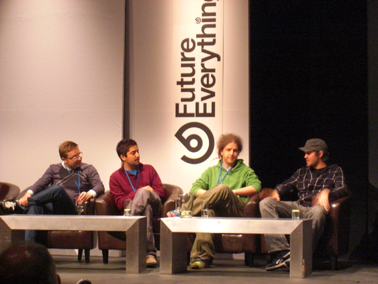
Tapio Makela’s conference presentation addressed a key question, ‘How can we make the environment more tangible and open for interaction?’ As he explained, ‘from a Western humanities tradition, environment seems to resist constructivist positions for the self that would enable agency for action’. He argued that environmental data is usually presented with an authoritative (and therefore detached) ‘view from above’ and described a need for a radical aesthetic for information design. He proposed this question as one ideally suited for exploration by media artists. And we agree. Media artists’ experimental processes, tools and media, frameworks and potential agility in relation to viewers/participants create ways in which complex information could be better processed, felt and differently experienced.
Usman Haque counts amongst those practitioners who start to address this question. His ‘radical aesthetic’ arises from his positioning within the network; from seeing himself as part of everything and asking himself the political question ‘what can I do?’ In his conference presentation he disentangled environment from the romantic concept (another detaching notion) of untouched nature, saying
environment is that which is generated through our existence. It’s the thing that we actually create. An environment is as much part of us as it is part of our existence.
His view of environment as being about relations is explored in two projects featured in the exhibition. Pachube, is an online platform to share and use sensor data. It explores the effect of actions or a set of conditions as they overlap with another; streaming real time data gathered by sensors (measuring for instance humidity, light, temperature, or energy consumption) located around the world. This data can then be used to control conditions in remote environments.
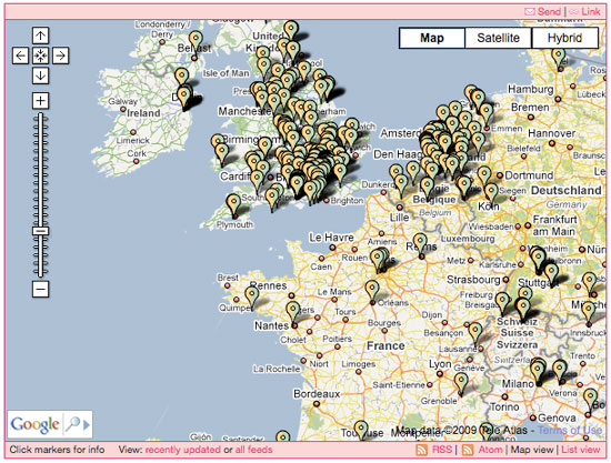
Possible uses include having your Second Life environment respond to sensors in the real world; connecting up basic home-automation devices so that they respond to other distant environments; connecting up your electricity meter to track it over time and embed usage graphs in your own website, or calculate your real-time carbon footprint.
The second work presented by Haque, Natural Fuse, consists of a circuit in which the elements are a fuse, a plant and a power socket. The amount of electricity available to the appliance through the socket is only that which can be offset by the plant’s carbon-sequester capabilities. The fuse has got two functions, fuse care and fuse kill. Fuse care works when there is still energy left to use, activating a water-controlling system. Fuse kill is activated when too much energy has been used and it literally kills the plant, breaks the circuit and it allows no electricity flow through the outlet.
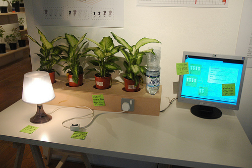
Haque proposes that Natural Fuse should work together with Pachube as a way to illustrate an alternative set of invisible relations and their effects in a networked environment. Using this system in an exhibition installation redolent of school project, a 50w light bulb was shown to need 402 average sized yucca plants to offset the carbon generated when it is switched on. In his conference presentation Haque used this to highlight the flaws in the offsetting approach to carbon-emission reduction, pointing out that at our current levels of energy consumption we would need entire uni-personal forests in order to reach anything like the necessary reduction in carbon emissions. As Cambridge University botanist Oliver Rackham puts it
planting trees to mitigate climate change is like drinking more water to keep down rising sea levels.
This engaging demonstration-system questions how we might become aware of these effects in order to relate differently to each other and to our environment. It draws the viewer into a calculation process that impacts on their perception of their energy consumption in relation to the complex questions about what right-action might follow.
David Griffiths‘s presentation of groWorld, a video game that explores ideas of guerrilla gardening and permaculture, suggests another way to engage peoples’ ability to both feel and know. Griffiths is developing the game together with FoAM – an organisation based in Amsterdam which works at the intersection between ecology, culture and technology. For him artists contribute by increasing public engagement and encouraging scientists to think in radically different ways.
Avatars in groWorld will not only be controlled by people but also by plants, using sensor data (for humidity, Ph level, temperature, etc.) drawn from ‘real’ gardens to shape game behaviours. Griffiths pointed out that many urbanites have lost the capacity to grow their own plants and vegetables, unable to produce either their own food or gardens. In groWorld, a community of real and virtual gardeners exchange techniques and ideas with the purpose of recovering important knowledge on the topic. This game claims to achieve a higher level of hybridity between virtual and actual worlds than traditional video games, in that it is controlled by bio-data in a way that produces horticultural knowledge in the players.

The works and ideas discussed so far engaged us, through processes of calculation and learning, with the some of the scientific and material realities of climate change. Urban Prospecting by Jon Cohrs, exhibited in the exhibition at Cube, makes us ‘feel’ the debate quite differently. A set of modified metal detectors equipped with hydrocarbon sensors for tracking oil ‘resources’ were displayed, in the style of a trade fair, along with a ‘promotional’ video.
Drawing on gold rush hopes and imagery, urban prospectors appear in the video to endorse the product’s ability to deliver great riches to their owners. “It’s as easy as walking the dog!”. Sumps of spilt oil and toxic waste are to be found in former industrial areas ripe for commercial exploitation through resale to the black market or litigation against the polluting corporations.
This joyful satire of opportunism and greed provides one of the few critiques presented at FutureSonic that account for the role of complex economic and ideological interests, in debate and action, surrounding climate change. The values (or at least the spirit) of America’s self-made-man, mining for black gold, sits uncomfortably comfortably alongside those of the hardware hackers and media activist dudes. “Being green has never been this cool”.
Cohrs’ exploration of ethical compromise, within the networks of market and media, contrasts sharply with Flight Patterns by artist, designer and researcher Aaron Koblin. This data visualisation project shows the traces of all the planes crossing the United States in one day. The result is a stunning animation, the beauty of which suspends the critical faculties and with them, any associations with toxic carbon emissions and the warming effects of contrails. Rather, the data driven imagery evokes clean travel through boundless, clean skies that could well be sponsored by one of the large airlines and exhibited on a huge screen in an airport terminal to sooth fretful passengers. How could anything that looks so natural be problematic?
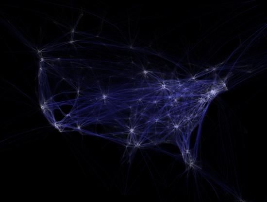
In the discussion that followed Koblin’s conference presentation, he acknowledged that when processing huge amounts of data for an artwork the artist is forced to present a particular point of view in order to make it accessible and comprehensible to the public. In that sense data-visualisation projects will always have a political implication and therefore carry a certain responsibility. One can see this principle in action in an excellent earlier Internet artwork by Koblin, The Sheep Market, “a series of 10,000 simple images of sheep drawn by online workers. Stylistically the sheep range from the indecipherable to the extremely detailed and cute […] They serve as a metaphor for the sharecropping masses of Web 2.0 projects. And their production speaks of the future of art and creative production.”[4] Viewers of and participants in The Sheep Market are addressed specifically as Internet users, allowing them to contribute a drawing or buy stickers and so drawing them into the economic and political relations that are the subject of the work. This is a wonderful example of the potential range of the media artists’ rich palette. Unfortunately Flight Patterns, though beautiful, fails to position, or connect with, the viewer who maintains a dreamy, apolitical distance from the subject of the work.
HeHe presented video documentation of Nuage Vert (Green Cloud), a data visualisation project with direct and purposeful public engagement. A site-specific laser projection on a cloud of vapour emissions, produced by a power plant in Helsinki, takes the shape of the cloud by measuring heat with thermal video analysis while the size varies depending on the levels of energy consumption.
HeHe organised the Unplug event in Helsinki which citizens were asked to switch off all appliances and go out to look at the green cloud. The cloud was supposed to grow as consumption fell. Consumption fell by 800 kVA – which is equivalent of the power generated by one windmill running for one hour. The accomplishment of this project is the way it connects directly to energy consumption and pollution at the very site where it occurs and in doing so achieves the kind of radical data visualisation to which Tapio Makela aspires; connecting sets of information, re-presenting their effects to the very people who have a part in their generation.

Less successful was Climate Bubbles, one of the three, large scale, participatory projects devised by FutureSonic in collaboration with Natural History Museum and Lancaster University. Biotagging: Manchester and One Hundred Years of Climate Change were the other two.
Climate Bubbles by Drew Hemment, Alfie Dennen and Carlo Buontempo set out to map local heat flows within the city. To do so, people were invited to blow soap bubbles, to track and document the paths they took and to upload the results to the website – a fun activity that would contribute to the body of scientific knowledge. At the time of writing, the map on the project’s web page does not show any of the measurements contributed by participants. It is therefore hard to imagine how participants were able to gain any sense of their contribution to the social or scientific aims of the project or to get a sense of their role either in relation to the location, or to the others who took part. As one of the most highly visible keynote projects in the art bit of FutureSonic this particular work testifies to the shadow side of the festival by taking a technocratic approach to participants. It proposes a distracting and flawed framework for collective agency in Environment2.0 and its positioning in an art context only adds to the confusion.
On the surface Amy Balkin‘s three day performance Reading the IPCC Fourth Assessment Report could be interpreted as an attempt to raise public awareness about the causes, effects and mitigation of man-made climate change by making its findings accessible (or at least the existence of the report known) to festival visitors. The collective reading did serve this purpose to a small degree, however it was as a multivalent artwork, rather than as a public information service, that it had a more profound impact. Festival visitors signed up online to participate by giving a 20-minute reading of a section of the report from a simple lectern, in the foyer of the Cube gallery or outside on the pavement. They could also sit and listen on one of the 6 chairs provided and be served a cup of Feral Trade coffee or tea.
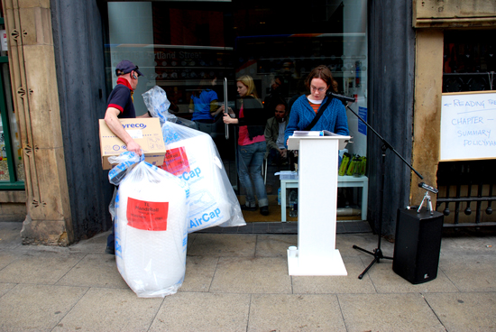
The artwork took as its materials the relationship between the IPCC report and participants in the performance (or more specifically their position in relation to issues of climate change). The report’s impressive use of jargon from the political and bureaucratic disciplines (as well as those of social and material science), combined with its length produced a range of experiences and knowledge in its readers and listeners. The participants and text came alive in unpredictable ways as the audience spontaneously interrupted and interacted with the reader to comment on particular points, to offer their own perspective, to cry out with frustration at particularly dense and obscure sections or to break off into tangential conversations. These revealed visitors’ self-reflexive awareness of the part they played in an allegory. Their participation in the performance of an impossible task (the text was just too long and dense to stand any hope of being read in full) resonated with their evident anxieties in relation to collective task (of climate change mitigation) under discussion. Through this sparely crafted framework for participation the artwork interrogated a set of questions around individual agency and public engagement with questions of environmental crisis. It also demonstrated the potential sophistication of sentient public participation in art action.
Most of us find ourselves in daily contradiction with our principles and this should not prevent us from holding and exploring our principles. Our intentions are also often mismatched with the effects of our actions. This is the human condition. However, an ecological approach must incorporate feedback processes for evaluating and making adjustments in response to the effects of these contradictions and mismatches. In his influential anthology, Steps to an Ecology of Mind[5], Gregory Bateson clearly sets out the dangers of attempting to instrumentalise living beings, no matter how apparently worthy the goal. The loss of flexibility that arises in an evolving civilisation when it ignores complex (bottom up) feedback in blinkered pursuit of a single process can be fatal for an ecosystem. Research by social scientists such as Tim Jackson on sustainable consumption also demonstrate the fatal consequences of persistent political attachment to economic growth and extravagant consumption as the sole ideological monorail to the future.[6]
So it was sinister to note how narrowly the frame of debate had been set at this year’s FutureSonic. None of the conference presentations we attended acknowledged the role of corporate and institutional power in Environment2.0. The role of economic interests or perverse effects of ‘free’ markets remained undiscussed. Instead most lines of thought were singly directed to technical solutions for environmental crisis, characterised by uncritical optimism and blind trust in technological progress as the ultimate counter-force to anthropogenic climate change. Jamais Cascio, an affiliate at the Institute for the Future and a fellow at the Institute for Ethics and Emerging Technologies provided a distillation of the general tone of the Social Technologies Summit:
I think we are going to make it through the century and I think what we’ll come out with at the end of the century will be wondrous.
So it appears that while participants are encouraged to run about blowing bubbles, connecting and shaping the physical and virtual Environment2.0 someone, somewhere else is running the economic and political bottom-lines.
The organisers of FutureSonic deserve recognition for a diverse line up of emerging and high-profile practitioners and some well wrought copy that appeared to attract a high turn out. It also gathered some important work and ideas together. First, projects like Pachube highlighted the value of sharing information about our environments as a crucial step towards acting upon it responsibly. Second, the festival highlighted an emerging field of experimental practices that deal with the growing hybridity of networked virtual and physical realities.
We think we understand FutureSonic 2009’s drive to conflate the coordination of mass social behaviours, demonstrated by web 2.0 ‘utilities’, with the sharing and critical practices of participatory media arts. If the precise and transforming effects of an encounter with the best of the dialogic media arts were to be distributed at scale they could perhaps make some significant contribution to the quality of connection and co evolution of humans and Environment2.0. They might also provide an alternative approach to sustaining radical artistic practice with diverse and interdisciplinary partners and collaborators.
However (and we know that it’s difficult), the ambitious aims of the programme were seriously undermined by a lack of focus in the conference line up and a casual approach to exhibition curation. Many of the works in the exhibition were poorly presented and contextualised (artistically and technologically). And then it was just plain unclear what lots of the works and projects were doing there, or what they contributed to the debate. This was very frustrating and felt like a waste of an opportunity. At a time when the value of media arts is being eroded by the dominant (scale and numbers-obsessed) agendas of creative industry and threatened with cuts in public funding by an impoverished national treasury[7] we cannot afford to present an incoherent interface. It just contributes to the already ill-informed arguments out there for the dismantlement of our arts culture. It’s even more crucial in the context of environmental crisis that we don’t settle for generalisations and approximations and that we attempt to be clear about where optimism is possible and where we have to allow uncertainty. As Bateson points out there are some times when appearing to do the job is just not good enough.
Choosing environment as a framework for a media arts festival carries with it a certain responsibility. To work at this scale, to make sense of work at the intersection of artistic and technological culture, to gather the resources and partners to produce a critical and conscious cross-section of what is really happening out there, and to take the necessary time to make sure that things are communicated well is a huge undertaking. We therefore applaud the ambition and energy of the FutureSonic team.
Perhaps though, as with environmental issues in general, a radical aesthetic of organisation and engagement is required. One that allows closer attention to local concerns and participation. One that incorporates an authentic engagement with connected, complex ecologies; felt, experienced and constructed at both local and translocal levels and visible from all points both above and below.
Footnotes
1. Corporate Dominance of Every Aspects of Our Lives Is Suffocating us, Douglas Rushkoff interviewed by Helaine Olen, AlterNet. August 7, 2009. http://www.alternet.org/media/141828/are_we_all_corporate_shills
2. For more about the GNU General Public License http://www.gnu.org/copyleft/gpl.html
3. Corporate Dominance of Every Aspects of Our Lives Is Suffocating us, Douglas Rushkoff interviewed by Helaine Olen, AlterNet. August 7, 2009. http://www.alternet.org/media/141828/are_we_all_corporate_shills/#comments
4. Rhea Myers. http://www.furtherfield.org/displayreview.php?review_id=244
5. Bateson, Gregory. Steps to an Ecology of Mind, in Collected Essays in Anthropology, Psychiatry, Evolution, and Epistemology, Chicago Press: 1972.
6. ‘Why Politicians Dare Not Limit Economic Growth’ by Tim Jackson, 15th October 2008 for New Scientist http://tinyurl.com/6784zw
7. See REAL-TIME POLITICAL ART OUT OF THE DIGITAL UNDERGROUND by Armin Medosch 2007 for an analysis of various economic and cultural cul-de-sacs for media arts http://www.ambienttv.net/footprints/book/02medosch.html#7
This article is co-published by The Hyperliterature Exchange and Furtherfield.org.
A short horror-game for adults, based on the Little Red Riding Hood folktale.
The Path is “a short horror-game inspired by the tale of Little Red Riding Hood” from Tale of Tales, an independent computer games development company, based in Belgium and run by Auriea Harvey and Michael Samyn. It was originally released in March 2009, and it represents Tale of Tales’ first attempt to produce a fully commercial computer game.
Harvey and Samyn’s output has always been driven by a desire to move away from the typical subject-matter and style of modern computer games, into territory which is more poetic and ambiguous, touching on deeper themes. Before they formed Tale of Tales they worked together under the name Entropy8Zuper! and produced work such as The Godlove Museum (texts from the Bible mixed with new media animations and social commentary). The first Tale of Tales project, 8, was based on the story of the Sleeping Beauty. The second, The Endless Forest, is a multi-player environment where each player controls a deer in an enchanted forest; and the third is The Graveyard, a meditation on old age and mortality, set in a cemetery, and featuring a little old lady on the point of death.
In many ways The Path‘s most obvious antecedent is 8 – in terms of its visual style and fairytale inspiration, not to mention the fact that the central character from 8, a girl dressed in white, actually reappears in The Path. But the game can also be seen as an inverted reworking of The Endless Forest, a release of the dark forces which were deliberately held at bay there. The Endless Forest is a completely safe environment because players are only able to communicate with one another through a limited range of gestures and the casting of spells – in effect, giving one another gifts. All the avatars are nominally male, since they are all stags, but essentially the game is sexless. In The Path, on the other hand, sexuality is one of the core preoccupations, and the fears that parents have about letting their children play on the Web – that they will be exploited and brutalised by sexual predators masquerading as playmates – hover in the background too.
The opening scene of the game is a red room containing six girls, aged from nine to nineteen. Your task as a player is to select one of them and guide her along a path through the woods. Words appear on-screen as you begin: “Go to Grandmother’s house. And stay on the path.” You can only play the game to the full, however, if you disobey these instructions, leave the path, and venture into the trees. As soon as you do so the ambience of the game changes: the music becomes more ominous, and most of the colour disappears from the screen. Daylight is replaced either by deep shade or night. You begin to notice things between the tree-trunks: in fact, one of the most effective aspects of the game is the way in which you catch the glimpses of things far off in the wood, and they gradually reveal themselves more fully as you move towards them. There are gleaming white flowers; a running girl dressed in a white smock; abandoned objects such as an armchair, an old car, a bath or a broken television; and finally places, such as a ruined playground, a disused theatre, a field of flowers with a scarecrow in the middle, or a graveyard.
At certain points in the game, semi-transparent images loom up onto the screen, and if you let go of the controls your avatar will act of her own accord. If you place her close enough to one of the shiny flowers, for example, she will bend down and pick it. If you place her close enough to one of the abandoned objects in the wood, she may interact with it – although some of them will only interact with certain girls. She may pick up an old teddy-bear with two heads, or get inside an abandoned car. When this kind of interaction occurs, images and text-fragments appear on-screen, apparently dropping dark hints about your avatar’s ultimate fate, her past history or her inner life. For example when Ruby – the most Gothic of the girls, who wears a black brace on one leg – interacts with an old wheelchair, the following text appears:
Sitting on wheels. Paralyzed soul. Nowhere to go. Fast. Don’t come close if you want something from me. Whatever it is, I probably don’t have it. Just leave me alone.
The most potent form of interaction occurs when your avatar arrives at one of the special places in the wood, and meets her wolf. Each of the girls has her own particular wolf and will meet him if she goes to a particular place. Scarlet, for example – the oldest of the girls, lover of order, hater of mess, devotee of the arts – meets her wolf at the disused theatre. The following text appears: “Art is where the nobility of humanity is expressed. I could not live in a world without it.”

When a girl meets her wolf she is no longer under the control of the player, but swept up instead into a lengthy and sinister video-sequence which ends with a blackout. She “comes round” from this experience in torrential rain, just outside Grandmother’s house. The only thing left is to enter. Inside the house, which is dark, predominantly red and full of snarling noises, what happens depends on how many discoveries she has made in the wood. The more extensively she has explored, the more rooms she will be allowed to enter. Each room reveals a sinister and enigmatic tableau – a roomful of empty glass jars, an underwater table, or a wrecked automobile. After passing through a series of these rooms, your avatar must finally traverse a corridor decorated with a nightmarish damask pattern of spiky black leaves, until she comes to the last room, where she discovers both Grandmother’s bed, and a whole sequence of split-second images, often images of bleeding or dismemberment, which seem to half-reveal some terrible experience she is undergoing or has already undergone, possibly her rape and murder.
If you restart the game you will find yourself back in the red room where it began, but this time there is one less girl in it. In order to play the game properly all the way through, you need to take each girl in turn through the woods to Grandmother’s house.
The Path is by no means flawless. One really serious problem is its slowness. Samyn and Harvey make a virtue of this (“The Path is a Slow Game” they point out on their website), and the game’s slowness certainly does help them to build up atmosphere and tension; but there comes a point at which suspense tips over into boredom and frustration. Perhaps the most glaring example is the plank bridge leading to Grandmother’s front door, which seems to take an eternity to get across.
Furthermore, the fragments of text which appear from time to time are effective at pointing up the main character-traits of the avatars, and reinforcing the main themes of the game, but the quality of the writing is functional rather than inspired. Here is Ruby, the Goth, at the rusty car:
Engines. And friends. Turn them on. Turn them off. Life. Death. Are they so different?
Here is Scarlet encountering an old armchair:
A serenade in the woods. Somebody is playing my song. Long slim fingers gently caressing the keys of me.
Here is Robin at the disused playground:
I see-a-saw. Slide-the-hide. Go round the merry. And swing-along.
The first expresses isolation, cynicism and nihilism; the second an aesthetic and poetical nature; and the third a little girl who wants to play. They do their job, but they all sound rather contrived – a point which is best illustrated by comparing them with a text-fragment that really works, this one from Robin, when she picks up an old hunting-knife:
I’ll have to be very careful with this and not run any more.
This sounds much more like something that a little girl would actually say, but it’s also much more psychologically convincing: Robin knows that she shouldn’t be playing with the hunting-knife, but she thinks she can make it all right by promising herself to be extra-careful. We immediately feel convinced that her good resolutions won’t last long – and the sense that she is doing something she shouldn’t be doing, allowing her curiosity about forbidden things to get the better of her common-sense, is relevant to the larger themes of the game. She should never have left the path in the first place. The text makes us more acutely aware of both her vulnerability and her naive expectation that things will be all right.
There is also a hint of woodenness to certain aspects of the graphic design. In general the playing environment of The Path is a visual triumph – the woods, the special places in the woods, the path itself, and best of all Grandmother’s house, which is both quaint and sinister on the outside, and downright frightening on the inside. Some of the special objects, however, are less convincing – an old boot and an old record-player come to mind in particular – and although the female avatars are all very well designed, one or two of the male “wolves” are not, especially the wood-cutter and the man at the disused playground, both of whom look comical rather than sinister from certain angles.
Another criticism which could be levelled at The Path is that although it is full of hints and clues, musical climaxes and visionary moments, which seem to suggest that secrets are being glimpsed and hidden truths uncovered, everything in it remains nebulous and unexplained, the clues don’t really lead anywhere, we never actually learn anything concrete about the girls or their wolves, and ultimately all we are left with is the unpleasant message that the quest for experience leads to trauma, and the quest for love leads to sexual brutality. The counter-argument to this, however, is firstly that the game derives its goriness and suggestions of rape from the tale on which it is based – a tale which goes right back into folklore, and thus into the depths of the human psyche – and secondly that by keeping their story nebulous and suggestive rather than explicit and detailed, Samyn and Harvey prevent The Path from becoming a mere puzzle-game with a fixed solution. In this way the imagination of the player is freed rather than tied down, and the symbolic aspects of the game-narrative, which are its real strength, are allowed to come to the surface.
Certain elements of the Little Red Riding Hood tale are missing from The Path altogether. One of the best-known aspects of the tale – the sequence in which Red Riding Hood comments about her wolf-grandmother’s appearance in tones of rising astonishment: “What big eyes you have”, “What big teeth you have”, and so forth – has vanished. But although the tale has been simplified and truncated in some respects, it has been opened out in others, because Samyn and Harvey have incorporated references to various different versions of the tale instead of confining themselves to one in particular. The two best-known versions are by Charles Perrault (who turns it into a fable about avoiding sexually voracious men) and the Grimm Brothers (who place more emphasis on the dangers of being distracted from the paths of duty) – but there are numerous others. Sometimes Red Riding Hood meets not a wolf but an ogre; sometimes she is asked to choose which way she would like to take to Grandmother’s house, the path of needles or the path of pins; sometimes, when she gets to the house, she is fed various parts of a dismembered grandmother; and sometimes she is commanded to join the wolf or ogre in bed, first performing a striptease and throwing her clothes onto the fire.
In The Path, the gleaming flowers which lead us deeper and deeper into the trees are a reference to the pretty flowers which distract Red Riding Hood in the Grimms’ version, amongst others. Samyn and Harvey also incorporate references to the path of needles and the path of pins in some of their texts. More importantly, they retain the gruesomeness, the allusions to dismemberment, and the violent sexuality which feature in many earlier versions. And the symbolism which lurks beneath the surface of Red Riding Hood in all its various manifestations comes through particularly strongly. First of all, of course, there is the symbolism of a path through tangled woods – the same symbolism with which Dante’s Divine Comedy opens:
Nel mezzo del cammin di nostra vita
mi ritrovai per una selva oscura
che la diritta via era smarrita.
(Midway this way of life we’re bound upon,
I woke to find myself in a dark wood,
Where the right road was wholly lost and gone.)
The road or path represents virtue, civilization, safety, a sense of purpose and direction – whereas the wood represents sin and error, wilderness, danger, the unknown, bewilderment and confusion. Aspects of the same symbolism can be found in Sir Gawain and the Green Knight and Bunyan’s The Pilgrim’s Progress: in fact it is a commonplace of Christian iconography. Beyond this lie other meanings: the road represents the known whereas the wood represents the unknown; so, by extension, the road represents the conscious mind and logic, whereas the wood represents the unconscious, emotions, desires and dreams. Samyn and Harvey reinforce these associations by having the path daylit, whereas the wood is always shrouded in darkness.
The beginning and end of the game are also interesting from the symbolic point of view. We begin in a red room, and we end in the red interior of Grandmother’s house. Red is the key colour in the game: all the girls are dressed in red, and all their names play on the same theme – Robin, Ginger, Carmen (Carmine), Ruby, Scarlet and Rose. Red is the colour of blood, and therefore signifies both life and death. We never see the mother at the beginning of the story, but in a sense she is there nevertheless, because the red room from which all the girls start their journey can be interpreted as a womb-symbol. What about the horrific red house where all the journies end? On one level the journey the girls make is from innocence to experience, especially in the sexual sense, and Grandmother’s scary house represents the terrors of adulthood, life with all the pleasantries stripped away. But on another level, the house where Grandmother lives – the house where all our ancestors live – is the grave. The girls in the story are thus like red corpuscles of life, journeying from the red starting-point of the womb to the red vanishing-point of death.
Needless to say this is all very far removed from the subject-matter of most computer games. Traditional adversarial games (such as Space Invaders, PacMan or Mario Brothers) are all about the triumph of the individual over difficult circumstances; their aim is to stimulate adrenalin, their requirements are concentration and dexterity, and their message, if they have one, is that winning is good and you can achieve anything if you try hard enough. In recent years the adversarial model has lost a certain amount of market share to games such as The Sims or Animal Crossing, which are more to do with exploring and integrating in a social milieu; but their messages still tend to be upbeat and uncomplicated – you can earn lots of money, get a better house, acquire lots of friends and so forth if you just try hard enough. Importantly, in these “social interaction” games, it is left up to you, as a player, to create your own narrative. By contrast, in The Path, we find ourselves in an environment which is drenched in symbolism, where the message is anything but upbeat, and where the story already exists. Your task as a player is not simply to explore the game’s environment but to experience it – in the same way that you might explore and experience a poem or a piece of music. In the process you are also unearthing the narrative which lies buried within the game. This game is not about the virtues of self-application, willpower, quick reactions and an acquisitive nature: it is about sexuality, the darker side of human nature and the price we sometimes pay for experience. It is a game which could never have been conceived by one of the big commercial companies, and which could perhaps never have been made in the USA at all, steeped as it is in European folklore and sensibility.
As regards the commercial success of The Path, Samyn and Harvey are unable to release full sales figures at the moment, due to the nature of their contract with their main distributor, Steam; but they comment that
…we need to pay back the 90,000 Euro loan (+ interest) we got from the governmental investment company CultuurInvest. And we’re happy to say that it looks like we’re going to make it. The total budget of The Path, however, was quite a bit bigger (but financed mostly by non- or less commercial art grants). And it’s far from certain if we will actually be able to make that much back.
Conventional marketing wisdom about The Path would undoubtedly be that it is hardly likely to succeed in commercial terms, because it gives itself too many disadvantages to start with. A game based on a fairy-tale is sure to appeal primarily to young children or parents with young children: The Path, on the other hand, despite its fairy-tale origins, insists that it is designed for adults. It’s also a game about girls (a disadvantage in itself), and about girls who succumb to the wolves in the wood rather than overcoming them; and despite its billing as a horror game, it’s long on atmosphere and short on visceral thrills. In other words it disqualifies itself from success with the mainstream gaming audience (teenagers and young adults, predominantly male) by virtue of its subject matter, disqualifies itself from success with a minority audience (younger children and their parents) by virtue of the way in which that subject matter is handled, and disqualifies itself from success with any gamers left over by being too “arty”, slow-moving and downbeat.
These may seem like very crushing considerations, but if you boil them down, like a lot of marketing wisdom, what they amount to is the assumption that nothing will sell if it doesn’t fit neatly into a pre-existing category, or if it deals with its subject-matter in an unconventional way – to put it more simply, that nothing will sell if it doesn’t imitate something which has sold already. Ultimately this kind of “wisdom” is self-defeating, and leads to nothing but stagnation.
The conclusion Samyn and Harvey themselves draw from their experiences with The Path is a positive one: “Apparently you can sell art to gamers now.” They may not have produced a huge commercial success, but they haven’t produced a flop either – and this is an achievement in itself, given their unconventional approach. And it probably isn’t desireable that The Path should become a huge commercial success in any case, since this would only be likely to produce an outbreak of Path imitations. What is more important is that Tale of Tales should continue to produce new and challenging work, demonstrating that the rules of conventional games-design are not written in stone, and that it is possible to design games which are poetic and expressive but still viable in the marketplace. If they can do this for long enough, then undoubtedly other independent games developers will be inspired to follow their example, and their influence over the evolution of games design in the next few years may well be a profound one.
Available via download for Mac or Windows at $9.99, or on USB for Mac or Windows for 25.00 Euros.
copyright – Edward Picot, August 2009.
Thou God Seest Me: Some Gathered Thoughts for A Short Film About War.
“You see the imagery, you know what’s going on, you see what you’re looking at. It’s very easy when something like that is happening to project yourself there and feel a part of the battle. Like I said, your heart starts racing a little bit.” – CNN interview with US-based predator drone aircraft pilot on flying air strikes in Afghanistan and Pakistan from a control room in the Nevada desert.
“Don’t fire until you see the whites of their eyes.” – Legendary command attributed to William Prescott at the Battle of Bunker Hill, American Revolutionary War
A Short Film About War by Thomson & Craighead is the second installment in what will be a series of three “desktop documentaries.” The first work in the series, Flat Earth establishes the context; a series of web based films constructed exclusively from media gathered from the Internet. A vast world is made smaller, more manageable, through the impossible eye that carries viewers in and out of the earths orbit to reveal the seemingly individual voices of bloggers as lines in an elaborately staged narrative. The idea that subjectivity belongs to oneself, that I am the subject of my own will, gives way to an unfolding map of interconnectedness, subjectivity externalized, an opening, and a chance at conceptualizing shared existence on a platform used mostly for performing private moments.

But something is awry here. There is free speech, and a presumption that someone’s listening, and yet there is no possibility of reciprocal communication. The global positions of the speakers are precisely pinpointed for us, but they seem lost to each other and lost to anything but an abstract notion of an audience. Unidirectionality is largely built into the technologies of traditional cinema and broadcast media, and criticism concerning the political implications of this self-imposed constraint are well circulated. Yet these conventions seem ripe for criticism when carried over to the context of the web where the structural/political limits of broadcast media are easily transcended and happily so by many. Perhaps, the fact that net cinema attempts to have an “audience” at all is worth looking at, simply for the political implications of (re)establishing the relationships of authority and passivity that are the hallmarks of cinema and broadcast media. All this seems particularly striking in A Short Film About War where alienated speech seems to deny the speakers and their (invisible) audience a view of our possible political and economic relationships in what could be called the fourth world war. There are connections without contacts, calls without responses. The network is revealed only to the privileged audience who is carried by the universal eye, soaring and yet mired in sublimity.
“We know now that a text is not a line of words releasing a single ‘theological’ meaning (the ‘message’ of the Author-God) but a multi-dimensional space in which a variety of writings, none of them original, blend and clash.” – The Death of Author, Roland Barthes
Once reviled by media institutions for the threat they offered to the authority kept by traditional broadcast media, the voices of bloggers, now assimilated, are framed (or haloed) as high voices in a hierarchy of sight – they’re assumed to be out there and on the ground, closer to whatever it is we wish to know intimately with the click of a mouse. In large part the celebration of blogging is a celebration of supposed individualism, the story of the man or woman who refuses to work within established boundaries of institutions, one who, with equal parts objective reporting and personal confessional somehow “gets it” and lures us in with the status that “getting it” and “going it alone” promises. But what are we to make of the war stories featured in A Short Film About War; a few selected from possible millions, but seemingly without reference to one another? How are we to contextualize these narrative fragments and find them meaningful as a group? For that, it seems that we’ve been given some rather heavy-handed help from a higher place.
A (holy)ghost of sorts lurks above this mushy swamp of lonely calls to the great search engine in the sky – keyword – “war,” and it’s not long before He speaks as the singular master narrator – as if to top off the long mythic journey of humanity from the wheel to the neutron bomb to the Internet in which this moment, as every other, plays its indelible part in a preordained techno-history. Here the stage is set, where a story of any particular war, and the development of any particular technology begins to smother under the weight of a narrative of mythic proportions as we zoom in and out of orbit and are treated to an image of the world as it might look to one who floats above it rather than live on it. And although this divine voice, who speaks in simulated orbit over a simulated planet seems to be a push-over, a cardboard cutout, a canned voice on the set of a made-for-tv Genesis remake – like most gods, he has a lot to say, but you listen most for what’s not said.
“From yon blue heaven the eyes of the glorified look down on us; there the children of God are sitting on their starry thrones, observing whether we manfully uphold the banner around which they fought; they behold our valour, or they detect our cowardice; and they are intent to witness our valiant deeds of noble daring, or our ignominious retreat in the day of battle.” – Omniscience . A Sermon Delivered by REV. C. H. Spurgeon, June 15, 1856 At Exeter Hall, Strand

Let us pray to the absolute speed of electromagnetic waves that simultaneously composes the three attributes of perfection and tyranny: urgency, omnipotence and omnipresence. How is democracy possible when this is the vantage point from which we’re (re)constructing the world? These days, communication is described primarily as a technological operation, and technology is often conceptualized as an evolutionary process somehow outside of the messy realm of human desire – a self-guiding force. This framework for understanding communication in techno-evolutionary terms (rather than cultural ones) seems to be upheld in A Short Film About War, where communication seems to be understood as the power of technology and progress to facilitate unfettered individual expression (even in the worst of circumstances). However frightening, seen from this vantage point, it is quite easy to view our current global predicament as the natural material outcome of a universal “man’s” ongoing dreams, ending in the deconstruction of the finite view of the human(ist) eye and the construction of the disembodied all-seeing post-human(ist) eye. We’re all just reporters of inevitable events. Not a whole lot of back-and-forth chat is needed.
“Thou God seest me.” – Genesis 16:13
In a way, the orbital perspective seems reminiscent of Pre-Renaissance European perspective – the work of Hieronymus Bosch comes to mind – where viewers are given a representation of God’s perspective – impossibly large landscapes, multiple time zones existing simultaneously, everything equally in focus. Of course, the feudal era of Europe wasn’t dubbed the “Dark Ages” for nothing; lacking widespread concepts of personal possession seeing for oneself was about as equally strange a concept to most as taking for oneself. It would take capitalism and the “Enlightenment” to finally convince people to think otherwise – though massive brutalities persisted through it all. It’s worth noting that during the “Middle Ages,” people assumed that they were on earth to act as stewards of God’s creation and to carry out this mission within a very particular and brutal hierarchy of power. Wholesale ownership and destruction of God’s creation was unthinkable and undoable, except by God himself. The damage of Christian feudal life was on a human scale not a planetary one. But what are we to make of the divine perspective we’ve fashioned for ourselves in today’s world, with today’s technologies? How is it that we can simultaneously embrace the post-human perspective even while caring about preserving humanity? Perhaps we’re all going (post)medieval – each one of us gods-of-sorts behind our computer screens receiving reports straight from our angels in orbit? Is the era of God 2.0 upon us?
…but wait, this whole thing is a fabricated view – not even a whole thing at all but a fragmented thing framed in a series of constructions posing as inevitabilities and divine rights. It is a fictional vantage point (like all) that we’re being asked to see and speak from, but regrettably one that often works to convince its subjects – us – of our simultaneous power as spectator consumers and outright political worthlessness. It has been said that to remain a docile and happy subject of rule one must (mis)recognize one’s subjectivity as one’s own. The master narrative provides that – given that the user/subject is provided with an impressive enough spectacle to call his or her own. Who is freer (in individualist terms) than one who can virtually see / possess everything? I am a god in front of my screen, but one who’s both omnipotent and impotent. With a click I become master of my destiny, but my destiny is not my own.
As a Furtherfield intern, I recently began a research project to find and investigate net.art originating from Asian countries. Coming from an Asian background myself, I thought it would be worthwhile to explore the field in hopes of making some self-reflexive connections. Before undergoing my research, it was clear that such net.artists are quite under-represented – even less-so than the “traditional,” Western net.artists like the Heath Buntings and Olia Lialinas of the digital world. But it was exactly this lack of representation that made the search even more compelling.
However, after nearly a month of research, I came to the conclusion that Asian net.artists are virtually impossible to find. The few that I kept running into during Internet searches were the net.art heavyweights – groups like Young Chae-Heavy Industries or Soiizen Art Labs. I wondered where the underdog was hiding. I was looking for the under-represented, the under-exposed, perhaps an underground, grassroots art community that needed to get their message out. All I found were dozens of broken hyper-links and unfortunately, websites with potential that were in languages I couldn’t understand.
Feeling quite defeated and frustrated, I realized that this blind spot in net.art might have something to do with me being based in the UK, where I am unable to take to the streets and explore word-of-mouth recommendations. There was also the possibility, and this was a complete assumption, that certain Asian countries such as the Philippines (my personal ethnicity), are culturally less likely to make net.art for its original purposes – as a method of social change or political/philosophical discourse, or to crack and manipulate the digital cipher. Artists in poorer countries like the Philippines seem to be largely more concerned with commercially orientated art – graphic design and animation for marketing and advertising industries. This was the type of work that was easily accessible. Thus, I was quite unsuccessful in gathering a list of what I deemed profound Asian net.art sources that weren’t already being picked up by the radar.
Just when I thought I was hitting a roadblock, my colleagues at Furtherfield suggested that I broaden my research requirements, to search within what I already knew was available. What I came up with was a compromise between the two worlds of Asian art and Internet-based work. The result was an investigation on the concept of identity within these works. These works are not necessarily net.art in the traditional sense, but they have two things in common – they are by Asian artists and they explore the concept of identity through digital means on the Internet.
Virtual Identity – CJ Yeh (Taiwan)
“Where a human is reduced to data, data is converted to values, values are transformed into art.” – CJ Yeh, myData=myMondrian 2004
In 2004, Taiwanese artist CJ Yeh created several digital interfaces known as The Equals Series, in which the participants input personal data in order to produce modernist-style artworks that are aural, visual or both. The Equals Series explores the ideas of taking fragmented personal computer data and using it to create artworks that mimic styles of modernist greats, such as Jackson Pollock and Piet Mondrian. New York Arts Magazine described Yeh’s work as a combination of “the principals of painting with the programming of the digital image.” Essentially, the works represent a merging of old and new styles, coupled with the uniqueness of personalized mathematical data.
One work of The Equals Series, called myData=myMondrian, transforms basic personal data into a digital painting modeled after Piet Mondrian’s modernist style – straight, horizontal and vertical lines forming blocks of white space and primary colors. Upon launching the interface, users are prompted to fill out a digital survey form that asks for basic information; such as age, height, weight, education level and ethnicity. After submitting the form, the data is then transformed into a mathematical code to generate a visual rendering of a Mondrian-like painting. As Yeh said himself, the human is reduced to data, which is then reduced to values, and transformed into works of visual art.
The rendering takes a similar form to Piet Mondrian’s compositions. Although the screenshot above is missing the color yellow, it is because the data transformed does not call for that particular color. In a way, myData=myMondrian plays on the idea of personal identity. Someone who answers the survey form differently will have a different visual result. Therefore, the artwork is completely personalized by the user – and is made possible solely from the capabilities of the Internet.
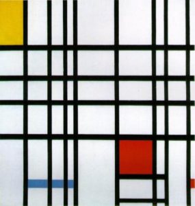
In another of the series works, titled myAvatar=myChuckClose, the participant works from an interface that looks much like the avatar interface of the Nintendo Wii gaming console. The user chooses from sets of basic head and body shapes, gender, skin color, hair, eyes, etc. After the user is finished creating his or her avatar, the image is transformed into a digital print mimicking the portraiture style of American artist Chuck Close – a fragmented photo-realist painting of the head and shoulders.
In contrast to myData=myMondrian, this work in The Equals Series takes an even more visually personal approach to identity. From the very beginning of the process, the participant is able to choose exactly which elements to include in the portrait. The ending result in myAvatar=myChuckClose comes as less of a surprise, as opposed to the other works in the series, which have more abstract results.
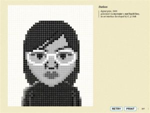
The rest of the artworks in Yeh’s Equals Series are similarly lighthearted. There are a total of five, including myParticipation=myMagritte (which utilizes a viewer’s movement in front of a webcam to trigger a work based on Rene Magritte’s The False Mirror) and myBirthday=myPhillipGlass (a computer program that generates musical compositions based on a user’s birthdate). In myTune=myPollock, the computer keyboard is used like an electric piano. While sounds are generated through pressing the various buttons, “splatters” of paint appear on the canvas. A Pollock-style composition is generated right on the screen according to the note, octave and the tempo in which the viewer plays the keys.
Each of the works in The Equals Series is significantly user-friendly. Upon launching each project, participation is self-explanatory, making the works easy to use. The works take an interesting approach on how virtual identity can be manipulated – while they may lack more profound messages and lean towards aesthetically “fun” results, Internet users are able to explore how personal portraits can take less-traditional forms. Although the artwork being generated through these interfaces are more or less established styles, today’s participants are able to express themselves in ways that were once reserved only to the muses of these artists. The Equals Series gives the audience a chance to be hands-on, and to customize and evaluate their own digital portraits for their own pleasure or reflection.
Racial Identity – Dyske Suematsu (Japan)
“Remember, we are not here to make a statement; it’s a question.”
-Dyske Suematsu, All Look Same, 2001-2009
In the ongoing artwork All Look Same, Japanese artist Dyske Suematsu poses a question regarding racial identity. He explores the way Asians are sometimes socially stereotyped by their facial characteristics or cultural traditions – such as architecture or food – and it offers us a way to test our knowledge on how to tell different Asian nationalities apart. The purpose of the work is less offensive than it sounds, and more so serves to provoke thoughts on how Asian nationalities are categorized throughout the western world. It can also be seen as a work attempting to dispel certain misnomers about Asian cultures.

All Look Same is presented to the user in the form of a digital exam room that holds a total of eight quizzes, where users can test their knowledge about various Asian cultural elements. In the first exam, different faces are displayed on the screen, where users are to choose from a multiple-choice menu of Chinese, Japanese and Korean. All the people in the photographs are residents of New York City, but are of 100% pure Asian descent. At the end of the exam, the correct answers are given to the test-taker for comparison, and the results are quite thought-provoking when a participant realizes he or she has used certain stereotypes to answer the questions.

The other seven exams in All Look Same involve Asian art, architecture, landscapes, urban scenery, food and decorative patterns. The artwork as a whole examines elements that are often thought of as easy to differentiate, but in fact, the results are often quite the opposite.
Based on average test results, which are given at the end of each exam, test-takers are generally bad at telling the difference between Chinese, Japanese and Korean characteristics. But the work does not mean to be taken as a way of calling people out on their lack of familiarity with Asian cultures. Suematsu writes on his website:
“I’ve always thought that it was one of those urban myths that you can tell different Asians apart. Especially if I can’t see what they are wearing, I don’t think that I can tell them apart. And, I’m an Asian myself. I’ve been living in the US for over 15 years and I’ve heard some people tell me I definitely look Japanese, while others thought that I don’t at all. Some people boastfully claim that they can tell the difference no problem, while others quietly admit that they can’t. Even with those who claim they can, is it really true that they can? Maybe there is something to be said about someone saying ‘You guys all look the same!’ Or, maybe they just don’t know any better. This site, therefore, is a way for me to demystify this issue once and for all.”
Like Suematsu said before, All Look Same is not trying to make a statement. It’s asking a question – is it really possible to tell the difference? And should Asians take offense when someone can’t tell the difference?
An interview with Annie Abrahams and Albertine Meunier by Cyril Thomas, French art historian and art critic, who posed his questions by mail separately to each artist.
How would you define yourself as an artist?
Albertine Meunier:
Will the first question be the most difficult one? To take a look at and to define oneself as an artist? Impossible. Others do this for me. The pronunciation of the words: “I am an artist,” seems too difficult. If I am, I am not solely. Because of my daily professional activity in the field of web innovation, because of my personal history, my career as an engineer in optoelectronics, as a researcher, as an Internet project manager, I juggle continuously from one status to the other. I feel like a web schizophrenic! At the same time, me and another. Albertine is there to show the borders. Albertine (alias Catherine Ramus), is my identity-plug, my artist identity. Catherine Ramus has the same body as Albertine, but only Albertine is an artist.
Annie Abrahams:
I do not feel the need nor the desire to define myself. I may be wrong.
In my video series I confirm Ami Barak answers the question Is what you see around you art?, with: Yes, because it’s done by an artist. This sentence pronounced by a contemporary art curator is revealing. Value is determined by both the claim of the artist and – do not forget that – by the power invested in art to defend it.
I am not only an artist, to some people I’m a poet, for others a video maker, a photographer, a performer and even a singer. I am also someone’s partner, an academic, a researcher, a teacher, as I am the daughter of, the aunt of, the friend of…
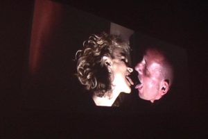
Would you say that you are Net-artists?
Albertine Meunier:
You add “Net” in front of a word and all of a sudden all becomes much simpler! If I am a net artist, my two “mes” are artists as well. Both of them handle, mix and play with the web. Me and my alter-ego, we try to understand the Internet, we digest it. We also try to protect ourselves from it. To be an artist of the Internet, a net artist, is to live the Internet as matter, to feel it breathing. In order to create, my two identities take detours, trace routes and analyse mechanisms in this universe.
Annie Abrahams:
Yes and no. No, because I refuse to qualify myself. I want to be both vague and fluid. I want to exist in different aspects and by following different roles and patterns. To some extent, I would like to remain an elusive identity. A moving person can be everywhere at the same time, is capable of acting according to circumstances and their own desires.
Yes, when I have to defend networked art. Then I transform into a missionary who travels to Paris, to small villages, who flies to other countries, in order to show that the Internet contains more than pornography and games to download.
Annie Abrahams, how do you define Albertine Meunier’s art practice? What are its main characteristics?
Annie Abrahams: Albertine Meunier = + or – Catherine Ramus. Albertine and Catherine have an intense practice on the Internet. They move around in the Internet with an enormous appetite coupled to an analytical eye and a strong willingness to show us, often through diversion, why and how the tools we use every day determine who we are, and sometimes take control over us.
In 2004, Albertine Meunier didn’t exist yet, only Cathbleue and Counter Googling existed. In this work Albertine published biographies meant to hijack and parasite the emergent practice called “googling” – i.e. the action of typing the name and surname of a person into the Google search engine – in order to create other identities, less truthful but far more humorous.
Since late 2006, with the work in progress My Google Search History, Albertine started publishing the history of her own Google searches. By making private data public, this work totally destroys the value of Google’s possession of personal data. Albertine points to the idea that the best way to react to the panoptical tendency of the Internet is to give and to share everything publicly, in order to make the race for personal data by private companies useless. Is it a way to immunise ourselves against attacks on our private space? Or a simple defence formula saying: “Take all my data, it is not me. You are mistaken if you think you can have me under control. I remain the one who decides, you cannot fool me” On one side it is delicious to see that a single person can intervene in the policy of a great Internet mastodon. On the other hand, this art piece draws a very intimate self-portrait of its author.
Catherine, Cathbleue, Albertine, three identities who raise essential questions that also underlie my own practice, “Who am I in a society where my references are located on the Internet? Who am I in a society with changing notions of identity and intimacy, turned upside down by networked practice? How will our identity evolve in the future? Where will it be hosted? In 1999, I asked three people to play Annie Abrahams in a networked performance entitled I only have my name. A few weeks after, I wasn’t able to recognise which of the four “Annies” in the performance was the real, authentic one. This experience strongly upset me. Play with and about identity is always disconcerting, maybe even dangerous, indeed, it generates real uncertainty.
Albertine Meunier, I address to you the same question in connection with the work of Annie Abrahams? More particularly, what does the metaphor of the “ant”[1] evoke?
Albertine Meunier:
In her pieces, there is an omnipresence of texts collected on the Internet and a constant presence of the voice. Words are repeated, sounds also. Repetition is fundamental in her creations; it is what involves us in familiar bodily sensations: fear, loneliness, the need to be reassured, separation…
In one of her works, Annie Abrahams says: “by repeating the content disappears”. The formal content disappears in order to allow the sensation, the feeling. The body with it’s emotions, it’s beats, it’s excesses, it’s irritations is made present…
The titles of her pieces reflect this bodily presence: Alone – Who am I? – I have only my name – Understanding – Tout va bien – Puisque ma voix / Since my voice – Do you doubt – One the puppet of the other – reassuring – Bitter times – Being Human – Separation – Painsong – Attentions – Solitudes – Breaking Solitudes – I am an artwork – Happy moving – Don’t touch me.
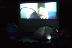
Annie Abrahams likes to assemble, to gather together. She says that she carries out “many collections on the Internet to observe the human being around her”.
On the occasion of a collective performance, she also brought together in a kind of Girls Band 11 French women working in and on the Internet. She constitutes a junction point between various people. This is concretely confirmed when she invites other artists to take part in the InstantS project or in the Breaking Solitude or Double Bind web performances.
The metaphor of the ant is directly related to her relational approach. The wandering ant, thanks to its “wanderings”, finds other sources, relates what was separate. Ants, with their way of approaching and touching each other, communicate and live together.
In her “collections”, Annie Abrahams evokes the idea “to give flesh and bone to what is on her screen,” because this “has lost its emotion.” In her pieces the emotion returns in the density of the texts and the voice. Through the omnipresence of the other in the work, of the relation with the other and of the barriers which are inevitably present, the limits of the skin emerge. And these reveal other borders, in particular those dealing with mutual comprehension.
When preparing this interview I also discovered a video I did not know: The green oaks. It’s a treat! One almost manages to feel the wind, present on the set on the afternoon when the film was made.
How did you come to work on and in the Internet?
Albertine Meunier:
Naturally and intuitively. With the arrival of the Internet, I quickly moved from the scientific sphere of optics towards the Internet. From white or black closed rooms[2], I passed into the world of open and unbounded Internet space. I engulfed myself in this unbounded universe where all seemed possible: to learn by one’s own methods, to construct, to communicate, etc. In parallel, I learned how to control the Internet in a professional framework. Very gradually, timidly, I began my artistic actions by publishing collages made up of texts and animated images. Year after year, I multiplied and enriched my practice by manipulating the Internet, the mobile phone, video formats… Today, I publish all my creations on the Internet. All is visible and downloadable online.
Annie Abrahams:
Since always, I have interrogated identity. Since always, I have sought my place in a world that I don’t understand. Since always, I have tried to comprehend the other. This is the very condition of my existence. It was impossible not to work on the Internet. Nowhere else, I can be closer to this other, nowhere else I can watch so intensely this other.
First I tried to better understand the world around me by studying biology at the University of Utrecht. (Doctorate, 1980) However, science did not help me to answer some very important questions. To quote Tolstoy: “What should we do and how should we live?” So, I radically changed my approach and went on to study at the Beaux-Arts. After my degree, I tried to identify what I called “truth” in installations based on 133 so-called chaos paintings. Then in 1990, I started using the computer. I quickly realised that besides efficient management of my installations in virtual and real space, this computer was also bringing other possibilities such as an escape from the gravity of the object.
In parallel, I increasingly began to work on the relation to the other, first in video, then also in installations. In 1995, in the gallery Ocre d’Art in Chateauroux, I created an installation called “Tribune / Refuge”. In 1996, I replaced all the tables of a bar in Nice – called the Wagram – with tables made out of paintings. In 1997, invited by an artists group in Nijmegen in the Netherlands, I developed an installation, a meeting device where the visitors could drink tea, eat cakes and assist in events. In order to be present from the South of France, I created my first website, quickly followed by the first works specifically designed for the Internet: Comprendre / Understanding,I am alone and I want a kiss, love and respect.
What place does the media occupy in your life and your practice?
Albertine Meunier:
I very much live the media through the web. The place of the Internet is central in my daily life because it is the place from which my ideas, my projects emerge. It’s like a small beating heart! The Internet is much more central than the newspaper deposited in the letter box, or the radio that I listen to in the morning. The newspapers and the radio function as appointments, which mark out the key moments of my day. They connect me with reality, with the thickness of matter. While the Internet is everywhere: everywhere in my day, everywhere in my eyes, everywhere in my practice, everywhere in my thoughts, and I cannot locate it anymore.
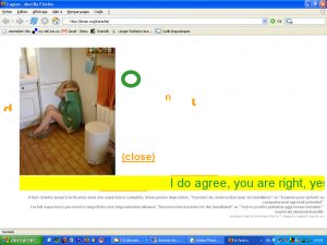
Annie Abrahams:
I almost always start my day by consulting my email account. Apart from my personal mail, I receive mail from SPECTRE, Nettime-fr, NetBehaviour, e-critures, NEW-MEDIA-CURATING, Empyre and a few other lists. I am also subscribed to some RSS feeds: “Instant RSS” from Nicolas Frespech, “Instants” of panoplie, Rhizome, Poptronics and some blogs of friends. Reading all these news, I easily spend two hours, in order to be informed and to keep in touch. Starting from information given by peers, I activate, I navigate and I operate the Internet. Some days I throw away everything except for my personal mail. This way I free myself from a ridiculous panoptic tendency. Then I relax, I am satisfied, because I managed to create empty time.
The Internet is omnipresent in my life, it determines my life, but by my actions I also control the Internet. I consider the Internet as a living organism with which I live on a day to day basis; either in a symbiotic relationship, where benefits are mutual, or in an almost parasitic way, that is to say beneficial to one and damaging or even harmful to the other.
You both record the modifications of the web, you note the evolutions. You evolve permanently with the tools placed at your disposal, you do not remain anchored on one type of software. The innovations related to the software, the new platforms become instruments which fit in your pallet.
Albertine Meunier:
I am interested in the evolutions of the Internet itself, and in particular in the tools, the services or the contents disposed of on the Internet; the service of Google Search History, the status of the friends of friends on Facebook, the mobile phone YouTube videos or the data of Freebase (free and open database accessible via an API[3]) which all become genuine matters for creation.
The Internet is unceasingly moving, has an incredible richness and is filled with innumerable contents. I wonder whether I do not seek to understand it, to capture it, to seize its nuances, its operations, its subtleties, its infinitude, its permanence. All in all, I try to touch the elusive.
Annie Abrahams:
In the beginning I was impressed by the possibilities of the Internet and I felt that each new tool could bring me new possibilities and that I needed to practice all of them in order to evaluate and judge them and eventually make art works out of them. Nowadays I focus more on the influences generated by such tools on our human behaviour.
Observing both your work, common topics appear: absence, disappearance, the trace and death… Do you think, the Internet abolishes temporality? Does it make a-temporal any physical trace, any inscription?
Albertine Meunier:
As a net artist, one knows that all this is very ambiguous. The Internet allows the storage of all, an eternal permanence and, at the same time, all can disappear in an eyelash, in a click. The Internet does not abolish all temporality, all physical traces or all inscriptions; it is at the same time impermanent and permanent. It is dubious. What will become of these pieces that only exist on the Internet? What will remain over time? It’s rather the law of all or nothing. A disappeared object, by a simple copy/paste operation, can reappear constantly because of its numerical nature. The Internet moves between two things: absence/presence – disappearance/appearance – traces/transparencies – inscriptions/obliterations. I think, the Internet transposes all on and in a binary mode. It transforms time, space, bodies and thoughts, in an operation between zero and one.
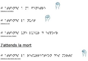
Annie Abrahams:
Being connected to the Internet may imply loosing the notion of your own body when you are online. It is comparable to the loss of a sense of time one might feel while writing a letter or while solving a puzzle. Our emotions are chemical states related to physical sensations. Emotions in their turn cause new bodily reactions. It is a biological cycle that begins at birth. The course of these cycles is inscribed unconsciously in our body. Sitting in front of my computer, my emotions are no longer associated with the same activity, with the same physical sensations as before. I type on a keyboard regardless of the emotion that crosses me. Whether joy, fear, disgust or anger, these emotions manifest themselves in the same way and so disturb my inner functions. I stress my body. My muscles tense. My level of excitement increases. Without necessarily noticing it, an unsteady state in my body settles down.
Albertine Meunier, what according to you are the interrogations conveyed by One the puppet of the other?
Albertine Meunier:
I did not see this performance live. I watched the video, with surely means a loss in perception. I was struck by the remoteness, the hesitation, and also by the silences – which do a lot of good – between the two characters. Somewhat like on the Internet, where a possible omnipresence of the other chokes, in these strained flux exchanges, silence is given a real breath.
The device of the performance itself is extremely disconcerting. Two tents inhabited by two persons connected by the Internet and communicating via webcam and microphone. First of all, these two tents resemble matrices, uterus; one wonders about the bond between them. The numerical umbilical cord, which connects these two people (these puppet-babies) directly one with the other, is also disturbing. Why are these “twins of the Internet” not together in the same space?
The title, One is [sic.] the Puppet of the other made me think of dislocated jumping jacks, stuck in a closed place, of directed puppets that wait until the wire coming from the Internet tells them what to do. By alteration, each one requires of the other to do or say something precise, for example: “Tell me your social security number” or “Face me…”.
In the beginning the one tells the other simply what to do and the other way around. Progressively during the performance, the symmetry in the device disappears, the puppets come to an independent life because each one is confronted with the other in its difference. So, they end up playing “dog and cat,” they say that they do not resemble each other much, and all of a sudden one is breathing.
How one and the other, do you invest the new social networks such as Myspace or Facebook?
Albertine Meunier:
I am not on Myspace. I am on Facebook. I am on Twitter. I am listening to Twitter’s chirping, where I am quite active, all day long. It allows me to have small news of my friends, of the web and of the “friends of the web.” My activity on Facebook is very minimal, I am almost only playing with “status.” I adore these short notes launched like numerical echoes on the Internet. Until now I particularly affection these short phrases of 140 characters. They became real matter for me. I adore reading those of others. This is probably at the base of my desire to make the Big Picture[4] and to use them in the Instants entre elle et lui, and in some of my videos.
They represent the assertion of oneself on these social networks and at the same time they are an almost useless gesture. The status of oneself or “statues of oneself” make us bathe in an ambient intimacy.
The Big Picture is an image of the updates of status on Facebook. Presented like a widget, the Big Picture consists of several zones, each zone being allocated to the status on Facebook of the friends of a person. The simple fact of moving the mouse on the surface of the Big Picture makes it possible to read the status on Facebook of a great number of people. This creation is also an artistic experiment in visualising the activity of a site like Facebook: to restore its rhythm, to make present the palpitations of its actors and also to record via videos[5] its accelerations, its decelerations, its stops. And last but not least: because any person can install, via a widget, all or a part of the Big Picture, the Facebook fortress is opened up a little bit.
For Instants entre elle et lui, I wrote every day and for approximately one month[6], poems with the Facebook status of people present in the Big Picture. The process was the following: Recover all the status present in the Big Picture on a particular day, make a selection of these statuses and finally create the instant, a poem, between her and him.
Extract of Instants entre elle et lui of April 17th 2008:
He crushes white.
He does nothing nothing nothing nothing nothing nothing nothing nothing nothing nothing nothing nothing nothing nothing nothing nothing nothing nothing nothing nothing nothing nothing nothing nothing nothing nothing nothing nothing nothing,
He is falling, it blows.
nothing discourages him!
she is high, low and below.
And she likes that.
by
Antoine Brea [Robin Hunzinger’s friend]
Xavier Leton [Andre Lozano’s friend]
JR Bellanger [Alex Andrek’s friend]
Andre Lozano [Albertine Meunier’s friend]
Laetitia To rust [Caroline Hazard’s friend]
Dawn Laloy [David Guez’s friend]
In these Instants of every day, I like to choose the status I prefer and give these a collective direction. This way I let some of their absurd but necessary content escape.
Annie Abrahams:
I watch closely how my “friends” are describing themselves on Facebook, how they establish links or not with others. I read their status, and look at their virtual libraries. Contrary to what one may think, people do not share much. They communicate their identities. It is usually more about promoting their tastes, their interests and expanding their influence.
Albertine Meunier, your observations nourish your works. How do these re-appear in your relation to the elderly people and your collective work the Big Picture?
Albertine Meunier:
With the Internet, I notice a certain impermanency, a ceaseless movement. One word replaces another and, at the same time, it can be stored at any moment, it can be fixed. The Internet is for me, quite simply, synonymous with life. Its movement is intrinsically associated with an accumulation…
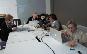
I noticed that with the Internet women that are more than 80 years old[7] have desires: desire to make, desire to say, desire to see, desire to listen, desire to show and to show themselves, desire to play with themselves and the other… Each day, these demonstrations of desire surprise me a bit more. All seems possible. Here, the wordplay: Internet makes us a life, has a sense. It makes a bit more immortal maybe.
Annie Abrahams, how do you analyse the Big Picture?
Annie Abrahams:
In the Big Picture, we see a nice colour table composed of a lot a coloured squares that shows in real time the Facebook Status updates of the “friends” of the Big Picture participants. Each status of a person is associated with a colour. According to the authors, Albertine, Olivier Auber and Yann Leguennec, this work is an artistic experience that should “capture the explosion of social media?” Be careful to the question mark and then imagine the follow-up: – People are more and more abandoning their Facebook activity, their status will no longer be updated and so they will disappear from the Big Picture table, leaving behind them the black square of death. On the contrary, Facebook might be booming and people will have more and more new “friends.” These new friends do not yet have colour, so their square is black but because newcomers are usually the most active, the table should also move towards a whole black picture, the dark colour of death.
According to you, what is the future of the Internet and the social networks?
Albertine Meunier:
Sacred question! The Internet is promised with a brilliant future… at the firmament of the media. I do not know how the social networks will change. They make more visible the contents inside groups, but it seems to me that their finite form has not yet been found. Their future will inevitably be determined according to what we are, we who have already changed so much in so little time.
For what concerns me personally, after ten years of practice I feel sometimes a little breathless running from link to link, a little mutant too. I become hypertext, hypermedia, hypernet. My spirit is “multi-task”, my brain “virtualised”, my body is sometimes elsewhere in the Internet, my thought is enriched but dispersed in all my roaming. I live in a kind of collective intimacy. The Internet grows, and I find out that my life narrows with the passing of days!
Annie Abrahams:
The future is in the hands of the users. It is through them that the Internet can grow, it is only by their “clicks” and “clacks” that one can earn money on the Internet. The users are also those who are building alternatives to proprietary softwares. They write blogs, create wikis and transform information sources. The Internet parasites these users, it feeds on them, it tries to phagocyte them by proposing behavioural molds such as Myspace or Facebook that make them harmless by encapsulating them. The Internet uses their loneliness, their need for recognition and fame.
I see all these users as living in their own bubble, in a sort of foam where everything is moving, where the exchange surfaces, in contact with other bubbles, are porous and let in some information but not other. Conglomerates form and disintegrate according to the requirements of the moment. It is not the image of an Internet where everything is connected by lines, but, I believe, the image of a fragile foam that reflects best our current situation. We should come out of our bubble to deal with the medium in which this foam will have to continue to exist. We should always leave our bubble.
This interview was originally undertaken for the French journal, Mercure, Les medias autrement, n.4-5.
Footnotes
Web cinema is an oxymoron. The internet is a resource; a hilariously unreliable encyclopedia for a distracted population amusing themselves to death as Richard Feynman has written – and all by themselves together. The new “web cinema” furthers none of the real time phenomenon of engaging with the seventh art. Bite sized videos on a computer screen actually remove the viewer from the energy and participation inherent in the original motion picture viewing experience. As dull as endless hours of someone else’s home movies – web cinema creations are typically viewed by one person watching a computer monitor in an endless possibility of environments. The very essence of cinema involves company, darkness and a communal experience.
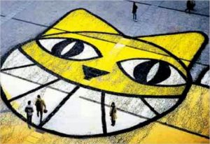
http://www.youtube.com/watch?v=5aIE3O-3RKg
The actual successor to the seventh art is Second Life. The enigmatic French cineaste and sociopolitical rabble rouser Chris Marker has been offering up his home movies for six decades now. At 87 he has led the charge out of the heady 16mm revolutionary 60’s of Parisian student unrest into the subdued society of blinking solitary screens that incite mass hypnosis via YouTube today. Second Life is the perfect realm for Mr Marker to further his socially conscious antics. While newcomers to the moving image who may never have spliced a real piece of film let alone toiled at a steenbeck lay claim to being the future of “web cinema”, Chris Marker has moved on and taken the foundations of cinema experience with him into Second Life. As a new medium Second life is not an extension of human experience like Youtube or Facebook it is an alternate collective experience in the spirit of film viewing.
Image: Monsieur Guillaume, photo by Bettina Tizzy
Famously elusive, Marker can engage people with remove in this alternate reality. While Marker stays put in Paris – his avatar traveling to points infinite in Second Life – he continues to have a presence in our actual reality through his recently appointed live action avatar Thomas Vuille. Vuille, the creator of serial Parisian graffiti cats has been rocketed out of obscurity into the public domain as a result of Marker’s interest. A collaboration made in cyber heaven, Marker’s attraction to Vuille’s anarchic art practice started with the resemblance he saw to his own cat Guillaume. Marker’s homage to Guillaume, “Cat listening to music” is the original and probably the most sublime YouTube home movie or “web cinema” ever created. Thomas’ enchanting graffiti cat has taken Marker’s subject back into the real world to continue his heroic journey while Chris ventures deeper into the virtual world to further the artistic discipline of cinema. Just as cinema propels us into a place that feels intensely real but is only a representation experienced collectively so – in spite of real time connections – Second Life has the potential to further the collective cinematic experience by creating a space for parallel experience.
Chris Marker first appeared in Second Life in the company of his longtime guide, Monsieur Guillame, a cat and a furry entity at the opening of his exhibit l’Ouvroir. On Tuesday, March 11th, 2007 at 11am SLT / 19:00 CET, in conjunction with a Real Life exhibition in Zurich, Switzerland, at the Museum Gestaltung. Marker exists in this cyber realm in much the same way as he has in the real world – only occasionally venturing out of his virtual hiding place. The site is still active but you may knock at his cyber door for hours if not months without a real interaction. He is there and he is not.

Image: Ouvroir, photo by Barbara Binder
Just as he was and is in his films, Marker is there through the creation of the work but absent in the experience of it. Marker’s highly regarded meditations on the state of our existence, including the infamous short film La Jetee, have mellowed into playful observations of our lunatic society through the eyes of a cleverly positioned graffiti cat who echoes Marker’s own feline amour “Guillaume”. Featured in such video art classics as “Cat listening to music” Marker’s cat has been reborn on the streets of Paris and the world and redrawn in Second life. This has revived the profile of Second Life at the same time – no longer a cyberia where losers go to live the lives they cannot in reality – it is becoming a creative platform, an infinite silver screen for individual heroes journeys to be played out in concurrent time.
Recently Marker participated in a brief discussion in Second Life that was broadcast live through Harvard’s Film Center. He cheekily “assisted” the cinematic dialogue in Second Life commenting on the limitations of the Second Life communication in amusing misspelled entries under the pseudonym Sergei Murasaki. Not unlike a director’s talk before or after the screening of a film in real life, the event offered more in the way of an experience of Marker as mischief maker than any elucidation of his Second Life experimentation as the new platform for his cinematic explorations. Marker’s contribution to the evolution of cinema into video and Second Life is documented, reviewed and archived on a comprehensive site that includes examples of what web cinema might have been if users were gathered around a giant screen together. His Youtube premiered video “Leila Attacks” from 2006 begs this communal experience and serves as a stark example of the non-cinema experience of “web cinema”. Like any great innovator Marker has infiltrated the realm of pretenders to his throne and dabbled enough to prove his explorations in Second Life are the real web cinema.
You can see other recent works, including experimental film loops such as Owls at Noon Prelude: The Hollow Men 2005 – at Peter Blum Gallery- Chelsea. New York. Between May 16th – July 31st 2009.
References and resources:
Museum of Design, Zurich: http://www.museum-gestaltung.ch/E_welcome.html
Marker Website: http://www.chrismarker.org/
YouTube: Leila Attacks: http://www.youtube.com/watch?v=iParBp8cS0w
Chris Marker’s second life site: http://slurl.com/secondlife/Ouvroir/187/61/39/
Archive of Marker as sergei-murasaki interacting on Second life during Harvard event: http://www.webknot.net/2009/05/17/chris-marker-sergei-murasaki-presente-son-exposition-dans-louvroir/
blog describing l’Ouvroir: http://islandouvroir.blogspot.com/
Telling Stories A History of Web Cinema: http://www.druidmedia.com/booksscripts/ahistoryofwebcinema.html
“Web Cinema” a Rogue site posting “great films and videos” http://ukrtv.com/en/
M. CHAT info site France: http://monsieurchat.free.fr/MChat.php
M. CHAT info site Chile:
[url=http://omarperezsantiago.blogspot.com/2007/11/monsieur-chat-clausura-feria-del-libro.html ]http://omarperezsantiago.blogspot.com/2007/11/monsieur-chat-clausura-feria-del-libro.html
[/url]
The collaboratively produced on-line encyclopaedia Wikipedia is becoming an important reference resource for art as well as for its traditional strengths in the sciences and popular culture. To help improve the representation of new media art on Wikipedia, more people who are involved in the field should learn about how Wikipedia works and get involved with editing it. This article is a brief introduction to doing so.
Wikipedia’s organization and culture can present a steep learning curve for even experienced new media art practitioners. Don’t be put off, it’s easy to learn how to work with Wikipedia’s organization once you understand the project’s core concepts and the rationales behind its processes.
Becoming a Wikipedia Editor
The technical side of editing Wikipedia is relatively simple, especially if you have experience of writing for other media or of HTML or BBCode editing. To become a Wikipedia editor just register, log in, set up your user profile and start working on a page. As soon as you click “save”, your work will go live on Wikipedia.
The social side of editing Wikipedia can be much more complex, even if you have experience of writing or editing for academia or the art world. Wikipedia is a large project with well established governance structures and its own peculiar terminology. It is important to learn how Wikipedia works at an organizational and social level as well as a technical level in order to write effectively for it.
There are several well written books on Wikipedia that cover all of the various aspects of editing Wikipedia clearly and in depth. Two that are available freely online are –
You can save immeasurable time and frustration by reading at least one of these before you join in editing Wikipedia. I also recommend practicing editing on articles that are unrelated to new media art to start with so you can get a feel for the editing process as an end in itself.
Wikipedia’s organization and processes have their own concepts and terminology (or jargon). The books linked to above should teach you the terminology and concepts you need to know, but if you encounter an phrase in an article or in a discussion you can always find a reference for it on Wikipedia itself.
Notability
The most important concept in editing Wikipedia is “notability“. Notability is Wikipedia’s standard for deciding which topics should be included in an online encyclopaedia. It’s best if you think of it as a strange new quantitative concept that shares only its name with any qualitative concept of notability.
You cannot establish notability in Wikipedia based on personal opinion or unsupported assertion. This would be considered “original research” in Wikipedia’s terminology and rejected. Instead you must establish the notability of your subject by citing multiple reliable third party sources that have in turn found the subject notable enough to comment on.
“Reliable sources” mean established and probably mainstream news or opinion sources such as magazines, journals, or major web sites. “Third party” means not self-published (and not autobiographies).
An additional difficulty when trying to establish notability for any artistic subject, never mind a new media art subject, is that there are no stated notability guidelines for art as there are for music. There should be.
If existing media, books, journals, magazines or the mainstream press cannot provide citations to support the notability of a subject, then it is not notable under Wikipedia’s definition of notability. The solution to this is lies outside of Wikipedia. You will need to write about your subject for reliable sources or to push for other people to do so. This will be of benefit to your subject more generally than just for Wikipedia if they do not already have such coverage.
Conflicts Of Interest
When a subject is suitable for inclusion in Wikipedia, it is important to avoid conflicts of interest. If you are tempted to write or edit an article about yourself or a project or organization you are directly involved with, there is a very simple rule to follow: don’t. This would be a conflict of interests. You can request that such an article be written, and you can contribute links to appropriate sources on its talk page, but you can’t edit it yourself.
Prohibiting conflicts of interest avoids vanity pages, and it avoids censorship. Individuals and corporations can both be tempted to remove negative facts and add positive spin to their Wikipedia articles. As an encyclopaedia, Wikipedia is intended to present a full and balanced view of its subjects. If you have information that you feel could help establish that a subject should be included in Wikipedia, you may be able to contact the editors and provide it, but it must satisfy Wikipedia’s standard for reliable sources (autobiography doesn’t, for example).
What Wikipedia Is Not
As a website Wikipedia can contain far more articles than a traditional printed encyclopaedia, but all of those articles should be encyclopaedic in nature. This means that original criticism, promotional material, reportage and other perfectly valid forms of writing about art have no place in Wikipedia.
As well as such writing not fitting Wikipedia’s stated purpose, Wikipedia is not the most effective way of distributing it. People who are interested in new media art are far more likely to find an audience and get useful input in more appropriate forums. There are many alternative outlets for writing about art, from web sites such as Furtherfield and mailing lists such as Netbehaviour to hosted blogs and Facebook groups. Using a more focused platform or setting up your own resource can be better for promotional purposes as well.
Deletion Reviews
When other editors think that an article does not meet Wikipedia’s notability criteria, they will list it for a deletion review. A deletion review is not a personal attack on the innermost being of the article’s author or subject, it is an opportunity to improve an article for readers by answering the concerns of Wikipedia’s editors. When you have created or edited a page, watch it for deletion review notices so that you can get involved in the process.
The formula for a successful deletion review is simple. Write a well structured article about a notable subject. Then answer any queries with reference to how the article itself satisfies people’s concerns about how it may not follow Wikipedia’s guidelines. If it does not already answer those concerns, edit the article so that it does. If the article cannot be edited to meet Wikipedia’s standards, then harsh though it may seem it should not be on Wikipedia.
It can be difficult to explain precisely how the subject of articles on new media art projects or organizations should be evaluated. Often other editors will evaluate online artworks or pages for community projects simply as web sites and argue that their low Google pagerank means that they are not notable. This is listed as an argument to avoid in Wikipedia’s own guidelines.
Even the longest running and most widely distributed art computing and new media art journals may be unfamiliar or inaccessible to the majority of Wikipedia editors who will vote on whether to delete an article or not. This can create problems for new media artists and galleries as perfectly valid sources may require explanation during a deletion review.
How To Write A Good Wikipedia Article
The formula for a successful Wikipedia article is surprisingly simple. State what the article’s subject is, state why that subject is notable and support this with links to multiple citations from reliable sources, then place the citations at the bottom.
This makes for an article that is informative for Wikipedia’s readers, that is easier for Wikipedia’s editors to review, and that because of this is more likely to remain on Wikipedia.
If you click on Wkipedia’s “Random Article” link you will see that most articles follow this formula (and that those that don’t have most likely drawn the attention of Wikipedia’s editors).
How To Improve The Representation Of New Media Art On Wikipedia
Establishing standards for notability for art and improving the quality of citations for art are tasks that will require involvement in the organization of Wikipedia as well as in the technical side of the editing of individual articles. Organization around a topic on Wikipedia is done through WikiProjects. There isn’t a New Media Art WikiProject (yet), and the Contemporay Art one is moribund. The Visual Arts Wikiproject is very active, and should probably be the starting point for any new-media-art-related developments –
http://en.wikipedia.org/wiki/Wikipedia:WikiProject_Visual_arts
The best argument for keeping an article on Wikipedia is an article structured to quickly make the case that its subject is notable with multiple citations from reliable sources. With a group dedicated to better provision of reliable sources, more articles about new media art topics will satisfy Wikipedia’s standards and be accepted as part of the online encyclopaedia.
And that, galling as it can be when sitting out a deletion review of an article on your gallery or yourself, is the point of editing Wikipedia. For articles to remain on Wikipedia they must satisfy its standards. Those standards exist to make Wikipedia a worthwhile resource for society. New media art should definitely be a part of that resource. It is artistically and socially notable, and we can work to establish this within Wikipedia’s guidelines.
The text of this review is licenced under the Creative Commons BY-SA 3.0 Licence.
“Onward transit of FER-1327 from Codecano arrived Cube Microplex 2007-07-25 kate rich 20/6/07”
Shipment pallet delivered by forklift, boxes were all present but many were opened and the coffee bags looked rummaged. Forklifters kindly reweighed the shipment (252 kg) and recorded the pickup as damaged. Drive home was gloomy yet aromatic. Arrived Cube at midnight, unloaded 1/4 metric tonne coffee into the under-auditorium-seating area. Coop had miscompiled the order as 175kg ground coffee and 75kg beans, the reverse of my emailed order; the ground coffee was also ground too coarse. Emailed Ricardo shipping report then went home to sleep.[1]
As food is seldom consumed when and where it was found, it needs wrapping into other materials before it can travel. Bulk ingredients packaged in batches move across long distances; they are stacked, stored, sorted and sold. Packaging is the result of an uneasy compromise between people and their machines, negotiating industrial wants with the more convoluted desires of individual customers, so that products roll off a food grade conveyor belt as smoothly as they fit into a biodegradable shopping bag or a kitchen cupboard. But besides physical protection, packaging offers a convenient surface on which to project messages about the product or even about the package itself. Food labelling is a means of communication between the many parties involved in the way food gets around; each of them leaving traces that represent their own interest in what is or what is not inside.
When a new product is added to Kate Rich’s Feral Trade product range, packaging is a factor to be reckoned with. As the goods are mainly passed by hand, size matters, for example, in relation to the volume that is allowed as carry-on luggage. In addition, its container needs to be tough enough to resist the unpredictable conditions that might occur on non-freight routes. But above all Feral Trade products, as well as their packaging, make the experience of trading tangible.
It’s 1986. In a conference centre in the Netherlands, shopkeepers of various local Fairtrade shops gather for a long meeting.[2] The single item on the agenda is a proposal to launch a new brand, Max Havelaar, named after a bestselling 19th century novel about the exploitation of Javanese coffee plantation workers by Dutch colonial merchants. Solidaridad, the country’s largest importer of Fairtrade coffee and initiator of the brand, is under pressure from Mexican coffee growers who demand access to a larger market than the autonomously and rather amateurishly run shops will ever be able to provide. The shopkeepers present at the meeting respond with mixed feelings, voicing their predictable worries about the risk of brushing with mainstream retail, and wondering how this brand will be able to increase sales and still guarantee the fairness of the trade.
The main anxiety though, is that once the coffee is sold in supermarkets, it will be hard to communicate the complex story of provenance that comes with it. Outside the narrative context they have carefully built in their small-scale, volunteer-run spaces, the packaging will be too tight a space to make up for the loss. By the end of the day, the argument for market expansion is more convincing. Solidaridad settles for a logo with a hand drawn portrait of a Mexican farmer carrying a bag of raw coffee beans. More than 20 years later, after an indecisive interlude, the brand is redesigned by a London agency[3] in an attempt to rationalise packaging and streamline marketing.
Again, after much discussion, the Max Havelaar foundation chooses a human figure but this time it is depicted in the form of an abstract swoosh representing both producer and consumer.
Feral Trade promotes its coffee proudly as ‘non-certified organic’, a community guaranteed label that is established through shifting social processes instead of relying on external quality assurance. Keeping with the same ethos of undefined definition, the hybrid philosophy behind the design for the packaging of Montenegrin Delight fits with the variable graphic styles of the Feral Trade product range: “The original owner of the company designed the box art himself on his home computer to connect tradition with modernity.”[4] Without a consistent brand identity, another layer of information is added to the many types of messages that are already conveyed by the diverse packages in the Feral Trade range. Sometimes attached as a label, often available through the Feral Trade website, customers can find a detailed breakdown of costs and also a full track record of each shipment. The information is retrieved from a custom made database in which Feral Trade shipping agents offload e-mails, reports, faxes and freight documents gathered along the way. Making the bureaucratic nightmares of international cargo legible, customers are offered a form of transparency that is not necessarily reassuring. In a parody on EU-regulated nutrition labelling, the supplied information here produces an active position, where unexpected events and, sometimes, undesirable results are to be taken into account.
To bring up the debate about Fairtrade labelling in the context of the Feral Trade project is, to say the least, a little uncomfortable. But even if their respective scales, aims and ideas are of a different nature, such a comparison might help to understand how to reveal complicated stories of origin and destination, without falling into the trap of pairing authenticity with reliability. Feral Trade’s unpredictable appearance offers an occasion to come into contact, proposing both a recording and a constitution of social networks. The precision of its design is in the persistent choice for the kind of leaky containment that allows narratives of trade to permeate through.
‘Instead of adopting narrative threads from other media, I am interested in the currency that exists already in the city space. These works are focused on the wider picture of city experiences which are being played out in real time.’ Stanza.
Unseen geographies of our cities lay around us with areas yet to be discovered. Much of it seldom noticed as we pass through them in our everyday lives. The traces of our journeys through each city leave temporary presences. There was once a time where many would have believed these traces were spirits, psychic remains, registrations and impregnations onto objects and environments, from what was possibly a traumatic event in time. Are contemporary technologies a realisation of this belief? These technologies that record our movements in time, are no longer odd, or alluding to being mystical occurrences but the switching of sensors and transmission of radio waves through the ether.
The sensors deployed for Sensity measure temperature, sounds and light as well as the humidity and vibrations, around each recording and transmission unit. Depending on the deployment (there have been several across different cities in Europe) the units are used for different combinations of these discrete elements. But rather than taking finite measurements at a moment in time, mathematically, the notation is delta, registering the change over a period of time. The difference between one state to another that brings our attention to the changes around us, where we may imagine the world around us has not altered very much, but the data gathered from the sensors tells a different story altogether. It draws our attention to the ever-shifting mood of the city. This ebb and flow, viewed over a period of time, might, one imagines, bring about some kind of anthropomorphism in our relationship to the environment. In the same way that an anonymous animal, viewed over a period of time, gradually shows personal characteristics, so does a city. It becomes a barometer of all our psychic imprints on it. As Stanza says in the project documentation:
‘These artworks represent the movement of people, pollution in the air, the vibrations and sounds of buildings. They are in effect emergent social sculptures visualizing the emotional state of the city.’
Stanza regards this change as vital to the work,
‘Some things change for the better but sometimes they don’t; one thing is for sure; things change’.
Presumably this means the physical space as well as the social aspect (psychic well-being?) of the environment. The two are like a bio-feedback loop. But what is it that Sensity reveals to us in its visualisation of the city?
One of the moods of the city is ‘fear’ of the consumer class. A very contemporary class, replacing what we once knew as the working class, caught within the trappings of an economical reliant state of bourgeois anxiety. The consumer classes who, it might be suggested, consume without question and are more likely, in their drunken Saturday night release from the pressure of state-endorsed nullification of the desire to think, to destroy and cause chaos. The CCTV cameras aren’t trained on the would-be anarchist, or political dissident. It’s the masses that scare the state, with their potential to destroy property. A hungry, voyeuristic CCTV culture is there all around us, and it works more subtly than we might imagine[1].
Sensity can be viewed as a way to challenge or exploit the power balance of state imposed surveillance systems like CCTV, mobile phone monitoring and car monitoring (for example, cameras installed on buses to monitor the illegal use of bus lanes in the city). There is, of course, an ongoing struggle between the population on one side and the privacy concerns of the population on the other side. And if these spaces are public, how much of our own surveillance technology are we allowed to deploy? The argument over public space becomes not just one of ownership, but of how much freedom we are allowed in those spaces. Anyone who has spent time within a shopping mall, soon comes to realise that you are only visiting those public spaces, and are allowed little more than the ‘privilege’ of being within them to consume products, that’s the deal.
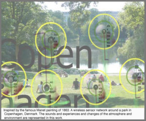
It would be good to imagine that the changes monitored by Sensity are working in favour of the ordinary public, rather than the elite who are most often served by the surveillance technologies. After all, aren’t most CCTV cameras deployed into areas of commerce and entitlement? Nobody cares what the general public actually gets up to, as long as property isn’t destroyed and the reputation of the city isn’t compromised. Of course, when the government talks about the general public, they mean the British working class, the consumerist, a celebrity-obsessed class. And in particular, those of us employed to work in the inner-city space, rather than live there. You can visit, work and spend your money here, but you must return to your own dwellings! Owen Hatherley points out this ambivalent attitude in the introduction to his book, Militant Modernism (2009):
‘The pervasive class hatred only slightly below the surface of British life (what else does the word ‘chav’ signify?) centres on the feared or ridiculed estate dweller.’
But whereas Hartherley is discussing the issue of Modernist architecture in relation to political standpoints and the class system, Sensity, through its monitoring of the movement through those architectural spaces, presents a human-centred perspective tracing our movements, rather than the monumental buildings.
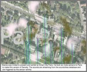
If we are truly to once again have ownership of our own spaces, then isn’t the right to deploy surveillance technology one of those rights? The argument of course, is as much about who owns the data, as who is collecting it. And to what use it will be put. Stanza takes the data to measure our existence in public spaces to ‘create artistic metaphors.’ These metaphors are the visualisations of existence projected into the exhibition space and online. These metaphors are like seances, drawing out the spirits of the city. Tapping into the spirit metaphor again, it is possible to communicate with the city and the inhabitants who are the cells and organs of the spaces. Sensity offers the city a chance to tell a different story.
On the Sensity website, clicking on the images activates the simulation of the recordings. The slightly blurred images of cities or park locations are covered with puffy clouds of ‘data’ moving out from the points that mark the locations of the sensors. The effect is hypnotic and gives more to the patient viewer than the casual observer. This isn’t the sort of artwork that the viewer should cast a casual glance at and then move on. It requires time to understand the change in the data. Where there is audio content, the click and stutter of noise begins to build a symphony of sounds that can hover just at the edge of recognition before fading away. Numbers form and then change, always offering a sense of movement.
What is being observed within the gallery is something that has already happened, an historical moment that has passed. Conversely, this gives the work its strength as a comment on contemporary time. The work sits within time and acts as a reminder that we are constantly in flux. Despite the many questions that it raises about the cityscape and urban life, this constant change offers a reminder that there is always the future to look forward to. If everything is constantly changing, there is always the possibility of reaching possible states of alternate contentment.
[1] For a more in-depth discussion on the surveillance society, read Marc Garrett’s article on the fourth radiator festival. Where he refers to the 2006 research document A Report on the Surveillance Society For the Information Commissioner produced “by a group of academics called the Surveillance Studies Network.”