


Data Soliloquies
Richard Hamblyn and Martin John Callanan
London: Slade Press, 2009
112 pages
ISBN 978-0903305044
Featured image: Data Soliloquies is a book about the extraordinary cultural fluidity of scientific data
Although much has been said about C.P. Snow’s concept of a “third culture”, we haven’t actually reached an understanding between the spheres of science and humanities. This is caused in part by the high degree of specialisation in each field, which usually prevents researchers from considering different perspectives, as well as the controversies that have arisen between academics, exemplified by publications such as Intellectual Impostures (1998) in which physicists Alan Sokal and Jean Bricmont criticise the “abuse” of scientific terminology by sociologists and philosophers. Yet there is a growing mutual dependency of both fields of knowledge, as the one hand our society is facing new problems and questions for which the sciences have adequate answers and on the other scientific research can no longer remain isolated from society. Some scientists, such as the astronomer Roger Frank Malina, have even argued that a “better science” will result from the interaction between art, science and technology. Malina presents as an example the “success of the artist in residence and art-science collaboration programs currently being established” [1], and considers the possibility of a “scientist in residence” program in art labs.
Our relationship with the environment is certainly one of the main problems we are going to face during this century and it is also a subject that brings up the necessary communication between science and society. The UCL Environment Institute [2] was established in 2003 to promote an interdisciplinary approach to environmental research and make it available to a wider audience. While being representative of almost every discipline in the University College London, it lacked an interaction with the arts and humanities. This gap has been bridged by establishing an artist and writer residency program in collaboration with the Slade School of Fine Arts and the English Department. Among 100 applications, writer Richard Hamblyn and artist Martin John Callanan were chosen for the 2008-2009 academic year: Data Soliloquies is the result of their work.
Despite “belonging” to the field of art and humanities, neither Hamblyn nor Callanan are strangers to science and technology. Richard Hamblyn is an environmental writer and historian who has developed a particular interest in clouds, and Martin John Callanan is an artist whose remarkably conceptual work merges art and different types of media. This may be the cause that Data Soliloquies is by no means a shy penetration into a foreign field of knowledge but a solid discourse which presents a richly documented critique of the apparently ineffective ways in which scientists have made society aware of such a crucial problem as that of climate change. The title of the book has been borrowed for a term that Jon Adams, researcher at the London School of Economics, coined to refer to Michael Crichton’s novels, who uses “scientific” facts to give his imaginative plots an aura of credibility. With this reference, the authors state that the way scientific data is presented actually constitutes a narrative, an uncontested monologue: “…scientific graphs and images have powerful stories to tell, carrying much in the way of overt and implied narrative content (…) these stories are rarely interrupted or interrogated.”[3]
As the amount of data regularly stored in all sorts of digital supports increases exponentially, and new forms of data visualisation are developed, these “data monologues” become ubiquitous, while remaining unquestioned. In his text, Hamblyn exposes the inexactitude in some popular visualisations of scientific data, which have set aside accuracy in favour of providing a more eloquent image of what the gathered evidences are supposed to tell. On the one hand, Charles D. Keeling’s upward trending graph of atmospheric carbon dioxide concentration, which according to Hamblyn is “probably the most important data set in environmental science, and has become something of a freestanding scientific icon”[4], or Michael Mann’s controversial “Hockey Stick” graph are illustrative examples of the way in which information displays have developed their own narratives. On the other, the manipulation of data in order to obtain a more visually effective presentation, such as NASA’s exaggeration of scale in their images of the landscape of Venus or the use of false colours in the reproductions of satellite images, call for a questioning of the supposed objectivity in the information provided by scientific institutions.
In the field of climate science, the stories that graphs and other visualisations can tell have become of great importance, as human activity has a direct impact on global warming, but this relation of cause and effect cannot be easily determined. As Hamblyn states: “climate change is the first major environmental crisis in which the experts appear more alarmed than the public” [5]. The catastrophism with which environmental issues are presented to the public generate a feeling of impotence, and thus any action that an individual can undertake seems ineffective. The quick and resolute reaction of both the population and the governments in the case of the “ozone hole” in 1985 points in the direction of finding a clear and compelling image of the effects of climate change. As Hamblyn underscores, this is not only a subject for engineers: “the reality of ongoing climate change has yet to be embraced as a stimulus to creativity –in the arts as well as the sciences– or as a permanent and inescapable part of human societal development” [6].
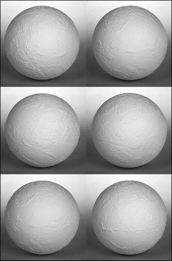
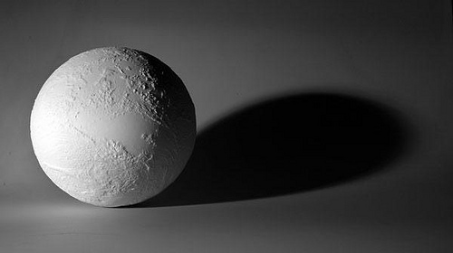
Martin John Callanan took upon himself to develop a creative response to this issue, and has done so, not simply by creating images or objects but by depicting processes. He states: “I’m more interested in systems –systems that define how we live our lives” [6]. A quick look at his previous work [7] will show how appropriate this statement is: he has visited each and every station of the London underground, collected every command of the Photoshop application in his computer, officially changed his name (to the same he already had), gathered the front page of hundreds of newspapers from around the world and engaged himself in many other activities that are as systematic and mechanical as ironic, poetic or simply nihilistic. During his residency, Callanan created to main projects. The first one, Planetary Order, is a globe in which the patterns of the clouds on a particular date (February 6th, 2009) have been sculpted. The artist composed the readings of NASA’s cloud monitoring satellites in a virtual 3D computer model, which was then laser melted on a compacted nylon powder sphere at the Digital Manufacturing Centre at the UCL Bartlett Faculty of the Built Environment. The resulting object is a sculpture, an artwork more than any sort of model in the sense that it develops a discourse beyond the actual presentation of data. An impeccable white sphere textured by its subtle protuberances, the globe evokes the perfection of an ancient marble sculpture while presenting us with an uncommon view of the Earth, covered with clouds. The clouds, which are usually erased in the depictions of our planet in order to let us see the shapes of the continents (the land which is our dominion), become an icon of climate change and the image of an order which is, in all senses, above us. Callanan freezes the planetary order of clouds in an impossible map, a metaphorical object which appears to us as a faultless, yet fragile and inscrutable machine.
The second of Callanan’s artistic projects is the series Text Trends. Using Google data, the artist has collected the number of searches for selected terms related to climate change in a time range of several years (from 2004 to 2007-2008). With this data, he has generated a series of minimalistic graphs in which two jagged lines, one red and the other blue, cross the page describing the frequency of searches (or popularity) for two competing terms. The result resembles an electrocardiogram in which we can see the “life” of a particular word, as opposed to another, in a simple but eloquent dialogue of abstract forms. Callanan has chosen to confront terms in pairs such as “summer vs. winter”, “climate change vs. war on terror” or “global warming”. Simple as they may seem, the graphs are telling and constitute and visual summary of the book whilst suggesting many other reflections. The final conclusion is presented in the last graph, in which the perception of climate change is expressively described by the image of a vibrant line for the word “now”, much higher in the chart than the flat line for the word “later”.
Pau Waelder